3 Market analysis
(where you learn to use our model to understand life at the Market Square)
In Chapter 2 you learned the intuition behind supply and demand. With this model you can understand how market forces shape much of life around the Market Square.
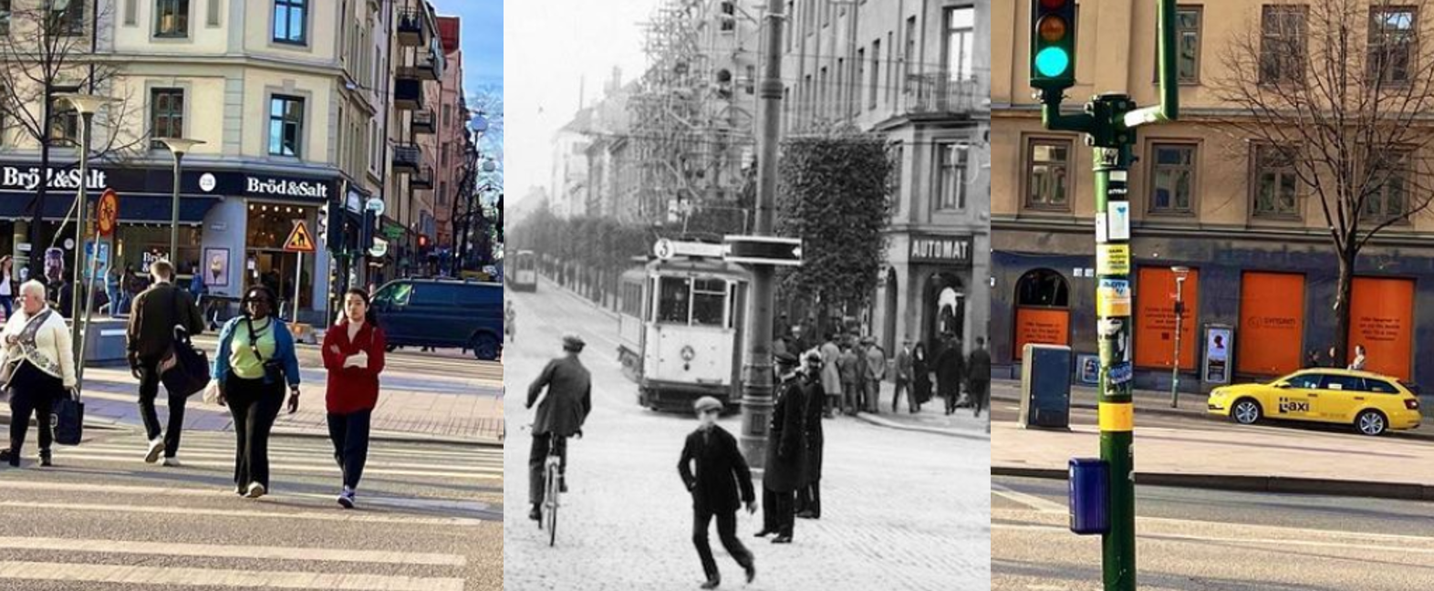
Think about why almost all DVD players and travel agencies have disappeared. It’s because fewer people wanted to use DVD players or hire travel agencies (demand shifted left) — which pushed prices down. Lower prices and reduced profitability made firms stop producing so many of these products. At the same time, sushi, organic eggs and eco‑friendly bags became trendy (demand shifted right), which drove up prices and encouraged firms to increase production of those goods. The price system ensured that we got what we wanted.
And if it suddenly becomes harder to produce something — for example when drought in Spain destroyed much of the olive harvest (supply fell) — prices rise and we use less olive oil. At the same time other foods become cheaper thanks to technological progress (supply rises), which leads us to buy more of those foods. The price system makes us use more of what is easy and cheap to produce and less of what is difficult and expensive.
In this chapter you will apply your new knowledge in practice. Let’s, for example, use the model to understand the hamburger market in Chicago.
3.1 The price of Wendy’s burgers
In spring 2024 the burger chain Wendy’s introduced dynamic pricing, which means the price of a burger is determined entirely by supply and demand. If you eat at unusual times when few others are dining, your burger may be cheaper. But if you happen to turn up at a restaurant that has bought too little meat, the price can be much higher.
Now we want to analyse this market more closely. What will burgers cost, and how much does the price vary during the day? Your team has already collected data on demand and supply, in the same way we earlier measured the relationship between strong beer and BAC in Section 2.3. They investigated how many burgers people want to buy at different prices and how many burgers restaurants are willing to sell at those prices. They then plotted the curves, which can be summarised by the following two formulas:
\[ \small \begin{aligned} \underset{\text{Demand}}{Q_{d} = 1600 - 100 \cdot P} \quad \Longleftrightarrow \quad \underset{\text{Inverse demand}}{P_{d} = 16 - 0.01 \cdot Q} \quad & \hspace{0.5cm} \text{(12:00 noon)} \end{aligned} \]
Qd is the quantity demanded. The formula shows how many burgers people want to buy depending on price. Note that on the right I have “flipped” the expression so the formula instead shows the price that makes people want to buy a given quantity. Using the formulas, how many burgers do customers want if the price is $10? And what price makes customers want to buy 600 burgers? Qs is likewise the quantity supplied.
\[ \small \begin{aligned} \underset{\text{Supply}}{Q_{s} = -50 + 50 \cdot P} \quad \Longleftrightarrow \quad \underset{\text{Inverse supply}}{P_{s} = 1 + 0.02 \cdot Q} \quad & \hspace{0.5cm} \text{(12:00 noon)} \end{aligned} \]
When you know demand and supply you can predict what the burgers will cost and how many will be sold. The trick is to think like this:
»On the market the price — miraculously — ends up exactly at the level where sellers want to sell precisely as much as buyers want to buy. Therefore I set supply equal to demand to find the price that makes them equal. Once I have found the price I can see how many burgers customers want to buy at that price.«
Here are step‑by‑step instructions for how you can technically calculate what will happen on the market with paper and pencil. In the exercises at the end of the chapter you will practise this type of problem. If you’ve forgotten how to do these calculations, refresh briefly on YouTube (for example the first two minutes of this video) or ask an AI to teach you the method.
-
Set demand equal to supply:
\[ Q_d = Q_s \quad \Rightarrow \quad 1\,600 - 100P = -50 + 50P \]
-
Collect all terms with letters on one side and all numeric terms on the other:
Remember to “change sign” when a term moves to the other side.
\[ 1\,600 + 50 = 50P + 100P \]
-
Simplify the expression as much as possible:
\[ 1\,650 = 150P \]
-
Calculate the equilibrium price \(\small P\):
Divide both sides by 150; if “150 times something” equals 1650, that “something” must be 150 times smaller than 1650.
\[ P = \frac{1\,650}{150} = 11 \]
-
Determine how many burgers customers want to buy at price 11:
Substitute the price 11 into the demand function. (Try substituting the price into the supply function instead — do you see why you get the same result?)
\[ Q_d = 1\,600 - 100 \times 11 = 500 \]
-
Summarise your conclusions:
The price will be $11, and 500 burgers will be traded.
You can easily automate this kind of calculation. Below I’ve made an app where you can enter supply and demand information yourself. The computer then draws the correct graph and calculates the equilibrium price and the quantity traded. You can also quickly see what happens to the market when you change supply and/or demand (remember to click Update figure and calculations).
Supply and demand.
When drawing the curves it is easiest to start from the inverse functions, for example Ps = 1 + 0.02Q and Pd = 16 − 0.01Q. The supply curve’s intercept is 1 and its slope is +0.02. The demand curve’s intercept is 16 and its slope is −0.01. Experiment with the numbers in the app until you understand how it works. Remember to click the blue button each time you want the computer to update the figure and calculations.
#| standalone: true
#| viewerHeight: 1240

# Standalone Shiny app code with improvements (English labels)
if (!requireNamespace("shiny", quietly = TRUE)) install.packages("shiny")
if (!requireNamespace("ggplot2", quietly = TRUE)) install.packages("ggplot2")
if (!requireNamespace("plotly", quietly = TRUE)) install.packages("plotly")

library(shiny)
library(ggplot2)
library(plotly)

ui <- fluidPage(
  fluidRow(
    column(4,
      wellPanel(
        numericInput("supply_intercept", "Enter the intercept for the supply curve:", 1),
        numericInput("supply_slope", "Enter the slope for the supply curve:", 0.02),
        numericInput("demand_intercept", "Enter the intercept for the demand curve:", 16),
        numericInput("demand_slope", "Enter the slope for the demand curve:", -0.01),
        numericInput("x_max", "X-axis maximum in the plot:", value = 2000),
        numericInput("y_max", "Y-axis maximum in the plot:", value = 20),
        actionButton("update", "Update plot and calculations",
                     style = "color: white; background-color: #007bff; padding: 6px 12px; border: 2px solid #007bff; font-size: 14px;"),
        br(),
        tags$h5("User guide: Fill in the parameters above and click 'Update plot and calculations' to see the result.
         Note that the supply slope must be positive and the demand slope must be negative.")
      )
    ),
    column(8,
      plotlyOutput("demandSupplyPlot"),
      br(),
      verbatimTextOutput("equilibrium"),
      verbatimTextOutput("inverseFunctions")
    )
  )
)

server <- function(input, output, session) {

  validatedInput <- reactiveValues(
    supply_intercept = 1,
    supply_slope = 0.02,
    demand_intercept = 16,
    demand_slope = -0.01
  )

  observeEvent(input$update, {
    supply_intercept <- input$supply_intercept
    supply_slope <- input$supply_slope
    demand_intercept <- input$demand_intercept
    demand_slope <- input$demand_slope

    if (is.na(supply_intercept) || is.na(supply_slope) ||
        is.na(demand_intercept) || is.na(demand_slope)) {
      showNotification("Invalid input. Please enter numeric values.", type = "error")
      return()
    }

    if (supply_slope <= 0) {
      showNotification("The slope of the supply curve must be positive.", type = "error")
      return()
    }

    if (demand_slope >= 0) {
      showNotification("The slope of the demand curve must be negative.", type = "error")
      return()
    }

    validatedInput$supply_intercept <- supply_intercept
    validatedInput$supply_slope <- supply_slope
    validatedInput$demand_intercept <- demand_intercept
    validatedInput$demand_slope <- demand_slope
  })


  equilibrium <- reactive({
    supply_intercept <- validatedInput$supply_intercept
    supply_slope <- validatedInput$supply_slope
    demand_intercept <- validatedInput$demand_intercept
    demand_slope <- validatedInput$demand_slope

    if (supply_slope != demand_slope) {
      eq_x <- (demand_intercept - supply_intercept) / (supply_slope - demand_slope)
      eq_y <- supply_intercept + supply_slope * eq_x

      if (eq_x >= 0 && eq_y >= 0) {
        list(eq_x = eq_x, eq_y = eq_y)
      } else {
        list(eq_x = NA, eq_y = NA)
      }
    } else {
      list(eq_x = NA, eq_y = NA)
    }
  })

  output$equilibrium <- renderText({
    eq <- equilibrium()
    if (is.na(eq$eq_x) || is.na(eq$eq_y)) {
      "Equilibrium: No intersection at positive values"
    } else {
      price <- round(eq$eq_y, 2)
      quantity <- round(eq$eq_x, 2)
      CS <- round(0.5 * quantity * (validatedInput$demand_intercept - price), 2)
      PS <- round(0.5 * quantity * (price - validatedInput$supply_intercept), 2)

      paste("Equilibrium:", "\nPrice:", price, "\nQuantity:", quantity, "\nConsumer surplus (CS):", CS, "\nProducer surplus (PS):", PS)
    }
  })

  output$demandSupplyPlot <- renderPlotly({
    supply_intercept <- validatedInput$supply_intercept
    supply_slope <- validatedInput$supply_slope
    demand_intercept <- validatedInput$demand_intercept
    demand_slope <- validatedInput$demand_slope
    x_max <- input$x_max
    y_max <- input$y_max

    x <- seq(0, x_max, length.out = 50)
    y_supply <- supply_intercept + supply_slope * x
    y_demand <- demand_intercept + demand_slope * x

    eq <- equilibrium()

    data <- data.frame(x = x, y_supply = y_supply, y_demand = y_demand)
    data <- data[data$y_demand >= 0 & data$y_supply >= 0, ]

    p <- ggplot(data, aes(x)) +
      geom_line(aes(y = y_supply, color = "Supply")) +
      geom_line(aes(y = y_demand, color = "Demand")) +
      labs(x = "Quantity (Q)", y = "Price (P)") +
      theme_minimal() +
      scale_color_manual(name = "Curves:", values = c("Supply" = "blue", "Demand" = "red")) +
      theme(legend.title = element_blank()) +
      coord_cartesian(ylim = c(0, y_max)) +
      geom_hline(yintercept = 0, linetype = "solid", color = "black", size = 0.5) +
      geom_vline(xintercept = 0, linetype = "solid", color = "black", size = 0.5)

    if (!is.na(eq$eq_x) && !is.na(eq$eq_y)) {
      p <- p +
        geom_point(aes(x = eq$eq_x, y = eq$eq_y), color = "purple", size = 3) +
        geom_segment(aes(x = eq$eq_x, xend = eq$eq_x, y = 0, yend = eq$eq_y), linetype = "dashed", color = "purple") +
        geom_segment(aes(x = 0, xend = eq$eq_x, y = eq$eq_y, yend = eq$eq_y), linetype = "dashed", color = "purple")
    }

    ggplotly(p)
  })


  output$inverseFunctions <- renderText({
    supply_intercept <- validatedInput$supply_intercept
    supply_slope <- validatedInput$supply_slope
    demand_intercept <- validatedInput$demand_intercept
    demand_slope <- validatedInput$demand_slope

    supply_inverse <- if (supply_slope != 0) {
      paste("Q = (P -", supply_intercept, ")/", supply_slope)
    } else {
      "The supply line cannot be inverted (slope = 0)."
    }

    demand_inverse <- if (demand_slope != 0) {
      paste("Q = (P -", demand_intercept, ")/", demand_slope)
    } else {
      "The demand line cannot be inverted (slope = 0)."
    }

    paste("Supply: ", supply_inverse, "\nDemand: ", demand_inverse)
  })
}

shinyApp(ui = ui, server = server)
Using computers and AI lets you get the correct results quickly, but to understand market analysis deeply it’s important that you can draw these kinds of graphs yourself with paper and pencil. Here’s how to do it:
Draw a figure with two axes. Label the vertical axis as price P and the horizontal axis as quantity Q. Let’s start by drawing the demand curve. What does the expression \(\small Q_D=1600-100P\) actually mean? This function tells you how many burgers customers want to buy at a given price. If the price is \(10\), demand is 600 burgers, because \(\small Q_D=1600-100\times 10 = 600\). At a price of \(5\) customers want 1,100 burgers (\(\small Q_D=1600-100\times 5 = 1100\)). And if burgers were free the demand would be 1,600 burgers. This is the point where the demand curve crosses the horizontal axis. Mark that point on your graph.
Now look at the inverse demand function: \(\small P_D=16-0.01Q\). This formula still describes customer behaviour, but from a different perspective because I have rearranged the original expression. Now the formula shows the price that makes customers buy a given quantity of burgers. For 1,100 burgers to be bought the price must be \(5\) (because \(\small P_D=16-0.01\times 1100 = 5\)). If customers buy 600 burgers the price must be \(10\) (\(\small P_D=16-0.01\times 600 = 10\)). Which price scares off all customers? Insert quantity 0 and you see the choke price is \(16\) (\(\small P_D=16-0.01\times 0 = 16\)). Mark this point as well; it is where the demand curve crosses the vertical axis. Now you have two points. Draw a straight line between them — that is the demand curve. Clearly label it in the figure, for example with D (short for demand).
When drawing the supply curve it’s often convenient to start from the inverse supply, for example \(\small P_S=1+0.02Q\). This function shows the price that makes firms willing to supply a given quantity of burgers. Which price is so low that firms won’t sell anything at all? The answer is \(1\), since \(\small P_S=1+0.02\times 0 = 1\). This point is where the supply curve crosses the vertical axis — mark it clearly on your graph. Now you need just one more point to draw the supply curve. I usually use the quantity that was demanded when burgers were free (i.e. \(\small P_S=1+0.02\times 1600 = 33\)), but in principle you can plug in any quantity. Finally draw a straight line between your two points to obtain the supply curve and label it clearly, e.g. S (short for supply).
Here are two short video clips where I explain once more how to draw and calculate.
Drawing and calculating. Two short 7‑minute videos that show how to illustrate supply and demand on a market and how to calculate the equilibrium quantity and price.
Practice this calmly until it sticks. Use the app if you’re unsure. Below is supply and demand in the morning. Can you draw the diagram yourself and calculate that burgers will cost only $7 in the morning?
\[ \small \begin{aligned} \underset{\text{Demand}}{Q_{d} = 1000 - 100 \cdot P} \quad \Longleftrightarrow \quad \underset{\text{Inverse demand}}{P_{d} = 10 - 0.01 \cdot Q} \quad & \hspace{0.5cm} \text{(10:00 am)} \end{aligned} \] \[ \small \begin{aligned} \underset{\text{Supply}}{Q_{s} = -50 + 50 \cdot P} \quad \Longleftrightarrow \quad \underset{\text{Inverse supply}}{P_{s} = 1 + 0.02 \cdot Q} \quad & \hspace{0.5cm} \text{(10:00 am)} \end{aligned} \]
Here’s another example: Suddenly some restaurants in the area must close due to a staff strike, which changes supply and demand as shown below. Can you show that the price of burgers rises to $13 as a result of the strike?
\[ \small \begin{aligned} \underset{\text{Demand}}{Q_{d} = 1600 - 100 \cdot P} \quad \Longleftrightarrow \quad \underset{\text{Inverse demand}}{P_{d} = 16 - 0.01 \cdot Q} \quad & \hspace{0.5cm} \text{(12:00 noon; strike)} \end{aligned} \] \[ \small \begin{aligned} \underset{\text{Supply}}{Q_{s} = -350 + 50 \cdot P} \quad \Longleftrightarrow \quad \underset{\text{Inverse supply}}{P_{s} = 7 + 0.02 \cdot Q} \quad & \hspace{0.5cm} \text{(12:00 noon; strike)} \end{aligned} \]
3.2 Elasticities: Are you desperate?
The supply-and-demand model is extremely useful for understanding what happens in a market. For example, this summer’s drought in Spain, which has destroyed large parts of the olive harvest, will likely affect the price of olive oil in your local shop. A reduced supply shifts the supply curve left, leading to higher prices and lower sales. But exactly how much will olive oil prices rise? The figure below shows two possible scenarios:
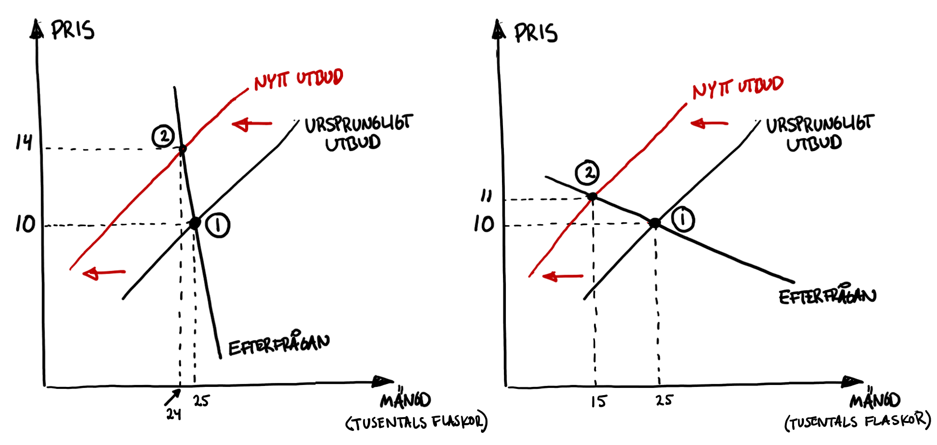
The starting point in both scenarios is point 1, where a bottle of olive oil costs €10 and Finns buy 25,000 bottles per day. Then the drought hits and dramatically reduces the Spanish harvest. Now almost only olive oil from Greece and Italy remains. At every price level less olive oil is therefore offered than before. We show this by drawing a new supply curve to the left of the original. The price rises until a new equilibrium is reached where buyers are again willing to buy exactly as much as sellers offer. Both graphs show that the price of olive oil rises and sales fall because of the drought in Spain, but they also highlight an important difference: in the left panel the price rises sharply while sales fall only a little. In the right panel we see the opposite: sales collapse while the price rises only slightly. Why does this happen?
The difference lies in the shape of demand. In the left panel the demand curve is steep, which means consumers are relatively insensitive to price changes: a higher price deters a few buyers, but most continue to buy. Consumers really want the olive oil, almost at any price. We say demand is inelastic with respect to price. The right panel shows a situation where customers are much more price sensitive (demand is elastic). Here a small price increase leads to a large drop in quantity demanded.
Mnemonic: When demand is insensitive (“inelastic”, Inelastic) to price, the demand curve looks like the letter I.
Which goods and services are price‑sensitive? A simple rule of thumb is that the degree of desperation matters. Here are some examples:

An example of a good where customers are likely insensitive to price is life‑saving cancer drugs for children. If your child is seriously ill, you are unlikely to cut back on medicines even if the pharmacy raises prices. Likewise, if you are responsible for tickets to the World Cup final you can probably raise prices sharply at the last minute without empty seats — if I’ve travelled all the way from Finland for this unique event, a price hike is unlikely to deter me.
By contrast, if you sell something customers can easily do without — for example because there are many similar alternatives — the good is more price‑elastic. It then becomes harder to raise prices without losing customers:
The degree of desperation can also depend on time. It is often harder to change your behaviour in the short run. If the price of petrol rises by 20%, you will probably still drive home from work today. But in the longer run you might consider buying a bicycle or moving closer to your workplace.
Can you think of other factors that affect the degree of desperation? For example, I personally care less about the price when I pay a restaurant bill with my employer’s card than when I use my own.
Measured elasticities
With data we can easily measure how sensitive customers are to price changes. Suppose you are the marketing manager at Prisma and observe the following: a price cut on strawberries from €3 to €2.70 increases sales from 40,000 punnets to 60,000, while a €0.30 price cut on ride‑on lawnmowers hardly affects sales. Does this mean customers are more price‑sensitive for strawberries than for lawnmowers? Not necessarily, because €0.30 is a much larger percentage change for an item that costs €3 than for one that costs €3,000.
To avoid this problem we instead look at percentage changes. We ask: what happens to demand in percent when price changes by 1 percent?
\[ \scriptsize{\text{Price elasticity of demand} = \frac{\text{Percentage change in quantity demanded}}{\text{Percentage change in price}} = \frac{\text{Change in quantity / Original quantity}}{\text{Change in price / Original price}}} \]
Let’s use this formula to calculate how price‑sensitive customers are for strawberries:
\[ \scriptsize{\text{Price elasticity of demand} = \frac{\text{Change in quantity / Original quantity}}{\text{Change in price / Original price}}=\frac{\text{+20000/40000}}{\text{-0.30/3}}=\frac{\text{+50%}}{\text{-10%}}}=-5 \]
When the price of strawberries was cut by 10% (from €3 to €2.70) the quantity demanded rose by 50% (from 40,000 to 60,000). This shows strawberry buyers are very price‑sensitive: the price change produced a change in demanded quantity five times as large. That means it’s easy to attract new customers by lowering the price, but also very easy to lose them when the price rises.
The table below shows the price elasticities for different products. Do these match the rule‑of‑thumb about desperation? What do you think?
| Product | Price elasticity of demand |
|---|---|
| Coca‑Cola | -3.80 |
| Economy‑class air travel | -2.00 |
| Cigarettes | -0.50 |
| Business‑class air travel | -0.35 |
| Petrol | -0.30 |
| Toilet paper | -0.20 |
| Life‑saving medicines | -0.10 |
| ‘Rice in China’ | +0.10 |
According to the table, a 1% price increase in Coca‑Cola reduces quantity demanded by 3.8%. This indicates customers are sensitive to Coke price increases, likely because there are many substitutes such as Pepsi, Fanta, Dr Pepper and Sprite.
The situation is different for petrol. The elasticity −0.30 shows petrol demand is inelastic: a 1% price rise reduces demand by only 0.30%. This tells us, for example, that higher petrol taxes are unlikely to cut driving very much, at least in the short run.
The table also shows an example of a Giffen good. For these goods the price elasticity of demand is positive: the higher the price, the more is bought! Giffen goods therefore violate the law of demand. Fortunately Giffen goods are extremely rare — people often say they only exist in introductory economics textbooks. To understand the mechanism imagine you are a poor rural worker in China. Life is hard. Six days a week your family eats rice, and on Saturday you treat yourselves to beef. Suddenly rice becomes more expensive, which hits your household because you consume so much rice. The sad result is that you can no longer afford beef on Saturdays and must eat rice even then. Higher rice prices thus lead you to buy more rice.
Giffen goods are goods for which you buy more when their price rises.
Just as you can analyse how demand responds to price changes, you can also examine how it reacts to changes in consumers’ incomes. The principle for calculating the income elasticity is the same:
\[ \scriptsize{\text{Income elasticity of demand} = \frac{\text{Percentage change in quantity demanded}}{\text{Percentage change in income}} = \frac{\text{Change in quantity / Original quantity}}{\text{Change in income / Original income}}} \]
The table below shows the income elasticity of demand for various goods and services:
| Product | Income elasticity of demand |
|---|---|
| Airline tickets | 5.82 |
| Luxury watches | 2.80 |
| Restaurant visits | 1.61 |
| Butter | 0.40 |
| Milk | 0.20 |
| Instant noodles | -0.35 |
Remember that these income elasticities show how the demanded quantity changes in percent when income rises by 1 percent. It is “normal” to want more of something when our incomes increase; goods with positive income elasticity are therefore called normal goods. These can be split into luxury goods, where income elasticity exceeds 1, and necessities, where it lies between 0 and 1. According to the table, restaurant visits are a luxury good and milk is a necessity. There are also goods with negative income elasticity, known as inferior goods. As the table shows, instant noodles are an example of an inferior good. You probably eat more instant noodles as a poor student than you will a few years from now when you earn €5,000 a month, right?
normal goods — we want more of these when our incomes rise
inferior goods — we want less of these when our incomes rise
Knowledge of these elasticities helps you predict market trends when the economy changes. For example, air travel is expected to increase sharply when Finns earn higher incomes, but to plunge in bad times. The airline industry is therefore cyclical. A plausible guess is that employment in the sector varies strongly over time, as does the price of airline stocks. By contrast, milk sales are less sensitive to economic swings: we buy only 0.2 percent less milk if our incomes fall by 1 percent. And the fact that instant noodles are an inferior good suggests that this sector may boom if the economy collapses.
Do you also want to know how demand for one product is affected when the price of another product changes? That is measured by the cross‑price elasticity:
\[ \scriptsize{\text{Cross‑price elasticity of demand} = \frac{\text{Percentage change in quantity demanded}}{\text{Percentage change in another price}} = \frac{\text{Change in quantity / Original quantity}}{\text{Change in other price / Original other price}}} \]
The table below presents examples of cross‑price elasticities:
| Good 1 | Good 2 | Cross‑price elasticity of demand |
|---|---|---|
| margarine | butter | 1.53 |
| pork | meat | 0.40 |
| lamb | meat | 0.28 |
| coal | oil | 0.70 |
| luxury | food | -0.72 |
| European cars | American cars | 0.76 |
| Asian cars | American cars | 0.61 |
| driving | bus travel | 0.07 |
Note, for example, that demand for margarine rises by 1.53% when the price of butter increases by 1%, indicating the goods are substitutes. That means the goods can easily be swapped for each other. If butter becomes more expensive you buy margarine instead. Other examples of substitutes are “Netflix and Viaplay”, “bicycle and bus pass” and “printed coursebook and e‑book”.
By contrast, leisure and restaurant meals appear to be complements: when restaurant food becomes 1% more expensive, demand for cinema visits falls by 0.72%. These activities often go together; if one becomes more expensive many people drop both. Other examples of complements are “coffee and coffee filters” and “gym membership and workout clothes”.
At the bottom of the table you can see that the relationship between bus travel and driving is weak, which means a reduction in bus fares is unlikely to affect driving much. Understanding these relationships can be crucial when designing policies such as environmental measures. Knowing which goods and services are substitutes or complements helps firms and policymakers predict how consumers will react to various policy actions or price changes.
3.3 The valuable market
Trade benefits both buyer and seller — otherwise they wouldn’t trade. Many of the world’s richest people, like Jeff Bezos and Mark Zuckerberg, built their fortunes by creating platforms where people can meet and cooperate. Amazon and Facebook are examples of such collaboration arenas. Today the marketplace Amazon is valued at about one trillion euros.
But how valuable is a specific market? Let’s try to value the market for strawberries at the Market Square in Turku. In the picture below I have illustrated the market:
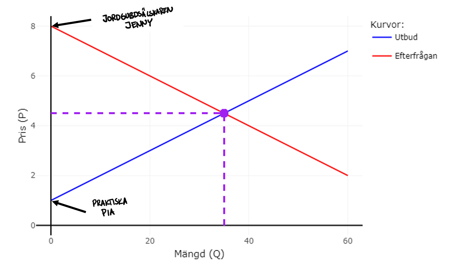
The market moves — as if guided by an invisible hand — to an equilibrium where 35 litres of strawberries are sold at €4.50 per litre. We now want a number that shows exactly how buyers benefit from this market. Look first at the demand curve. Imagine I say the following to all potential buyers:
“I’m going to call out prices. I’ll start at an extremely high price and then gradually lower the price toward €0. Raise your hand as soon as the price is low enough that you want to buy one litre of strawberries. Keep your hand up.”
Then I begin calling out prices. At €7,000 nobody bites, and likely not at €800 or €40 either. But when the price reaches €8 Jenny raises her hand. Jenny loves strawberries and is willing to pay a lot for them. As the price keeps falling, more hands go up. My guess is that most of you will have your hand raised when the price approaches €0.
How does Jenny benefit from buying strawberries at the market? We now know she values them at €8, but she only pays the market price €4.50. She therefore gets a “surplus” of €3.50; she goes home with a good she personally values €3.50 more than the price she actually had to pay. In the same way all other buyers are happy with their purchases because each of them would have been willing to pay more than they actually did. The sum of all these surpluses is called the consumer surplus (CS) and is represented by the upper triangle in the figure.
In a similar way trade benefits producers. Imagine I say this to the sellers:
“I will now call out prices. I’ll start at €0 and then gradually raise the price. Raise your hand as soon as the price is high enough that you want to sell one litre of strawberries.”
The first seller to raise her hand is Pia. She raises her hand already at €1. This is probably because Pia is an excellent strawberry grower. For some reason her strawberries thrive. Growing strawberries is a breeze for her! That means she is willing to sell already at €1.
How does Pia benefit from being able to sell at the market? Internally she was willing to sell the strawberries for €1 — but now she receives the market price €4.50. Pia therefore earns a surplus of €3.50. The sum of all sellers’ surpluses gives us a measure of how firms as a group benefit from being able to sell on the market. We call this producer surplus (PS) and it appears as the lower triangle in the figure.
We have just seen that markets create value for both buyers and sellers. It’s no wonder a global marketplace like Amazon has made its owner Jeff Bezos obscenely wealthy.
3.4 The efficient market
Proponents of the market economy often emphasise that the market is efficient. Saying a market is efficient means both production and allocation are “optimal”. Goods and services are produced in just the right quantities and by the firms that can produce them at the lowest cost. Moreover, they are purchased by the consumers who value them the most.
This is exactly the hard task you struggled with as head of the Unit for Production and Allocation! The market manages to succeed where you didn’t. But how is that possible? Let’s return to the strawberry market to understand what efficiency in production and allocation means in practice. You have seen the figure below before, but I have added one extra buyer and one extra seller.
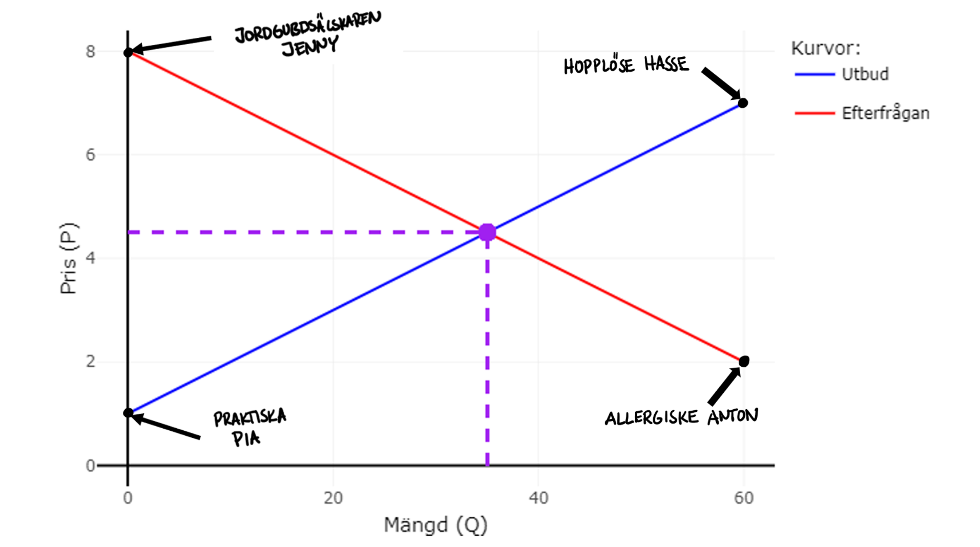
Customer Anton is allergic to strawberries. He also prefers blueberries to strawberries. He is therefore only willing to pay at most €2 for a litre of strawberries. Since the market price is €4.50 Jenny buys but Anton does not. In other words, only those who value strawberries at €4.50 or more trade.
Seller Hasse is a poor strawberry grower; he’s lazy and frankly uninterested in farming. He would rather work in media. That means he will only sell strawberries if he gets at least €7 per litre. At the market price of €4.50 Pia sells strawberries, but Hasse does not. So it seems the right people are selling in the market.
Finally, think about the equilibrium quantity 35 litres. Is 35 litres really “optimal”? Was it so wrong when you, as head of the UPA, decreed that the people of Turku should get 60 litres of strawberries? The quantity 60 litres would mean that even Anton, who values strawberries at only €2, would receive strawberries, and that Hasse, who needs €7 to produce them, would sell. Producing 60 litres is obviously insane. Why should we produce something that costs more to make than people actually value it?
Equally foolish would be to produce only 20 litres. The figure shows that there are strawberry lovers who would be willing to pay almost €6 for the 21st litre and capable growers who would be willing to sell for just over €3. Producing the 21st litre at a cost of a little over €3 and selling it to someone who values it at nearly €6 would be wise — which implies 20 litres is too little.
The lesson is that the market is right about WHAT should be produced, HOW it should be produced and FOR WHOM it should be produced. That is an extraordinary achievement. As UPA chief you usually chose the wrong quantities: too much toilet paper and too few haircuts. You also gave strawberries to allergy sufferers and forced hopeless Hasse out into the strawberry fields. What makes the market solve the production and allocation problem so much better than the UPA? The answer concerns the so‑called information problem. Let’s take ice cream as an example.

There are almost countless flavours: vanilla, chocolate, liquorice, pistachio, mango, blueberry, lemon and more. You know what you like and dislike; hazelnut is your favourite while Sea Salted Caramel makes you feel sick. But how are firms supposed to find out what you like? Should customers email and visit the CEO of Ben & Jerry’s in person? It’s impossible for 8 billion people to communicate their preferences to every ice‑cream maker. Preferences also change over time; what you loved last year may not appeal to you now.
The best way for firms to learn about consumers’ tastes is through purchasing behaviour. If many people, like you, love hazelnut ice cream, demand rises and pushes up the price for that flavour. The information about your preferences is transmitted as a strong signal — an invisible hand — to the ice‑cream producer. The high price makes it extra profitable to produce hazelnut ice cream, so more is produced. The result is that we get exactly the ice creams we prefer most.
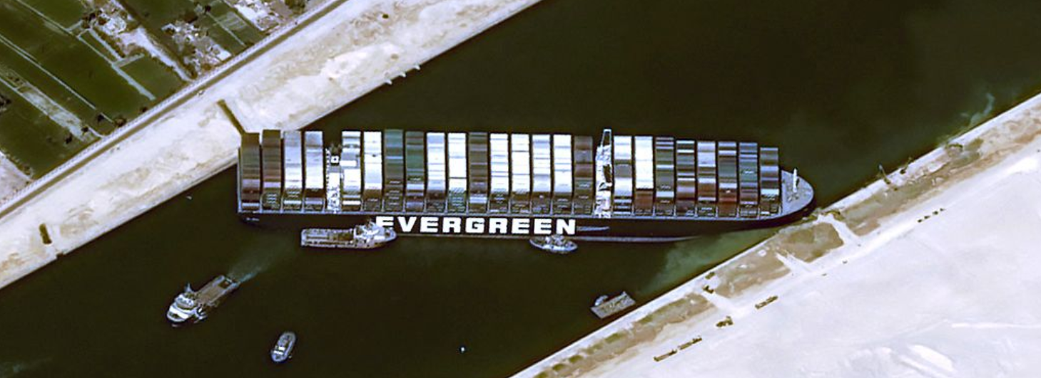
Example: Total stoppage in the Suez Canal. In March 2021 the container ship Evergreen ran aground in the Suez Canal. The consequences were dire. Among other things, the amount of coffee arriving in Finland was halved. For simplicity we can assume that only 50 packages arrive instead of 100. We will now consider how society can handle this shock, and how the response differs between a planned economy and a market economy. How should we allocate the coffee among all those who want it?
Planned economy. The Unit for Production and Allocation (UPA) must decide which Finns will receive the 50 coffee packages. The authority therefore tries to find out how much each person likes coffee. Collecting all this information is an enormous task. People also have an incentive to lie: if you say you love coffee your chances of getting a package increase. The risk that the coffee ends up with the wrong people is high.
Market economy. Here market forces determine who gets to drink coffee. A reduced coffee supply leads to a higher coffee price. The higher price makes many cut back on their coffee consumption. Some switch to tea. Probably only the biggest coffee lovers find it worthwhile to buy coffee at the new higher price. Each individual decides for themselves whether to buy coffee. Each of us already knows what we truly prefer and what alternatives exist. No UPA is needed to analyse what happens to the coffee supply. We don’t need to know why there is suddenly less coffee in Finland — whether it’s because of the pandemic, a civil war in Colombia, a freeze on the plantations or a careless captain blocking the Suez Canal. All that matters is that the price has risen.
Milton Friedman, Nobel laureate in economics (1976), explains in 2 minutes why the market economy succeeds where the planned economy fails.
3.5 The ruthless market
“You’re right, the market may solve the information problem and produce what we want — but think of all those who get so little!” the skeptic objects.
Absolutely true! The image below illustrates that production and allocation in the market can be experienced as unfair. My friend Gustav earned 45 million kronor last year and ÅA alumnus Peter Sarlin sold his company Silo AI to US firm AMD for €614 million in 2024. At the same time, 9 percent of the world’s population is undernourished.

On the market you are rewarded according to how productive you are and how much others value what you produce. A stallholder with a great harvest becomes wealthier than one whose crops largely failed — and a seller of popular goods can charge more than someone offering things few people want.

The market is therefore often efficient but also creates income inequality. But how large are income gaps in society — and are they growing or shrinking over time? As always we want to avoid vague opinion and instead show a number that describes society. One of the most common measures of income inequality is the so‑called Gini coefficient. The measure runs from 0 to 1, where 0 means there is no income inequality at all and 1 means inequality cannot be any greater than it is now.
Gini coefficient is used to compare income distribution across people and households; the higher the value, the greater the inequality
The map shows each country’s Gini coefficient. In which parts of the world are inequalities currently largest and smallest? If you press the PLAY button you can see how inequality has changed over the period 1963–2025. Explore the inequalities on your own for a minute.
But why do some earn so much and others so little? We will find out in the next chapter.
Exercises
In this chapter you learned a bit more market analysis. Here you can practise the techniques. Press Show Answers when you want the computer to grade your responses. Good luck!
Preseason training I: Solving an equation
We begin with useful, if slightly dull, basic training. Messi didn’t win the World Cup by sleeping and drinking beer — and the same applies to you in your university studies. Work through the following exercises. This quantity training will make you strong. Then you won’t have to think so much about technique and can focus on reasoning instead. If you’re unsure, use the app you used to analyse the burger market. Practice until you can do all the exercises without peeking at the answers. Then you’re ready to move on to more applied problems. Good luck!

An equation is an equality: what is written to the left of the = sign is always equal to what is written to the right. For example: \(\small 10 + 5 = 15\). You can think of an equation as a balanced scale.
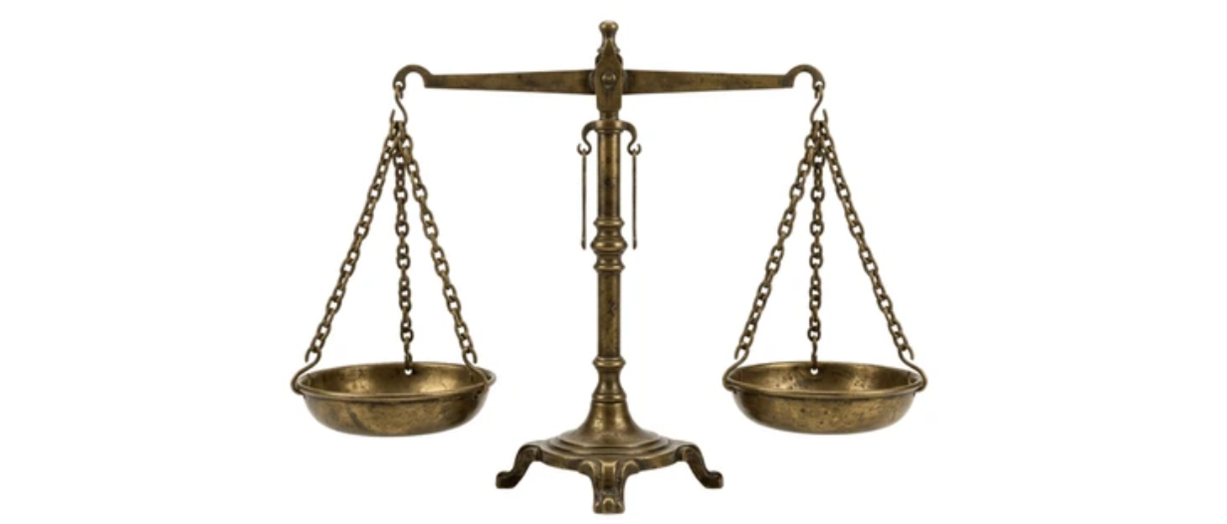
It’s perfectly fine to add or remove something on one side — but only if you make exactly the same change on the other side. That preserves the equality. If you add 1 to both sides of the equation above you get: \(\small 10+5+1=15+1\), and the equality still holds.
Often an equation contains an unknown term. Your task is then to find which number the unknown must be so that the left side equals the right side. The unknown is often written as the letter \(\small X\), for example: \(\small 10+X=15\).
In some simple cases you can see at once what X must be; in \(\small 10+X=15\) you surely recognise that X must be 5 for the left side to equal the right. Usually it’s not obvious by inspection. The trick is to perform the same operation on both sides until X stands alone. For \(\small 10+X=15\) you subtract 10 from both sides: \(\small 10+X-10=15-10\), which gives \(\small X=5\). You have now solved the equation — that is, found the value of X that balances the two sides. To be extra sure, plug your answer back into the original equation to check the scale is really balanced: \(\small 10+5=15\).
- What is X in the equation \(\small 10+X=15\)? Answer:
- What is X in the equation \(\small X-7=13\)? Answer:
- What is X in the equation \(\small 4X=28\)? Answer:
- What is X in the equation \(\small \dfrac{X}{5}=6\)? Answer:
- What is X in the equation \(\small 3X+4=2X+19\)? Answer:
- What is Y in the equation \(\small 4Y+3=2Y+11\)? Answer:
- The inverse demand is given by \(\small P_D=100-0.1Q\). The intercept in this expression is and the slope is .
- You know the following: \(\small P_S=10+4Q\) and \(\small P_D=100-2Q\). The quantity traded in the market will be and the price will be .
- How much is traded if \(\small P_S=10+0,5Q\) and \(\small P_D=200-0,5Q\)?
- How much is traded if \(\small P_S=10+0,5Q\) and \(\small P_D=300-0,5Q\)? Answer:
- How much is traded if \(\small Q_S=-20+2P\) and \(\small Q_D=400-2P\)? Answer:
- How much is traded if \(\small Q_S=-20+2P\) and \(\small Q_D=600-2P\)? Answer:
- What is the market price if \(\small P_S=50+0,1Q\) and \(\small P_D=180-0,3Q\)? Answer:
- You are given: \(\small P_S=10+0,5Q\) and \(\small Q_D=400-2P\). The equilibrium price is:
- In summer new potatoes are sold at the Market Square in Turku. Demand and supply (kg per day) can be described as \(\small Q_D=1200-150P\) and \(\small Q_S=-100+50P\), where P is the price per kg in euros. The market price per kilo will therefore be euros per kilo, the traded quantity is kilos per day and the consumer surplus is euros.
- The market for online tutoring is growing. Suppose demand is \(\small Q_D=3500-50P\) and supply is \(\small Q_S=-250+25P\), where P is the hourly price in euros and Q is the number of tutoring hours. One hour of tutoring will cost euros, lessons will be bought and producer surplus will be euros.
These exercises are purely practice. Train until you feel confident. You can also use the app earlier in the chapter and watch my two recorded videos if you like. Remember to draw the solution — it usually makes things much easier and reduces the risk of mistakes.
The trick is to set \(\small Q_D=Q_S\) and find the price that makes them equal. If you have the equations in inverse form you can first rearrange them and then set \(\small Q_D=Q_S\) — or you can set \(\small P_D=P_S\) and find the quantity at which consumers are willing to pay the same price sellers require. What you must NOT do is equate, for example, \(\small Q_D=P_S\) — that would mean the quantity consumers want equals the price sellers demand (which makes no sense).
When you calculate consumer surplus and producer surplus remember to compute the area of a triangle: base times height divided by 2. Contact me if you need help.
Preseason training II: Drawing a graph
In this exercise you will practise drawing correct supply‑and‑demand diagrams.
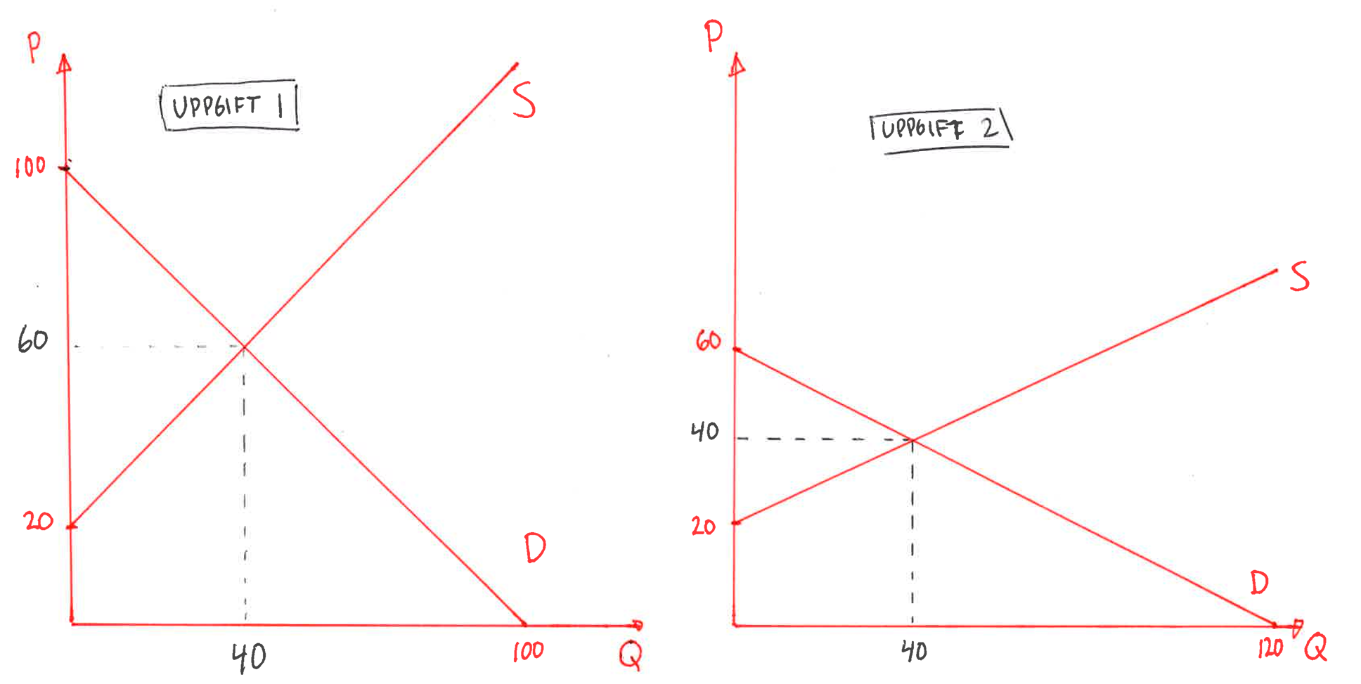
- Demand on a market is given by \(\small Q_D=100-P\) and supply by \(\small Q_S=P-20\). Plot both lines in the same graph and mark the equilibrium. Remember to label the axes and each curve clearly. The equilibrium price is and the quantity traded is .
- Demand on a market is given by \(\small Q_D=120-2P\) and supply by \(\small Q_S=2P-40\). Illustrate the relationships in a neat graph. The equilibrium price is and the quantity traded is .
Trading at the Dow Jones Bar in Barcelona
Last year’s course participant Iris visited the Dow Jones Bar in Barcelona. What’s special about the Dow Jones Bar is that they let supply and demand determine prices in real time. How much a beer or a mixed drink costs is therefore decided by the market forces at that very moment.
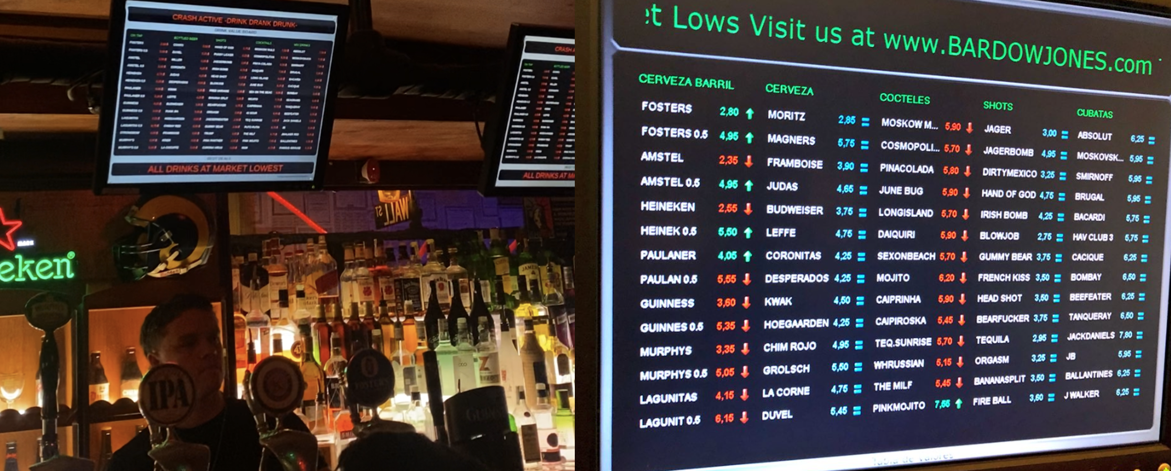
- When Iris took the photos above a Fosters cost €2.80. Sketch a supply‑and‑demand diagram for Fosters and explain in your own words why the price ended up at €2.80.
- Give three examples of things that could suddenly increase demand for Fosters beer.
- Give three examples of things that could suddenly decrease the supply of Fosters beer.
- The most expensive drink was the Pink Mojito, which at that moment cost €7.55. Why was this particular drink so expensive? Give possible explanations based on both demand and supply.
- Be precise with the diagram. Clearly label the axes and which curve is which. One way to see why the price ended up at €2.80 is to ask: what would happen if the price were, say, €4 or €2?
- What kinds of shocks would shift the demand curve to the right so that we want to buy more Fosters at any given price? For example: pay raises, the beer being perceived as tastier, warmer weather, or the start of the World Cup.
- What kinds of shocks would shift the supply curve to the left so that firms want to offer less Fosters at any given price? For example: higher input costs for brewing, tougher business regulation, distribution disruptions, or a strike at the brewery.
- Pink Mojito being so expensive must be due to high demand and limited supply. Give concrete examples of factors causing this: e.g. sudden popularity among customers that evening (celebrity, trend), a scarce special ingredient (limited‑stock syrup or fresh fruit), few bartenders able to make it (long queues), or supply bottlenecks for the drink’s components.
Taylor Swift is coming to town
During the weekend 17–19 May 2024 Taylor Swift performed three shows in Stockholm. You will now analyse how this affected hotel prices in Stockholm over that weekend.

- Draw how you think the supply and demand curves for hotels in Stockholm look on a typical weekend in May, i.e. when Taylor Swift is not performing in Stockholm. Which curve do you think is steeper — and why?
- Now add to the same diagram what happens when Taylor Swift comes to Stockholm. Which curve shifts?
- According to your analysis, what happens to the price?
- My guess is that the supply curve is steep: on any given weekend there is a fixed number of hotel rooms in Stockholm and it’s hard for hotels to adjust capacity quickly. Hotel supply is therefore fairly inelastic. Demand is likely more elastic: if prices rise sharply people may forgo the hotel night and instead stay with friends, use a hostel, or skip the overnight stay.
- Taylor Swift causes about 120,000 Swedes to travel to Stockholm for the weekend, which will likely increase demand for hotel nights. The demand curve shifts to the right.
- The effect, according to my analysis, is that hotel nights become more expensive. You can read what actually happened to Stockholm hotel prices during the Taylor Swift weekend here.
Wendy’s in trouble
The same day Wendy’s launched dynamic pricing, all hell broke loose. On the evening news customers angrily complained that supply and demand would determine the price of burgers. Here is the segment from ABC’s broadcast:
- Customers protested that Wendy’s burger prices would be set by supply and demand. What would you personally think of such a system?
- In Japan there are vending machines that vary the price with the temperature: a Coca‑Cola can cost €15 at 40°C and be almost free in heavy rain. The organisers of the 2026 FIFA World Cup used the same type of dynamic pricing, where prices fluctuate with demand and supply. Do you think this pricing system is ethical?
- Write down, for yourself, what it means for a market to be efficient.
- Suppose you run a burger restaurant. Why is it important for you to know customers’ price elasticity for your products?
- Why is it important for you as an entrepreneur to know customers’ income elasticity for your products?
- This is a normative question — there’s no right or wrong. Reflect for yourself on why this kind of dynamic pricing triggers such strong emotions.
- See answer to question 1.
- No way to make someone better off without making someone else worse off; there are no unexploited opportunities left. Watch the Milton Friedman clip in Section 3.4 for deeper insight.
- Knowing the price elasticity tells you how customers will react if you change your prices.
- Knowing the income elasticity tells you how your customers will react if they suddenly become poorer or richer.
How to combat drugs?
The synthetic opioid fentanyl — about 50 times stronger than heroin — has become a huge problem in the United States. The drug is extremely addictive and is sometimes called a “zombie drug.” Drug producers, however, are considerably more price‑sensitive: if the price of fentanyl falls slightly it is likely that many producers will switch to manufacturing other drugs or to other types of crime.
- Draw, on paper, the supply and demand curves for fentanyl. Mark the equilibrium price and quantity.
- One way to combat drugs is to crack down on trafficking networks. What happens to the price of fentanyl if authorities target suppliers?
- Will the value of the fentanyl market increase or decrease when authorities crack down on suppliers? Show this clearly in your diagram.
- Another approach is to target the demand side. Suppose authorities succeed in preventing many young people from trying drugs. What happens to the price of fentanyl if fewer young people choose to buy it?
- Will the value of the fentanyl market increase or decrease when demand falls? Show this clearly in your diagram.
- Draw a very steep demand curve and a much flatter supply curve.
- Attacking producers shifts the supply curve left. The effect is that the price rises sharply while the quantity of fentanyl falls only a little.
- This can lead to the total money value of the drug trade rising. For example, suppose the initial price was \(1\) and 100 units were sold, so \(100\) changed hands. In the new equilibrium the price might be \(3\) and quantity fall to 95 units. The value traded would then be $285.
- If you instead fight the drug problem via the demand side, this leads to a lower price and less trading (assuming you succeed in reducing the number who want drugs).
- The value of the drug trade falls, according to theory. To know what actually happens you must, of course, go out and collect data on the drug market.
You start your own business in 2029
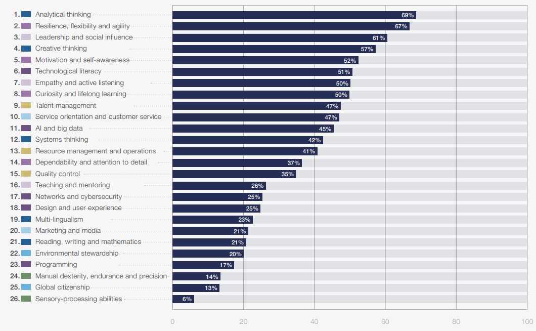
In 2029 you run your own company in your dream industry. The table below also shows which skills are currently the most important to have on the labour market, at least according to the report Future of Jobs 2025.
- What product or service would you sell if you ran your own dream business?
- All markets face shocks. Give a clear example for your market of: i) a positive demand shock, ii) a negative demand shock, iii) a positive supply shock, iv) a negative supply shock.
- If you raise your product’s price by 10% the quantity demanded falls from 100 to 80. The price elasticity of demand is therefore , which means demand is .
- If consumers’ income rises from €2,000 to €2,400 and demand for your product increases by 10%, the income elasticity of demand is therefore , which means your product is .
- Why is it important to know both the price elasticity and the income elasticity of demand?
- Give an example of a complement and of a substitute for your product.
- If the price of another good rises by 1% and the quantity demanded of your product rises by 2%, the cross‑price elasticity is therefore , which means the goods are .
- On the market the consumer surplus is €56 million. What does that mean in plain language?
- On the market the producer surplus is €32 million. What does that mean in plain language?
- Do you think the law of demand holds in your market? Motivate!
- Example: Sofie wants to become a Personal Trainer focusing on health for over‑stressed students.
- Positive demand shock: higher student grants. Negative demand shock: falling interest in health. Positive supply shock: new technology makes online coaching possible. Negative supply shock: increased bureaucracy for self‑employed PTs.
- Remember how to calculate percentages: change divided by the original, then ×100. If participants increase from 240 to 264 that is a 10% increase (change +24 over base 240).
- Calculate the percentage change in demand and in income.
- Price elasticity tells Sofie how customers will react if she changes her price; income elasticity tells her how customers will react when their incomes change. Both clearly help Sofie run her business.
- Complements for PT services are items used with PT services, e.g. towels and shampoo. Substitutes are things done instead of PT, e.g. a training book or group fitness classes.
- Think about what this implies; perhaps give an example of two products with that relationship.
- Remember consumer surplus should be expressed in money. Think of the demand curve when interpreting the number: it’s the total amount by which buyers valued the goods more than what they actually paid (summed across all buyers, in euros). Buyers left the market with goods they valued €56 million more than the price they paid.
- Think of the supply curve: it’s the total extra amount sellers received above the minimum they would have accepted (summed across all sellers, in euros). Sellers left the market with €32 million more than the minimum they would have accepted.
- The law of demand almost always holds (hence the term “law”). It means the demand curve slopes downward: more is bought when price falls. It likely applies to PT services as well.
Trade in used coursebooks
You start an online marketplace where students can buy and sell used coursebooks. Your business idea is that older students can resell their coursebooks to younger students. Demand is given by \(\small Q_D=7000 - 100P\) and supply by \(\small Q_S=50P - 500\), where Q is the number of books and P is the price in euros. For simplicity we assume all books sell at the same price.

- Illustrate the solution with pen and paper. Remember to clearly label the axes and what each curve represents.
- If the price were €30, buyers would want to purchase books while sellers would want to sell books, and this excess demand would push the price upward.
- If the market price were €54, buyers would want to purchase books while sellers would want to sell books, and this excess supply would push the price downward.
- How many books will be traded in equilibrium? Answer:
- What does a used coursebook cost in equilibrium? Answer:
- What is the consumer surplus? Answer:
- What is the producer surplus? Answer:
- Use the app to check the correct answer. To use the app you must first invert the expressions. \(\small Q_D=7000-100P\) can be rewritten as \(\small P_D=70-0.01Q\). So the demand curve’s intercept is 70 and its slope is −0.01. Similarly \(\small Q_S=50P-500\) can be rewritten as \(\small P_S=10+0.02Q\). So the supply curve’s intercept is 10 and its slope is 0.02.
- This exercise is the trick to understanding why a market is drawn to a particular price.
- This exercise is the trick to understanding why a market is drawn to a particular price.
- Find the price that makes consumers want to buy exactly as much as sellers want to sell. Then check how many books consumers want to buy at that price (or equivalently how many sellers want to sell).
- What characterises the equilibrium? That consumers want to buy exactly as much as sellers want to sell. Which price produces this balance?
- Remember that consumer surplus is the upper triangle in the figure. To calculate the area of that triangle you need to know how many units are traded, the market price, and the choke price at which nobody wants to buy. Can you work that out?
- Remember that producer surplus is the lower triangle in the figure. To calculate the area of that triangle you need to know how many units are traded, the market price, and the reservation price at which nobody is willing to sell. Can you work that out?
What happens to income inequality?
In the market you are rewarded according to how productive you are and how much others value what you produce. The market can therefore lead to large income inequalities. The map below shows the GINI coefficient for every country in the world. If you like, you can switch the view to Table or click an individual country to see its development over time.
- The country with the largest income inequality in 2025 was and the country with the smallest inequality was .
- The country where income inequality has increased the most since 1989 (in percent) is .
- The country where inequality has decreased the most since 2013 (in percent) is
- Explain in simple terms how the GINI coefficient is calculated.
- I think income inequality in Finland should be .
- Can you also find Finland in the data? How do our inequality levels compare with the rest of the world?
- Check the time axis in the chart and make sure you have set the period from 1989 onwards. Remember to look at the relative change, i.e. in percent.
- Check the time axis in the chart and make sure you have set the period from 2013 onwards. Remember to look at the relative change, i.e. in percent.
- In the lecture I show how to calculate the GINI. In chapter 11 there is an app that helps you understand the GINI measure (link här).
- Remember this is a normative question — there is no objectively “right” answer.