11 Poor and Rich
(where you learn how to compare prosperity across countries and over time)
As a macroeconomist you deal with the big, overarching questions. While the microeconomist focuses on specific markets — like strawberry trading at the market square or the price development of an iPad — the macroeconomist analyses the entire economy. But how can we actually describe a country’s economic situation?
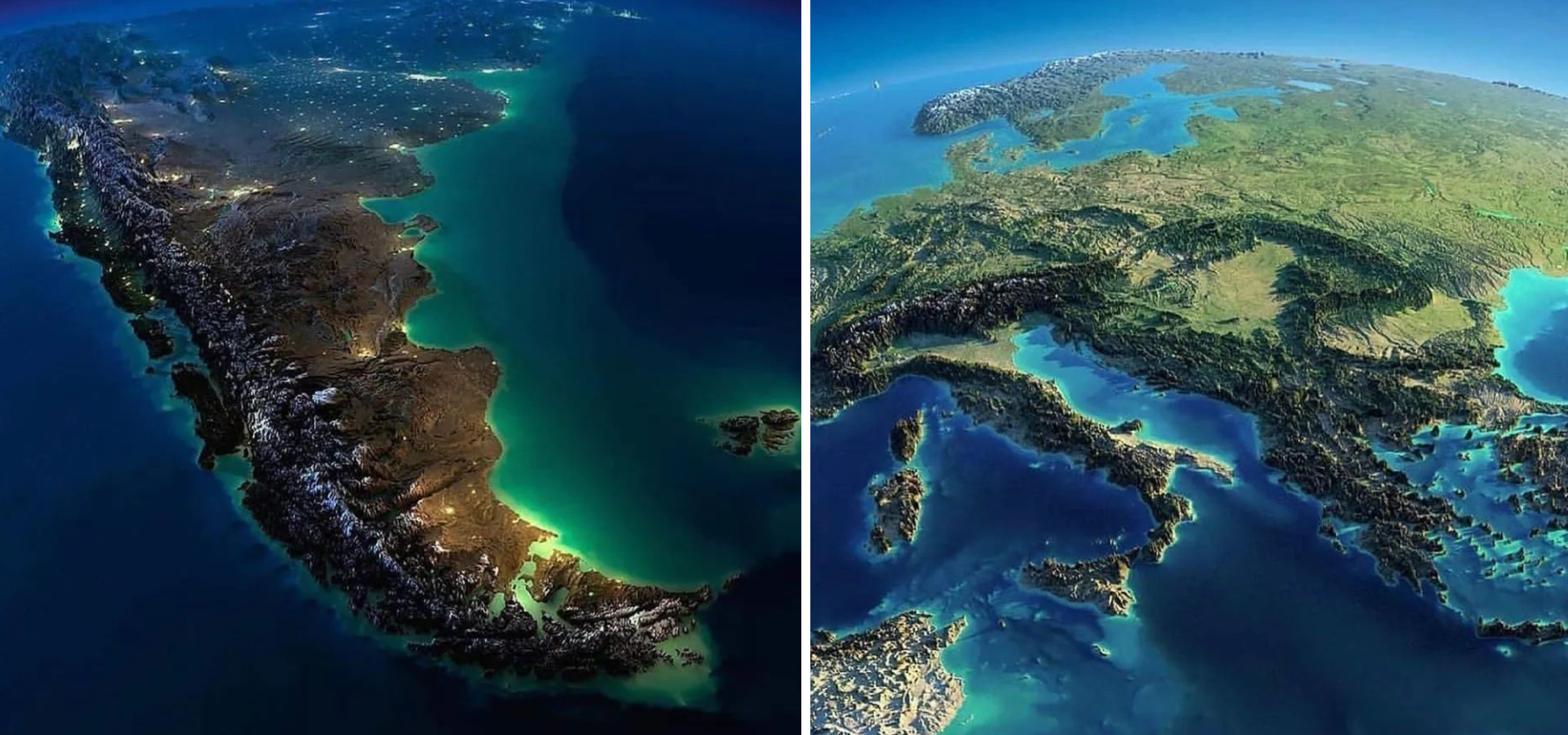
How, for example, is the Finnish economy doing? Does the average Finn enjoy a higher standard of living today than when you were born — and how do we compare with Sweden, Greece and Argentina? Fortunately there is a well‑established measure for assessing a country’s standard of living, namely gross national product (GNP). In this chapter you will learn how to measure and use GNP to see how our economy has developed over time and to compare our standard of living with that of other countries.
11.1 Gross domestic product
You will soon discover that GDP, roughly speaking, shows the value of a country’s total production. Obviously GDP is much larger in countries with many people; 1.4 billion Chinese can of course produce more than the mere 800 people who live in the Vatican. To compare countries more meaningfully we therefore almost always use GDP per capita instead, which is simply GDP divided by the number of people.
GDP per capita means GDP per person. You get GDP per capita by dividing GDP by the number of people who live in the country.
But you might think that goods and services aren’t necessarily the meaning of life, and that’s of course true. Still, it turns out that GDP is closely linked to many other things most of us regard as “a good life”. High GDP, for example, correlates with a long life. Look at the following fascinating figure:
Here you see the world in 2025. Each dot is a country, and the dot size reflects the country’s population. If you hover over the dots with your mouse you can see the country names. Now look first at the horizontal axis. This shows the country’s GDP per capita. As you can see, the differences between countries are huge: in Singapore (far right) average income per person was USD 139,000 while the corresponding figure in South Sudan (far left) was only USD 716.
Now instead look at the vertical axis, which shows life expectancy in each country. Here too there are large differences. In the Central African Republic (bottom) life expectancy was only 55.5 years, whereas people in Singapore (top) were expected to live almost 86 years.
Finally, note the clear positive relationship between GDP per capita and life expectancy: in countries with high GDP per capita people generally live much longer than in countries with low GDP figures. If you press PLAY the computer will show the development for the period 1800–2025. In most countries GDP and life expectancy have tended to move hand in hand. Play with the figure for a minute. Can you, for example, find Finland and follow its development through history? [Tip: Click “Find” and choose “Finland”. Then press “Trails”.]
But high GDP seems not only to correlate with a long life — it also correlates with a good life. The following image shows what everyday life looks like in countries at different GDP levels:
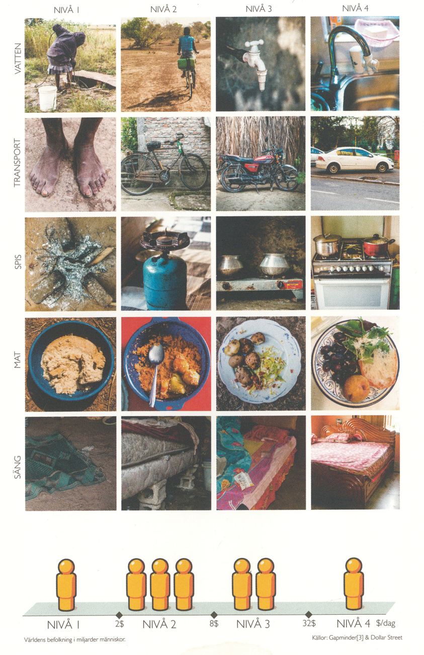
At the far left of the figure above you see the typical living conditions for the billion people who live in countries where GDP per capita is less than USD 2 per day. At the far right you see, correspondingly, the situation for the billion who live in countries where GDP per capita (per day) is greater than USD 32. Most people would agree that life is easier and better at GDP level 4 than at GDP level 1. If you want to see even more about how living conditions look across countries and income levels, click here. But how is GDP measured? That’s what we’ll learn now.
Measuring GDP
In 2024 Finland’s gross domestic product (GDP) amounted to EUR 276 billion (source). But what does this figure actually mean? Calculating GDP can be a bit complicated in practice, but the basic idea is simple. In the figure below I have drawn the economy’s circular flow:
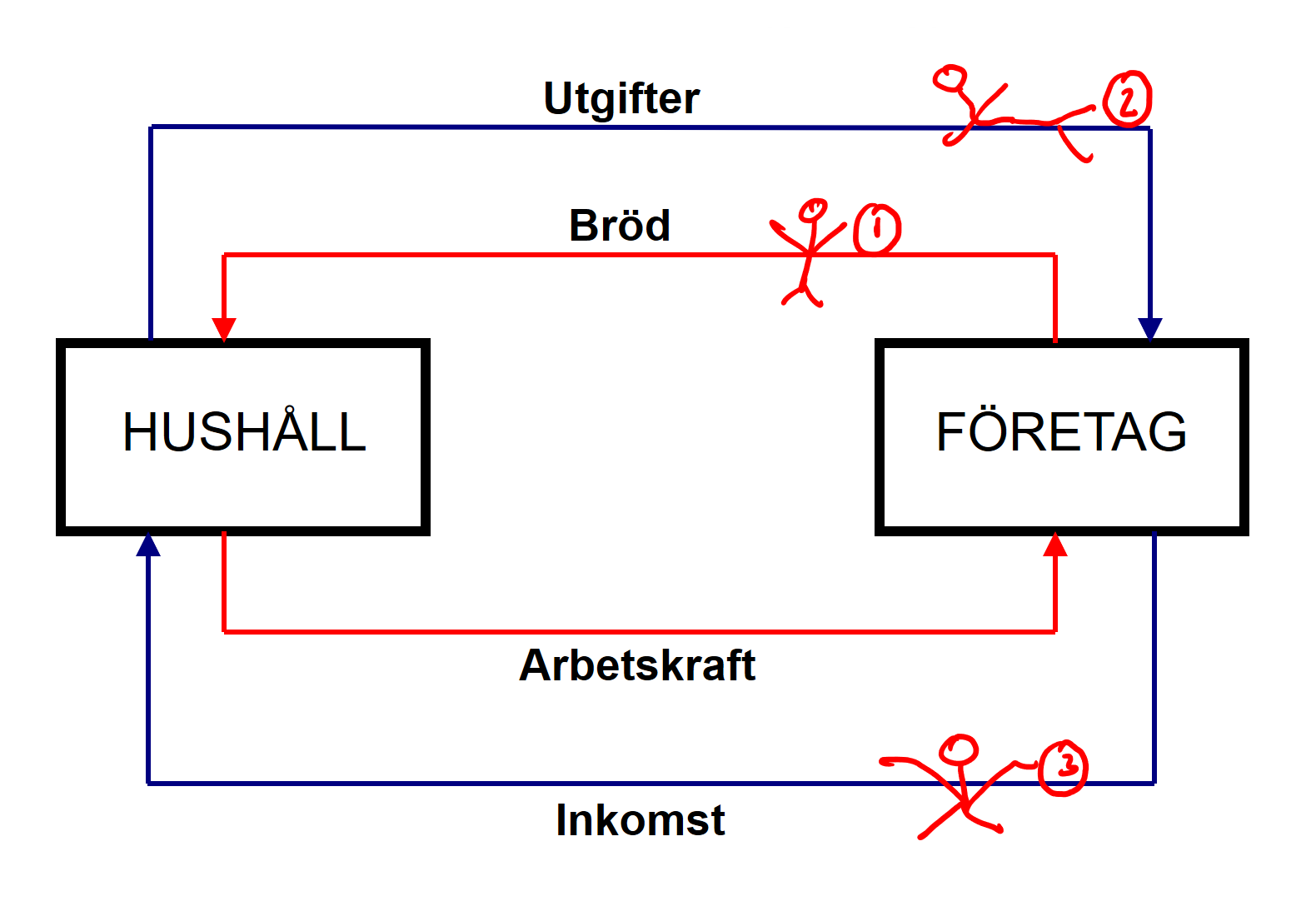
This figure gives you a first feel for how the economy works. To understand the GDP measure, imagine this country produces only bread and the only input used in production is labour.
The red arrows show how resources and goods move within the country. Take the lower red arrow, for example: it shows workers leaving their homes to work in the firms where they make the bread. The upper red arrow illustrates how the bread is transported from the firms to the households.
The blue arrows instead show how money flows through the economy. Workers go to work because they receive wages, which in the figure means firms send incomes back to households in return for their labour. At the same time the bread flows from firms to households — but not out of charity, because households pay for the bread. Hence expenditures flow from households to firms.
Now suppose you are tasked with measuring how much is produced in this economy during one year. How would you proceed? One way would be to stand at point 1 in Figure 11.2 and count the amount of bread sent from firms to households. But because there are many different types of bread that would quickly become a long and complicated list. A more efficient method would be to calculate the value of all the bread produced during the year. That is GDP!
If instead you look at point 2, where your friend sits measuring how much households pay firms for all the bread they buy during the year, they should obtain exactly the same figure as you. The value of all bread production must by definition equal households’ expenditures on bread. At point 3 another friend has set out to measure all incomes in the economy during a year. She should also get the same GDP figure. Firms are not black holes where money disappears; someone always receives the money that enters a firm.
Hopefully this simple version of the economy’s circular flow has given you an intuitive understanding of what GDP is. The key insight is that there are three alternative ways to calculate GDP, and all three methods yield identical results. That Finland’s GDP was EUR 276 billion therefore means that the market value of all final goods and services produced in Finland was EUR 276 billion. The figure also indicates that total incomes in Finland were EUR 276 billion, and that total expenditures in Finland were EUR 276 billion.
gross domestic product (GDP) is the market value of all final goods and services produced within a country during one year; GDP per capita is GDP divided by the population; there are three ways to calculate GDP — production, expenditure or income — and they all give the same result
Limitations of the GDP measure?
Is EUR 276 billion a fair picture of Finland’s standard of living? To understand what the GDP measure captures and what it misses, it’s worth spending a few minutes analysing the measure in detail. Let us therefore, step by step, look at the different colours in the definition market value of all final goods and services produced within a country in one year. What does all this mean in practice?
“Market value…” To understand the problems with the GDP measure, imagine standing in the circular flow and counting the value of the loaves passing by. What happens, for example, if everyone bakes their own bread at home or if the bread is traded on the black market? In such cases the GDP figure would underestimate actual production. GDP does not capture activities such as baking your own bread, doing carpentry on the summer cottage, cutting grandad’s hair or babysitting off the books. GDP measures only the value of production that takes place on (legal) markets.
Another limitation of GDP is that it can sometimes be hard to measure the value of what is produced. When you calculated the value of the bread in the circular flow, you did so by multiplying the number of loaves by the price of a loaf in the shop. But consider, for example, a lecture in this course. That is also a service produced — but because you do not pay for it directly it is hard to say what it is worth. In practice my hourly wage is therefore used as a proxy for the lecture’s value. Likewise it is difficult to know the value of what police officers and nurses contribute — and all the others who provide services without a clear price tag.
It is also worth noting that GDP says nothing about the distribution of income. Is GDP distributed equally, or does every cent go to a single person while the rest of the population starves? The GDP figure tells us nothing about that.
“…of all…” In reality, of course, not only bread is produced but thousands of different goods and services. All production should be counted: bread, strawberries, snus, toilet paper, haircuts, cancer medicines, lighthouses and so on. In other words, the GDP measure says nothing about WHAT we produce. In our simple model it was bread, but it could just as well be chemical weapons, paediatric cancer drugs or elderly care. In the figure below you can see what GDP in Finland consisted of over the period 1976–2024.
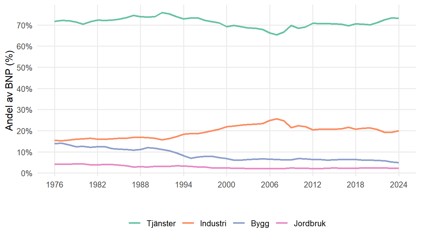
As you can see, today GDP consists of just over 70 per cent services while goods make up less than 30 per cent. Over the past 50 years the split between services and goods has been fairly stable, but if you were to pull up the corresponding figures for 1900–1976 you would quickly see that the goods’ share of GDP was considerably larger then (especially agriculture in the early part of the century and industry in the mid‑century). During the 20th century Finland thus first transformed from an agricultural society to an industrial society, and thereafter from an industrial society to a service society.
“…final goods and services…” Why only final? Imagine the following scenario: your sister is a wheat farmer, your brother runs a mill and you own a bakery — and now we are going to add up the value of what you produce. Let us pretend your sister produces wheat out of thin air and sells it for EUR 1,000 to the mill, where your brother grinds the wheat into flour and sells it to you for EUR 5,000, and you use the flour to bake loaves that you sell for EUR 15,000. How much have you actually produced? Would EUR 21,000 be a sensible figure for your contribution to the world? The answer is no — but do you see why?
The problem with simply adding up the wheat, the flour and the bread is that the wheat and the flour would then be counted several times. Part of the flour sold for EUR 5,000 contains the wheat worth EUR 1,000, and we have already counted that. Your brother has in fact bought wheat for EUR 1,000 and processed it into flour worth EUR 5,000. His own contribution to the economy — his value added — is therefore only EUR 4,000. Similarly you have taken something worth EUR 5,000 and turned it into something worth EUR 15,000. Your value added is thus EUR 10,000. A more correct measure of your total contribution to the economy is therefore to sum your value added figures: EUR 1,000 from the farmer, EUR 4,000 from the miller and EUR 10,000 from the bakery. The total is EUR 15,000. Note that the sum of all value added is always exactly equal to the value obtained by counting only the final goods and services (the bread in our example).
“…produced…” GDP shows only what was produced during the year. If you buy a new jumper it is included in GDP, but if you buy a second‑hand jumper it is not (because it was included in GDP in the year the jumper was originally produced).
Also note that GDP tells us nothing about HOW production was carried out. In the circular flow we saw workers entering the firms, but we never saw what happened inside. Were they forced to slave away 14 hours a day in a horrible work environment, or did they enjoy their jobs and have plenty of leisure time? We cannot determine that from the GDP figure either.
“…within a country…” GDP includes all production that takes place within the country. Everything produced in Finland, even by foreign companies, is included in Finland’s GDP. If, for example, Volvo has a factory producing car parts in Finland, that production is counted in Finland’s GDP.
“…in one year…” GDP is usually reported per year. GDP is often also measured quarterly to give a more up‑to‑date picture of the economic situation. Remember that GDP shows what happened during the year. Hence GDP gives no information about what happened to a country in previous years, which can affect, for example, your wealth.
Are all these measurement issues so serious that GDP becomes meaningless? One consolation is that we are most often interested in how GDP changes over time. When we look at changes, many of the measurement problems magically fade away. Here is an analogy that may help you understand why: you are standing at the front of the lecture theatre looking out over the sea of students. Unfortunately you forgot your glasses at home, so you can only see those sitting in the front rows.

In spring 2026 there are 200 students present, but your sight problem makes you think there are 100. Last year only 100 people came to the lecture theatre. Because you’re half‑blind without your glasses you, as usual, only perceived half, i.e. 50.
Do you see the analogy? At a single point in time the sight error makes you drastically misjudge the number of students — just as the measurement problems with GDP give you a very misleading picture of how rich a country is. But now analyse the change over time. With perfect glasses you would have said the number of students in the hall has doubled, from 100 to 200. Even without glasses you would say it has doubled. Provided you make the same kind of error every time the result is therefore still correct when you talk about changes. In the same way we can draw reliable conclusions about economic growth — how GDP changes from one year to the next — even if the measurement of GDP is far from perfect.
Alternatives to GDP?
All countries in the world calculate GDP in the same way. It is useful to have a comparable measure, but we now also know that GDP has many shortcomings as a welfare metric. Fortunately there are several alternatives you can use. Here we mention three variants of the GDP measure: GNI, NNP and disposable income.
GNI. What happens, for example, if you live in Tornio in Finland but work in Haparanda in Sweden? Your contribution to production would then be counted in Sweden’s GDP. But Swedes may prefer a measure that shows how the residents of Sweden are doing — and you go home to Tornio in the evening. You can therefore subtract your income from Sweden’s GDP. Likewise you can add the income of Haparanda residents who work in Tornio. The result is gross national income (GNI).
For most countries GNI is roughly the same size as GDP; most people work in their own country after all. A couple of countries, however, show larger gaps between GDP and GNI. Luxembourg and Ireland stand out. GNI is substantially lower than GDP in Luxembourg mainly because many cross‑border commuters work in Luxembourg but live elsewhere. Ireland’s case is driven by multinational firms that have located headquarters there for tax reasons, meaning much of the profits are ultimately paid to people in other countries.
NNP. Gross means “before deductions” and net means “after deductions”. GDP therefore captures the value of production before deductions. Imagine you run a farm that produced milk, meat and wheat worth EUR 1,000. Unfortunately production has also worn down the farm. Altogether equipment worth EUR 200 has been lost: a milking pump broke and a barn burned down. Shouldn’t we take into account that the milk, meat and wheat sold for EUR 1,000 also “used up” EUR 200 of capital on the farm? That is exactly what net national product (NNP) does.
Disposable income. Look again at the flow of incomes from firms to households in the circular flow in Figure 11.2. There I assumed every euro paid out as wages by firms reached your household, but in practice that never happens. Part of the wage disappears as tax and, if you’re lucky, you may receive study or child benefits. Your disposable income — the income you can actually spend — is therefore the income firms pay you minus taxes plus benefits.
There are also several other measures that try to capture life in a country. The best known is the Human Development Index (HDI). The idea behind HDI is not just to measure money but also “softer” outcomes. HDI therefore gives equal weight to life expectancy, education and GDP per capita. Because people in rich countries typically live longer and are better educated, HDI usually correlates closely with GDP per capita — but there are interesting exceptions.
Remember that GDP says nothing about how income is distributed within a country. If you want to say something about inequality you must therefore use other measures. The most common is the GINI coefficient. Imagine sorting everyone in a long line from the poorest to the richest. You can then see what share of total income, for example, accrues to the poorest fifth of the population. Then look at the share that goes to the poorest 40 per cent, the poorest 60 per cent, and so on. Play around with the following app for a while and you should get an intuitive feel for how the GINI measure works:
The Lorenz curve and the GINI coefficient.
The GINI coefficient is a value between 0 and 1 that shows the distribution of income in a country. The coefficient measures the share of total income that accrues to different shares of the population. A value close to zero indicates small differences between rich and poor, whereas a high value signals large economic inequalities in the country.
#| standalone: true
#| viewerHeight: 920

if (!requireNamespace("shiny", quietly = TRUE)) install.packages("shiny")
if (!requireNamespace("plotly", quietly = TRUE)) install.packages("plotly")
if (!requireNamespace("scales", quietly = TRUE)) install.packages("scales")

library(shiny)
library(plotly)
library(scales)

# Helper for consistent formatting
fmt <- function(x) comma(x, accuracy = 0.001, decimal.mark = ".", big.mark = ",")

ui <- fluidPage(
  fluidRow(
    column(4,
      wellPanel(
        numericInput("q1", "Share of total income (%) going to the poorest 20%:", 5, min = 0, max = 100),
        numericInput("q2", "Share of total income (%) going to the poorest 40%:", 15, min = 0, max = 100),
        numericInput("q3", "Share of total income (%) going to the poorest 60%:", 30, min = 0, max = 100),
        numericInput("q4", "Share of total income (%) going to the poorest 80%:", 55, min = 0, max = 100),
        actionButton("autofill", "Autofill valid values", style = "margin-right:10px;"),
        actionButton("update", "Draw Lorenz curve and calculate GINI!",
                     style = "color: white; background-color: #007bff; padding: 6px 12px; border: 2px solid #007bff;"),
        br(), br(),
        tags$small("Note: Values must be non-decreasing and between 0 and 100.")
      )
    ),
    column(8,
      plotlyOutput("lorentzPlot"),
      br(),
      textOutput("giniValue"),
      tags$div(style = "margin-top:6px;", textOutput("interpretation")),
      tags$div(style = "color: red; margin-top:6px;", textOutput("errorMessage"))
    )
  )
)

server <- function(input, output, session) {

  validate_inputs <- function(vals) {
    if (any(is.na(vals))) return("Error: All fields must be filled.")
    if (any(vals < 0) || any(vals > 100)) return("Error: Values must be between 0 and 100.")
    if (any(diff(vals) < 0)) return("Error: Income shares must be non-decreasing (q1 ≤ q2 ≤ q3 ≤ q4).")
    NULL
  }

  observeEvent(input$autofill, {
    vals <- c(input$q1, input$q2, input$q3, input$q4)
    vals_fixed <- cummax(vals)
    vals_fixed <- pmin(vals_fixed, 100)
    updateNumericInput(session, "q1", value = vals_fixed[1])
    updateNumericInput(session, "q2", value = vals_fixed[2])
    updateNumericInput(session, "q3", value = vals_fixed[3])
    updateNumericInput(session, "q4", value = vals_fixed[4])
    showNotification("Fields autofilled to be non-decreasing.", type = "message")
  })

  observeEvent(input$update, {
    income_shares <- c(input$q1, input$q2, input$q3, input$q4)
    err <- validate_inputs(income_shares)
    if (!is.null(err)) {
      output$errorMessage <- renderText(err)
      output$giniValue <- renderText("")
      output$lorentzPlot <- renderPlotly({ NULL })
      output$interpretation <- renderText("")
      return()
    } else {
      output$errorMessage <- renderText("")
    }

    cumulative_shares <- c(0, income_shares, 100)
    x_vals <- c(0, 20, 40, 60, 80, 100)

    dx <- diff(x_vals)
    y <- cumulative_shares
    area_under <- sum((y[-length(y)] + y[-1]) / 2 * dx)
    total_area <- 100 * 100 / 2  # 5000
    shaded_area <- total_area - area_under
    gini <- shaded_area / total_area
    gini <- max(0, min(1, gini))

    output$giniValue <- renderText({
      paste0("GINI coefficient: ", format(round(gini, 3), nsmall = 3))
    })

    output$interpretation <- renderText({
      if (gini < 0.2) {
        "Interpretation: Low inequality (GINI near 0)."
      } else if (gini < 0.4) {
        "Interpretation: Moderate inequality."
      } else if (gini < 0.6) {
        "Interpretation: High inequality."
      } else {
        "Interpretation: Very high inequality (GINI near 1)."
      }
    })

    y_perfect <- x_vals
    y_actual <- cumulative_shares

    p <- plot_ly() %>%
      add_lines(x = x_vals, y = y_perfect, name = "Perfect equality",
                line = list(dash = "dash", color = "#444444"), hoverinfo = "text",
                text = paste0("Perfect: ", x_vals, "% / ", y_perfect, "%")) %>%
      add_lines(x = x_vals, y = y_actual, name = "Lorenz curve",
                line = list(color = "#1b9e77"), hoverinfo = "text",
                text = paste0("Lorenz: ", x_vals, "% / ", y_actual, "%")) %>%
      add_markers(x = x_vals, y = y_actual, marker = list(color = 'orange', size = 8),
                  showlegend = FALSE, hoverinfo = "text",
                  text = paste0(x_vals, "% of population → ", y_actual, "% of income")) %>%
      add_polygons(x = c(x_vals, rev(x_vals)),
                   y = c(y_perfect, rev(y_actual)),
                   fillcolor = 'rgba(100,149,237,0.25)',
                   line = list(color = 'rgba(0,0,0,0)'),
                   hoverinfo = "none",
                   name = "Difference") %>%
      layout(
        xaxis = list(title = "Share of population (%)", range = c(0, 100), tick0 = 0, dtick = 20),
        yaxis = list(title = "Share of income (%)", range = c(0, 100), tick0 = 0, dtick = 20),
        legend = list(x = 0.8, y = 0.95, bgcolor = "rgba(255,255,255,0.9)"),
        font = list(size = 13, family = "Arial"),
        margin = list(l = 60, r = 20, t = 60, b = 60)
      ) %>%
      add_annotations(x = 0, y = 0, text = "A", showarrow = TRUE, arrowhead = 2, ax = -20, ay = -20) %>%
      add_annotations(x = 100, y = 100, text = "B", showarrow = TRUE, arrowhead = 2, ax = -20, ay = -20) %>%
      add_annotations(x = 100, y = 0, text = "C", showarrow = TRUE, arrowhead = 2, ax = 30, ay = -30)

    output$lorentzPlot <- renderPlotly({ p })
  })
}

shinyApp(ui = ui, server = server)
Technically, the GINI coefficient shows the size of the blue area relative to the total area given by triangle ABC in the figure above. If incomes were perfectly equal the Lorenz curve would lie on the dashed line and the GINI would be 0. If incomes were utterly unequal — so that all income went to the richest person — the GINI would be 1. Do you see how it works? Could you, for example, draw the figure above in an exam and explain what the measure means?
Finland is currently one of the world’s most equal countries in terms of income; our GINI coefficient is 0.27. Income inequality in Sweden is slightly higher (0.29) and in the USA considerably higher (0.42). If you want to see how income inequality looks across all countries and over time you can return to Section 3.5.
11.2 Comparing GDP across countries
Comparing GDP across countries is not as simple as it may first appear. One initial hurdle is that countries use different currencies. In 2024 Finland’s GDP per capita was EUR 49,101 while Sweden’s figure was SEK 600,000 (sources here and here). To compare the figures we must somehow convert incomes into the same currency.
One way is simply to apply the exchange rate. At the end of 2024 one euro could be exchanged for 11.46 Swedish kronor (source here). The Swede’s SEK 600,000 thus corresponded to EUR 52,356. By this method the average Swede had about 6.7% higher income than the average Finn.
But hold on! If you look closely at the top of the figure above you’ll see that all countries’ GDP per capita has been converted to US dollars (to allow comparison) and that the figures are also adjusted “for inflation and differences in living costs between countries”. Remember that ultimately we want to compare what life is like in the two countries. Okay, the average Swede has a slightly higher income, but what if it’s also more expensive to live in Sweden than in Finland?
So how can we compare price levels between Sweden and Finland? A lunch surely costs more in Sweden than in Finland, but how do we know that it isn’t because portions are larger or ingredients more premium? Gym membership in Stockholm is pricier than in Åbo, but perhaps the gyms are bigger and have more machines? Ideally we would compare something we know is exactly the same everywhere. What is exactly identical in every country in the world? The brilliant answer is: a Big Mac
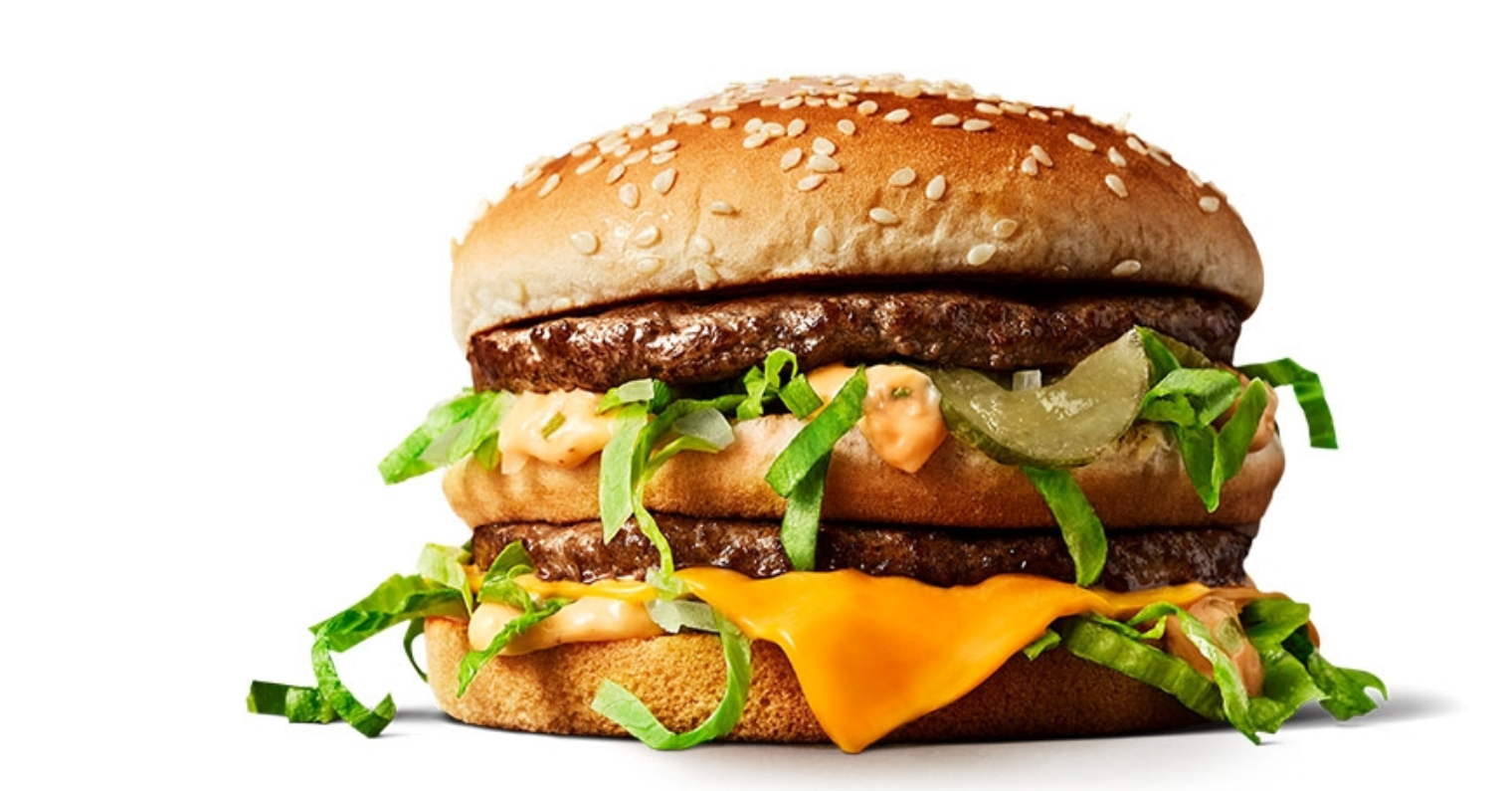
In Finland a Big Mac cost EUR 5.75 at the end of 2024 while it cost exactly SEK 60 in Sweden. The Swede earning SEK 600,000 could therefore afford 10,000 Big Macs, whereas the Finn’s EUR 49,101 only bought 8,539 Big Macs. In practice the Swede could thus purchase considerably more Big Macs with their income than the Finn. Once we account for price differences between Sweden and Finland in this way, the purchasing‑power‑adjusted GDP per capita by this method is about 17 per cent higher in Sweden than in Finland. In practice one does not use only the Big Mac but constructs a whole basket of goods and services (trying to make them as comparable as possible), yet the principle is the same as in the Big Mac example.
11.3 Comparing GDP over time
My grandmother — born in 1925 — thought young people in Sweden should be grateful for earning SEK 20,000 in a summer. She herself only earned SEK 100 when she worked the summer of 1945. Grandma calculated that today’s youngsters are 200 times better off than she was as a young woman.

No offence to my grandmother, but she got it wrong. It’s as if she stands in the circular flow and first counts the value of all the bread passing by in 1945: “One rye loaf costing 10 öre, two oat breads at 5 öre each and three buns at 3 öre.” Then she does the same for this year: “Two rye loaves at 36 kronor, one oat bread at 22 kronor and four buns at 18 kronor each.” Do you see why grandma is misleading herself? It’s possible Sweden produces more bread today than when she was young, but the price level has also risen sharply. When grandma computes GDP for a given year she uses that year’s prices. This is called nominal GDP. And nominal GDP has indeed risen enormously since grandma’s youth. So she’s right that today’s youngsters earn 200 times more than she did — but how much of that is simply due to higher prices?
How should grandma have calculated it? If the problem is that prices may have risen between 1945 and today — why not lock the prices? It does not matter which year’s prices grandma uses, as long as she uses the same ones consistently. Suppose she always uses 1945 prices: “One rye loaf at 10 öre, two oat breads at 5 öre each and three buns at 3 öre” gives GDP in 1945 expressed in 1945 prices of 29 öre. Now she should compute today’s GDP using today’s quantities but 1945 prices: “Two rye loaves at 10 öre, one oat bread at 5 öre and four buns at 3 öre.” Result: this year’s GDP expressed in 1945 prices is 37 öre. Now we can compare the GDP figures: 37 öre today versus 29 öre in grandma’s day. That is an increase of about 28 per cent. This rise cannot be due to higher prices since we held prices fixed; the 28 per cent increase must therefore reflect that Swedes have become better at baking bread. When grandma computes GDP this way, holding prices fixed, the result is called real GDP.
In practice there is an even simpler way to calculate how fast the real economy has grown, namely as follows:
\[ \small \text{Change in real GDP (\%) = Change in nominal GDP (\%) - Change in the price level (\%)} \]
Remember that nominal GDP can rise for two reasons: 1) we produce more, and 2) the price level has increased. If nominal GDP has risen by 7 per cent and prices have risen by 4 per cent, then real GDP must have risen by 3 per cent, right?
In practice price changes in the economy are measured using a so‑called consumer price index (CPI). Imagine a gigantic basket containing all the goods and services you buy in a year: all the beer bottles, bags of crisps, concert tickets, train journeys, Netflix subscriptions and everything else. Calculate what this gigantic basket costs this year and what exactly the same basket cost last year. If the basket has become more expensive, the price level in the economy has gone up. Remember that you must not change the contents of the basket from year to year. If the basket contains exactly the same items each year then any price increase must be due to everything becoming more expensive.
11.4 Have we become richer?
You now know quite a bit about how GDP is calculated and what the figure means. It’s high time to look at how GDP actually looks around the world and how it has evolved over time. Start by looking at the following figure:
As you can see, the figure shows GDP per person, expressed in dollars and in 2011 prices. The figures have also been PPP‑adjusted to account for the fact that living is more expensive in some countries than in others. But what conclusions do you draw from the figure?
The first thing that strikes me is that life on Earth has almost always been extremely poor. In fact I could have extended the figure to the left and gone back 200,000 years; the GDP curve would then have been near zero throughout. Your ancestors 200,000 years ago had no bright future. The next 199,800 years would have remained a life of poverty: you were born, you lived at subsistence, you died young.
| Period | Annual GDP growth (%) | Years until twice as rich |
|---|---|---|
| 0–1000 | 0.00 | infinitely many |
| 1000–1820 | 0.05 | 1400 |
| 1820–2026 | 1.3 | 58 |
According to Table 12.2, GDP growth was 0.00 per cent during the period between Jesus and the Vikings. Between 1000 and 1820 global GDP per capita grew a little, but the growth rate was low. An annual growth rate of 0.05 per cent means it takes roughly 1,400 years to become twice as rich. Cold comfort for anyone who is starving.
Then, at the beginning of the 19th century, the miracle happens: humanity suddenly finds a way to rise out of poverty! You can also see this clearly in the figure above. It starts with the Industrial Revolution in Britain and its extraordinary scientific and technical advances. Sweden and Finland take off at the end of the 19th century. China rises like a giant around 1980. After 200,000 years humanity has finally found a path out of famine. In the next chapter you will see what the key to prosperity was.
Exercises
In this chapter you have learned how to measure the economy, for example using GDP, and how to use the measure to compare living standards across countries and to study how living standards change within a country over time. Below are some cases where you can apply your knowledge in practice. Press Show Answers when you want the computer to grade your answers. Good luck!
How rich is a country?
GDP is often used to show how wealthy a country is and how its economy evolves over time. In this world map you can see GDP per capita for every country. If you click Table you can view the data in tabular form and Line makes it easy to select specific countries. You can also choose the time period to display.
- Using the world map above (click Table and sort with the arrows) I see that: the country with the highest GDP per capita in 2022 was , the country with the highest GDP per capita in 1700 was , the country with the highest percent growth during 1975–2022 was and the country where income fell the most (in absolute terms) during 1950–2022 was .
- Click Line in the world map, press Edit countries and regions and include only Finland, Sweden and Argentina, and choose the period 1918–2022 with the slider. In 1918 the richest of these countries was .
- Suppose nominal GDP in a country rises from 114 billion to 121 billion. At the same time the price level rises from 103 to 108. What was the economic growth? .
- Why should you use real GDP rather than nominal GDP when calculating economic growth? .
- Ireland has many guest workers and foreign firms. This likely means that GDP is than GNI.
- GDP can be measured in three different ways: from the production side, from the expenditure side and from the .
- A forester grows timber. The timber is sold to a sawmill which processes it into planks. The planks are sold to a shipyard which processes them into boats. The table below shows what happens but some entries are missing (you can logically fill in all blanks). Wages at the sawmill are , the shipyard’s value added is and GDP is .
| Forestry | Sawmill | Shipyard | |
|---|---|---|---|
| Value of sales (€) | 1550 | 5500 | |
| Value of intermediate goods (€) | 0 | 1550 | 3000 |
| Wages (€) | 800 | ||
| Profits (€) | 1000 | 600 | |
| Firm value added (€) | 1550 | 1450 |
- Spend a few minutes exploring the world. It’s fun, broadens your general knowledge and may reveal interesting patterns to investigate.
- If you follow Spain’s development you’ll see that Spaniards were, strangely, not much richer in the 1950s than they were in the 1200s. In the next chapter you’ll learn why economic growth was so low in Spain for those 750 years. Looking at Finland’s economic development you’ll notice GDP per capita over the past 20 years has been sensibly poor: in 2007 GDP per capita was basically the same as today. The typical Finn therefore hasn’t become better at producing goods and services during your lifetime. Why do you think Finland has stagnated while many comparable countries, such as Sweden, have become richer?
- Nominal GDP is GDP calculated using each year’s price level. Here nominal GDP rose by about 6.14% (percent change = change / original). This 6.14% increase can be due to two things: 1) we produce more, 2) the price level has risen. To capture only economic growth we must therefore subtract inflation. Inflation in the exercise was about 4.85%. That implies growth was about 1.29%.
- Remember: the average monthly wage for full‑time employees in Finland is currently EUR 4,140. The corresponding figure when your grandmother was young was vastly lower. Nominal wages have therefore rocketed. But that does not necessarily mean your purchasing power is higher than your grandmother’s — what if the price level was far lower in her youth? Always account for inflation when comparing GDP or wages over time.
- Work out the difference between GDP and GNI. Do you now understand why Luxembourg always ranks high in GDP per capita lists?
- Base your reasoning on the simple sketch of the economy’s circular flow.
- Can you get the numbers below? Forestry, for example, creates value of EUR 1,550. If EUR 800 goes to wages, the remaining EUR 750 must go to the owners.
| Forestry | Sawmill | Shipyard | |
|---|---|---|---|
| Value of sales (€) | 1550 | 3000 | 5500 |
| Value of intermediate goods (€) | 0 | 1550 | 3000 |
| Wages (€) | 800 | 450 | 1900 |
| Profits (€) | 750 | 1000 | 600 |
| Firm value added (€) | 1550 | 1450 | 2500 |
BNP vs HDI
Gross domestic product is a contested measure. Macroeconomists therefore also use a number of alternative indicators to get a more reliable picture of a country’s economic situation. The following chart shows the relationship between the Human Development Index (HDI) and GDP per capita:
- Click Table. In 2023 had the highest HDI, while had the lowest.
- Click Chart. One of the following countries was rich in 2023 but nevertheless had a relatively low HDI, suggesting unexpectedly low education and/or life expectancy. Which country is it? .
- One of the following countries was poor in 2023 but nevertheless had a relatively high HDI, suggesting high education and/or life expectancy. Which country is it? .
- Make sure you know what HDI consists of: life expectancy, education and GDP per capita.
- Imagine drawing a straight line that captures the general relationship between GDP per capita and HDI. Which country had very high GDP per capita but lay well below that line?
- Using the same line, which country had very low GDP per capita but lay well above it?
The GINI coefficient 1963–2025
In this world map you can see the GINI coefficient for every country in 2025. If you click Table you can view the data in tabular form and Line makes it easy to select specific countries. You can also choose the time period to display by adjusting the slider beneath the figure.
- Draw your own figure and explain, based on the figure, how the GINI coefficient is calculated.
- The GINI coefficient in 2025 was 0.29 in Sweden and 0.27 in Finland. In which of these countries were income gaps largest?
- The country with the largest income gaps in 2025 was and the country with the smallest gaps was .
- The country where income gaps increased the most during 1980–2025 (in percent) was .
- The country where gaps decreased the most during 1980–2025 (in percent) was .
- I think income gaps in Finland should be .
1–6. Rising income inequality is a highly topical and interesting issue. Knowing how to measure income gaps and what causes them is useful for all economists and social scientists. In Chapter 19 you will discover that both international trade and new technology have likely contributed to widening income gaps in Finland.
- If you want to hear two AI voices discussing the content of this chapter you can listen here. If you want to play with AI tools yourself, see the Data section at the top of the chapter here.
- Need other introductory macroeconomics textbooks? A good introduction in English is The Economy 2.0: Macroeconomics (free e‑book here).