14 Business‑cycle analysis
(where you learn why Finland swings between gloomy periods of high unemployment and brilliant times when life is good)
We will now visit some of my former classmates. Where did they end up after graduation — and what do they do at work?

Ann has been chief economist at Handelsbanken. Anna has had the same job at Länsförsäkringar. In Finland Heidi has been chief economist for several major banks and Nanna is an analyst at the European Commission. All four are well versed in long‑run developments — but that is rarely their main focus. Instead they mainly analyse how the economy evolves in the short run. How deep is the downturn? How many young people are forced to go without work? What happens to the general price level in the economy? What should politicians do to improve people’s economic wellbeing?
One key measure they often watch is GDP per capita. The following figure shows how GDP per capita in Finland has evolved over 1917–2022. Note that the series shows real GDP, meaning it has been adjusted for the fact that the price level a hundred years ago was different from today.
At first glance Finns seem to have enjoyed a pleasant ride since independence in 1917. We appear to have doubled our income roughly every twenty years. But look more closely and you soon realise Finland’s economic history has been far from uneventful. In fact it consists of many sharp short‑term swings around the long‑run upward trend. What happened, for example, in the early 1990s? The series suddenly plunged and incomes fell by almost 15 per cent. You see a similar crash at the end of 2008.
Revision: Can you use the Rule of 70 to work out the growth rate that doubles our income in 20 years?
In growth theory you learned to understand the long‑run trend, but with business‑cycle analysis — the theme of this chapter — you will understand why these short‑term fluctuations around the long‑run trend occur and what, if anything, can be done about them. The goal is that by the end of the chapter you will be able to use both data and theory to make your own short‑term forecast for how Finland will fare.
14.1 Key terms and data
There are certain words you must know to follow the economic debate. I have summarised them in the following sketch:
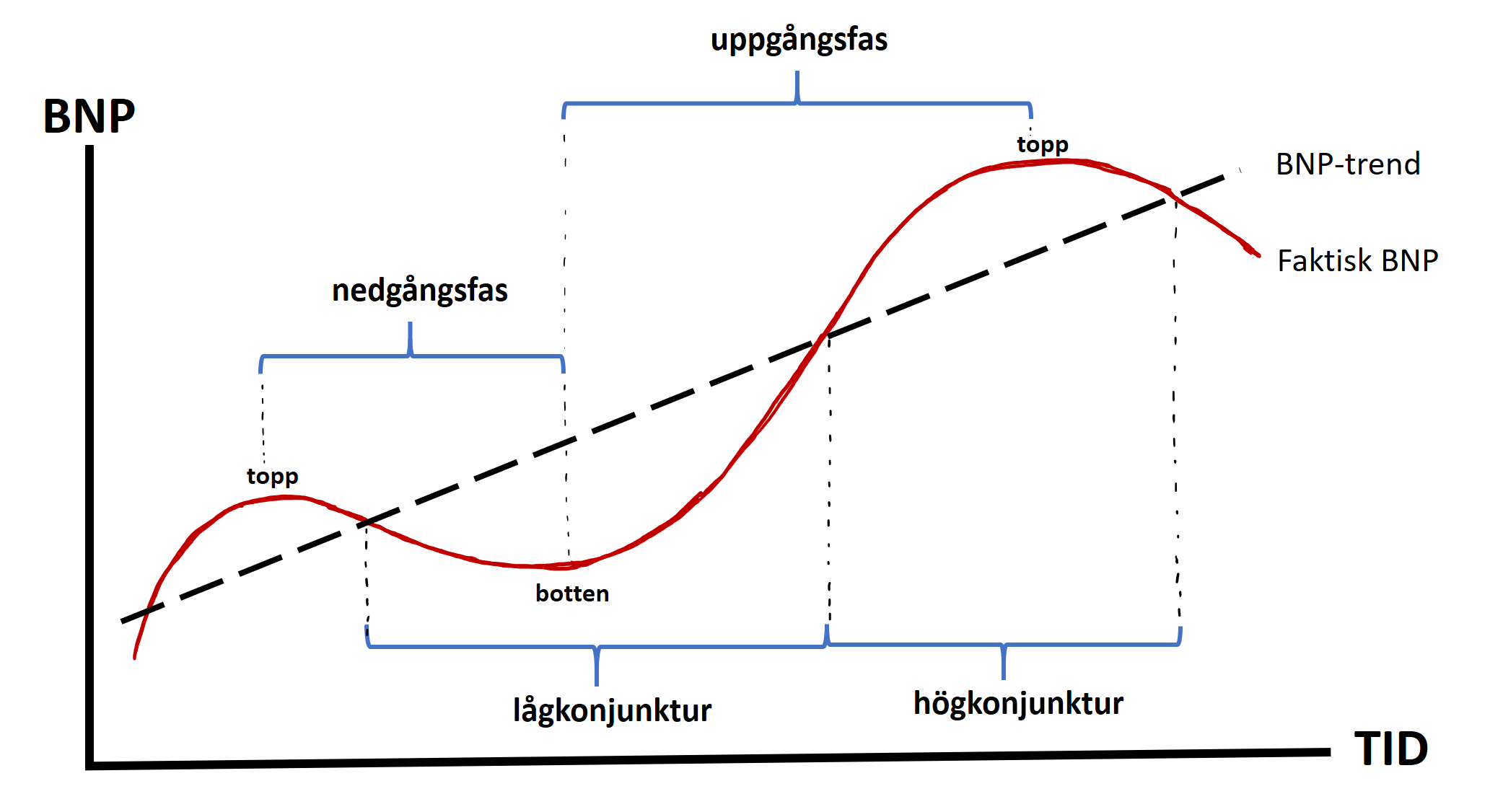
The red curve shows actual GDP — the real GDP you already know about. I have also dashed in the GDP trend. The trend level is often called potential GDP. Think of it as the equilibrium level around which the economy fluctuates in the short run. Whenever actual GDP lies above the trend line the country is by definition in a boom. When actual GDP lies below the trend line the country is in a recession. The period from peak to trough is called a downturn (or contraction) and the period from trough to peak an upturn (or expansion).
boom is when the economy is larger than “normal” (GDP lies above the trend), which can lead to overheating and higher inflation
recession is when the economy is smaller than “normal” (GDP lies below the trend), which can lead to rising unemployment
stabilisation policy are measures to smooth economic fluctuations using monetary, fiscal and income policies
Ann, Anna, Heidi and Nanna each head an analysis unit. There, economists work to compile and interpret the latest figures on the economic situation. But how do they determine how the economy looks right now? Here are five general tips:
- Watch several indicators! Don’t fixate on a single measure — it may not give a full picture. It’s safer to base conclusions on a broader set of data. Statistics Finland has facts on Finland’s situation. The figure below gives a good first impression of Finland in the summer of 2026. For example, GDP rose by a modest 0.8 percent in 2025. Inflation is 2.1 percent, which means prices overall are currently increasing by 2.1 percent per year. You also see that unemployment is 10.5 percent — i.e. 10.5 percent of those who want to work have been unable to find a job. That is a worryingly high figure, especially for you near the end of your studies and about to enter the labour market. You also see that the median monthly wage for full‑time employees is just over €3,600, consumer confidence is weak, and there are currently 48,600 job vacancies in the country.
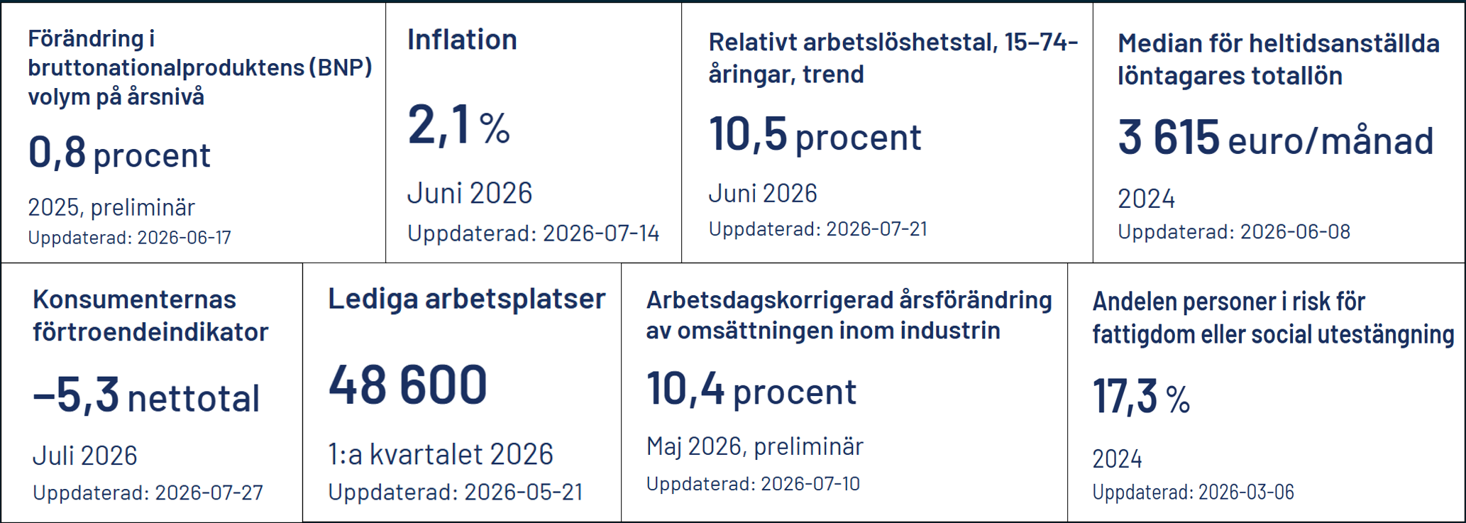
First look at broad indicators! As you can see there is also a measure of industrial turnover. There is often good data on how much is produced in industry because this type of production is easy to measure. But industry now accounts for only about one third of the economy. GDP is broader because it captures all production.
Look for the very latest data! Some indicators take longer to produce than others. For example, it takes several months to calculate GDP. By contrast, unemployment figures are available more quickly. A useful trick is to also use data that give a hint about how GDP will evolve. Below you can see, for example, that the number of building permits granted rose last autumn, which suggests rising optimism and that better times may be coming. If Ann and the others discover that building‑permit applications suddenly increase, it is a sure sign that GDP will rise soon. A so‑called leading indicator therefore changes before GDP changes. Another example of a leading indicator is the Purchasing Managers’ Index (PMI), which is based on surveys asking purchasing managers about order intake, business volume and production, employment, suppliers’ delivery times and inventories of purchased inputs. If you want to see the current index for the Euro Area, Sweden, the USA and China click here. Below you can also see that Roger is launching another leading indicator. Do you have your own suggestion for a leading indicator?

-
Find the signal in all the noise! Many datasets show strong seasonal patterns. If you work at an ice‑cream company, sales will always be higher in summer than in winter. If your boss asks in July how the company is doing, don’t reply:
»We’re selling loads, this is the industry of the future!«
The strong sales likely reflect the season — sales are always higher in summer. Likewise, don’t call an emergency meeting just because sales are low in January. To understand how the company really performs you must seasonally adjust your data to account for systematic within‑year variation. You’ll learn this later in your studies. Tip: being skilled at handling and analysing data gives you a huge advantage in the labour market. Our era is characterised by drowning in information while very few have the competence to turn that data into something useful.
Only update your analysis when data deviate from your expectations! Imagine Apple’s sales rise by 10 per cent. Is that good or bad news? It depends on what you expected. If you expected sales to double, 10 per cent is a disaster. If you expected a decline, 10 per cent is a triumph. The reason the stock market did well in 2021 — despite the world being in turmoil — was that many expected the pandemic to hit the economy even harder than it did.
But what exactly throws Finland into a recession — where incomes are “unusually” low and the country suffers high unemployment? And why do booms arise? Can economists influence these cycles? To understand this we must go back to an October day on Manhattan nearly a century ago.
14.2 The Great Depression
Thursday 29 October 1929 began like any other day in New York. The “Roaring Twenties” had been a decade of optimism and was dubbed the “decade of prosperity”. But on this day everything turned — the New York stock market suddenly started to fall. First some car stocks were hit, and soon 10,000 anxious people had gathered outside the exchange on lower Manhattan. By the end of the day prices had fallen by 20 per cent and over the following days the market plunged by around 40 per cent.
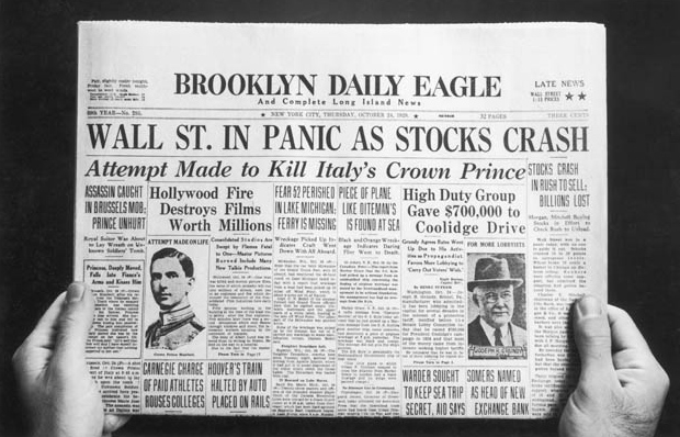
The stock‑market crash had devastating consequences for the entire American economy. Between 1929 and 1933 GDP per capita in the USA fell by almost 33 per cent. You can see the development yourself by adding the USA to the GDP chart above. The crisis also spread to Finland; trade at the market square in Åbo declined dramatically. How would you explain the crisis if you could only use the growth models from Chapters 12–13? Maybe something like this?
“GDP is determined by the amount of labour, capital and technology in society. If GDP is low it is likely because we work too little, have invested too little in new capital and/or do not work smart enough. Maybe we’ve become complacent and lazy. The solution is that we pull ourselves together!”
Do you think this sounds like a credible explanation? Have you, by the way, read John Steinbeck’s novel The Grapes of Wrath, which follows Tom Joad through the poverty of the 1930s? He lives in shantytowns and in an increasingly desperate search for work. No one who has read the book can accuse Tom Joad of being labour‑shy. Yet President Herbert Hoover agreed with the economists of the day and offered the following little‑comforting advice to Tom Joad and the other Americans:
“This crisis will purge the rottenness out of the system. High costs and high living will come down. People will work harder and live a more moral life. Enterprising people will pick up the wrecks from less competent people.”
- President Herbert Hoover

Many economists of the time viewed business‑cycle fluctuations much like the ancient Egyptians viewed the Nile’s floods. Sometimes the river overflowed and drowned the crops. Other years there was too little water and the harvest withered in the heat. The river level affected the Egyptians’ lives, but no one understood why it was high some years and low others. Maybe it was simply God’s will. But what if one could understand why these short‑term fluctuations occurred in the Nile? Perhaps one could then take measures to eliminate both floods and droughts. That is exactly what John Maynard Keynes set out to do in macroeconomics.
In 1936 he published The General Theory of Employment, Interest and Money, in which he presented a completely new way of looking at macroeconomics. This is what Keynes said:
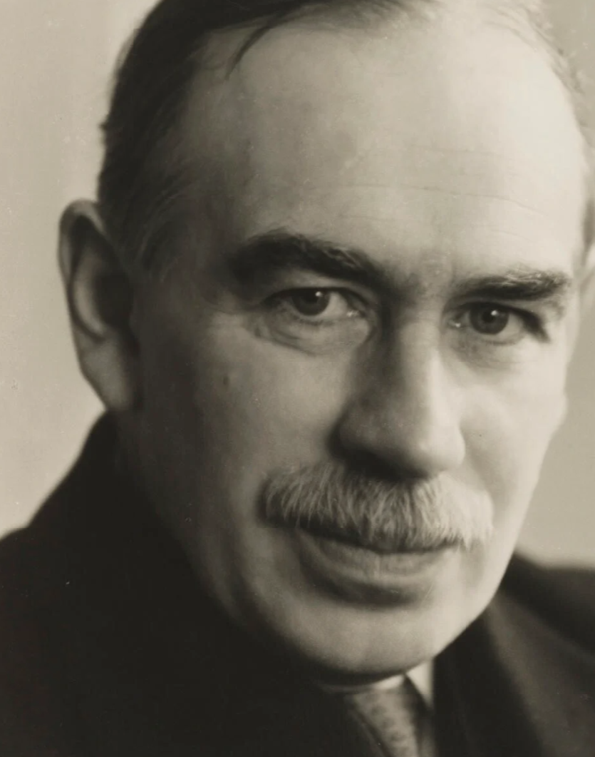
“The long run is a misleading guide to current affairs. In the long run we are all dead. Economists set themselves too easy, too useless a task, if in tempestuous seasons they can only tell us, that when the storm is long past, the ocean is flat again.”
- John Maynard Keynes
It’s as if Keynes wants to say: “Sure, the old economists are partly right. The economy will recover over time. But it takes far longer than they realise. It doesn’t happen in a few weeks. It can take years, or even a decade! And Tom Joad cannot afford to wait that long. He lives his life here and now.”
This is the core of Keynesianism, which revolutionised the view of macroeconomics. We will now look more closely at what the theory says. It’s time to build another toy model. Unlike the growth models, we will now develop a model that helps us understand the short‑term fluctuations of the economy. In a little while you will be able to use it to understand the economic effects of events such as tech bubbles, terrorist attacks, COVID‑19 and trade wars.
14.3 Business‑cycle analysis according to Keynes
In the first part of this book you learned a lot of microeconomics. To understand how much is traded on a single market — for example strawberries at the market square — we used the supply and demand model. We found out how much consumers want to buy and how much sellers want to supply. As a macroeconomist, however, you want to understand the entire economy: how much is produced in aggregate in Finland? To answer that we must analyse aggregate demand and aggregate supply for everything in Finland. Let us start with the demand side!
Aggregate demand according to Keynes (AD)
To find out how much we collectively want to buy in Finland we can start from Figure 11.2. Remember the figure? I made the model simple to help you see how GDP is calculated. Now we will redraw the circular flow, but make the model a bit more realistic:
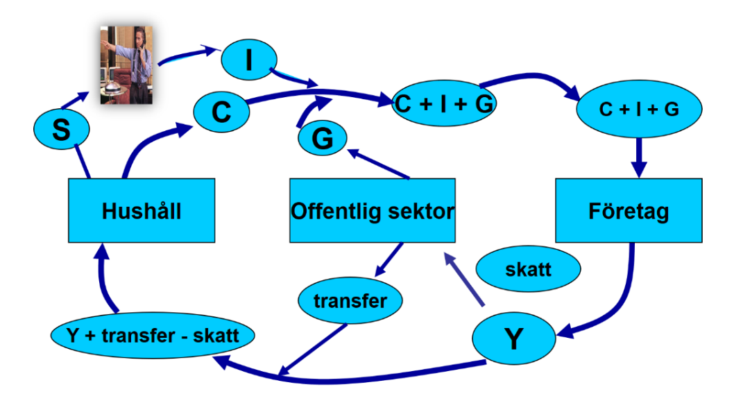
The biggest changes are that I’ve now added a public sector and a financial market to the model. Let us go through the circular flow step by step, starting at the right of the figure. Firms pay out incomes, which we denote Y, that flow to households. Part of these incomes disappears en route as taxes, which are paid to the public sector (that is, central and local government). Many households also receive transfers — for example study grants. The money that actually reaches your household is called disposable income. It is your income minus taxes plus transfers. If your income is EUR 1,000 and you pay EUR 500 in tax but receive EUR 100 in housing benefit, your disposable income is EUR 600.
the circular flow is a model that describes how money and goods move in the economy
domestic demand consists of private consumption (“C” for consumption), investment (I) and government consumption (“G” for government spending); it shows how much goods and services are consumed
But what do you do with that EUR 600? Earlier I assumed you buy loaves of bread with your entire income, but in our updated model households can choose whether to save (S) or consume (C). Saving is, by definition, the part of your disposable income that you do not consume. If you have EUR 600 in disposable income and choose to consume EUR 400, you therefore save EUR 200. All saving in the economy ends up in the financial market. These funds are often lent out and used to finance large investments.
One branch of economics is financial economics. There you learn more about saving and borrowing. How do you save to get the highest return without taking unnecessary risks? How does a firm raise funds for a gigantic investment? If you’re interested in these questions, the course Introduction to Financial Economics is a good start.
So what do we collectively want to buy from firms in Finland? As before, households want to consume goods and services. In addition, the public sector now also wants goods and services — for example ventilators for hospitals, lunches for schools and a new IT system for the municipality. We also want investment. For instance, UPM Jakobstad might invest in a new wastewater treatment plant costing EUR 100 million. What we demand from firms is therefore consumption (C), investment (I) and government consumption (G). The sum of these is called aggregate demand, abbreviated AD.
Supply in the economy according to Keynes (AS)
In Keynes’s macro model aggregate supply (AS) is an important component for understanding how an economy works. One of Keynes’s central insights was that prices and wages in the economy are “sticky” or rigid in the very short run. Read the following box to get an intuitive feel for why these rigidities arise in the very short term:
It’s an ordinary Monday on campus in Åbo. Suddenly our lecture ends and, as if by magic, 250 students flood into Fabbe’s café. There’s no way he can respond to the rush by raising his prices — he has them chalked on the boards and advertised across campus. It’s as if there are long‑term contracts that make it practically impossible to change prices.
The only option is for Fabbe and his staff to work flat out to bake buns and brew coffee for all those students. The effect of the increased demand is therefore a large rise in production.
Contrast that with March 2020, when the pandemic hit Finland. Suddenly almost all customers disappeared. Overnight the café was nearly empty. Because prices are fixed in the very short run, customers still paid the same as before. Besides long‑term contracts, there can also be psychological reasons that make Fabbe reluctant to cut prices. And sometimes information asymmetries matter; since Fabbe lacks full information about the market he may simply not realise prices should be cut. The result of fewer customers is therefore that Fabbe sharply reduces bun and coffee production. He and his staff have almost nothing to do.
The Keynesian lesson is this: how much is produced in the very short run depends entirely on how much we want firms to produce for us. Rigidities mean that an increase in aggregate demand—via higher consumption (C), investment (I) or government spending (G)—raises output and employment rather than merely pushing up prices. In the very short run it is therefore aggregate demand (AD) alone that determines how much Finland produces (GDP).
eynes argued that prices and wages are sticky in the short run due to long‑term contracts and agreements, psychological factors and information asymmetries.
The Keynesian cross
We are now ready to see how aggregate demand (AD) determines how much is produced in the very short run (GDP). I have constructed an app that will hopefully help you understand Keynes’s model.
Let us begin with a relatively simple version:
#| standalone: true
#| viewerHeight: 1100

if (!requireNamespace("shiny", quietly = TRUE)) install.packages("shiny")
if (!requireNamespace("plotly", quietly = TRUE)) install.packages("plotly")
if (!requireNamespace("grid", quietly = TRUE)) install.packages("grid")
if (!requireNamespace("scales", quietly = TRUE)) install.packages("scales")

library(shiny)
library(plotly)
library(grid)
library(scales)

# Helper for consistent formatting
fmt <- function(x) comma(x, accuracy = 0.01, decimal.mark = ".", big.mark = ",")

ui <- fluidPage(
  fluidRow(
    column(4,
      wellPanel(
        numericInput("a", "Autonomous consumption (a):", value = 10, min = 0, step = 1),
        numericInput("b", "Marginal propensity to consume (b):", value = 0.5, min = 0, max = 0.99, step = 0.01),
        numericInput("I", "Investment (I):", value = 20, min = 0, step = 1),
        numericInput("G", "Government spending (G):", value = 30, min = 0, step = 1),
        numericInput("maxY", "Max value for output Y in the figure:", value = 200, min = 10, step = 10),
        actionButton("calculate", "Calculate and illustrate!",
                     style = "color: white; background-color: #007bff; padding: 6px 12px; border: 2px solid #007bff;"),
        br(), br(),
        tags$small("Consumption function: C = a + bY. Click 'Calculate and illustrate!' to compute or update the solution.")
      )
    ),
    column(8,
      plotlyOutput("adAsPlot"),
      br(),
      verbatimTextOutput("equilibriumOutput")
    )
  )
)

server <- function(input, output, session) {

  validate_inputs <- function(a, b, I, G, maxY) {
    if (any(is.na(c(a, b, I, G, maxY)))) return("Error: Please provide all parameters.")
    if (b < 0 || b >= 1) return("Error: b must be in the interval [0, 1).")
    if (maxY <= 0) return("Error: maxY must be greater than 0.")
    NULL
  }

  observeEvent(input$calculate, {
    a <- input$a
    b <- input$b
    I <- input$I
    G <- input$G
    maxY <- input$maxY

    err <- validate_inputs(a, b, I, G, maxY)
    if (!is.null(err)) {
      showNotification(err, type = "error")
      output$equilibriumOutput <- renderText({ "" })
      output$adAsPlot <- renderPlotly({ NULL })
      return()
    }

    # Equilibrium
    denom <- 1 - b
    Y_e <- if (denom == 0) NA_real_ else (a + I + G) / denom
    C_e <- a + b * Y_e
    AD_at_Ye <- a + b * Y_e + I + G  # should equal Y_e

    output$equilibriumOutput <- renderText({
      if (is.na(Y_e) || !is.finite(Y_e)) {
        "No well-defined equilibrium (b approaches 1)."
      } else {
        paste0(
          "Facts about the equilibrium:\n",
          "Equilibrium output (Y*): ", fmt(round(Y_e, 2)), "\n",
          "Consumption at Y*: ", fmt(round(C_e, 2)), "\n",
          "Investment (I): ", fmt(round(I, 2)), "\n",
          "Government spending (G): ", fmt(round(G, 2)), "\n",
          "Aggregate demand (C+I+G) at Y*: ", fmt(round(AD_at_Ye, 2))
        )
      }
    })

    output$adAsPlot <- renderPlotly({
      Y_range <- seq(0, maxY, length.out = 300)
      AD_values <- a + b * Y_range + I + G
      AS_values <- Y_range  # 45-degree line

      p <- plot_ly() %>%
        add_lines(x = Y_range, y = AD_values, name = "AD (C+I+G)", line = list(color = "darkred"),
                  hoverinfo = "text", text = ~paste0("Y=", round(Y_range,1), "<br>AD=", round(AD_values,2))) %>%
        add_lines(x = Y_range, y = AS_values, name = "45° (Y)",
                  line = list(color = "black", dash = "dash"),
                  hoverinfo = "text", text = ~paste0("Y=", round(Y_range,1)))

      # Mark equilibrium with dashed lines and a point (point not in legend)
      if (!is.na(Y_e) && is.finite(Y_e) && Y_e >= 0 && Y_e <= maxY) {
        p <- p %>%
          add_segments(x = Y_e, xend = Y_e, y = 0, yend = Y_e,
                       line = list(color = "green", dash = "dash"), showlegend = FALSE) %>%
          add_segments(x = 0, xend = Y_e, y = Y_e, yend = Y_e,
                       line = list(color = "green", dash = "dash"), showlegend = FALSE) %>%
          add_markers(x = Y_e, y = Y_e, marker = list(color = "green", size = 6), showlegend = FALSE,
                      hoverinfo = "text", text = paste0("Y* = ", fmt(round(Y_e,2))))
      }

      p %>%
        layout(
          xaxis = list(title = "Output (Y)", range = c(0, maxY), tickformat = ",.0f"),
          yaxis = list(title = "Aggregate demand"),
          font = list(size = 13, family = "Arial"),
          legend = list(x = 0.75, y = 0.95, bgcolor = "rgba(255,255,255,0.95)", bordercolor = "grey80"),
          margin = list(l = 60, r = 20, t = 20, b = 60),
          shapes = list(
            list(type = "line", x0 = 0, x1 = 0, y0 = 0, y1 = 1, xref = "x", yref = "paper", line = list(color = "black", width = 1.2)),
            list(type = "line", x0 = 0, x1 = 1, y0 = 0, y1 = 0, xref = "paper", yref = "y", line = list(color = "black", width = 1.2))
          )
        )
    })
  })
}

shinyApp(ui = ui, server = server)
Think of the figure in the app this way. In the very short run a country’s output (GDP) is determined by total demand in the economy — that is, how much all actors together want firms to supply. A simple example: when 250 students suddenly increased their demand, Fabbe had to ramp up production quickly; when demand collapsed during the pandemic, production fell. To forecast GDP we therefore first need to know how large aggregate demand (AD) is.
AD is the sum of three components: household consumption (C), firms’ investment (I) and government consumption (G). In the app I set I = 20 and G = 30. Household consumption is governed by a function with two parameters: autonomous consumption (a = 10) and the marginal propensity to consume (b = 0.5). This gives the consumption function \(C = 10 + 0.5Y\), which shows that households’ demand for consumption depends on their income. If income is zero the function implies households still want to consume 10. The function also says consumption rises by 0.5 for each extra unit of income.
When you add C, I and G you get the red AD line — it slopes upward because consumption increases with Y.
The equilibrium in the model is the point where AD = Y. In the graph this is marked by the green dashed line: that is where total demand crosses the 45‑degree line (Y = AD) and it shows the short‑run equilibrium level of GDP. If you change the numbers in the app I think you’ll understand the mechanism of the model.
The app computes GDP automatically, but you can also do it yourself. Here are step‑by‑step instructions for calculating GDP in the very short run when you know aggregate demand:
-
Define the aggregate demand components:
Total aggregate demand (AD) consists of consumption (C), investment (I) and government spending (G).
\[ AD = C + I + G \]
With the given functions:
- Consumption: (C = 10 + 0,5Y)
- Investment: (I = 20)
- Government spending: (G = 30)
-
Set up the equilibrium GDP equation (Y = AD):
\[ Y = C + I + G \]
Substitute the given values:
\[ Y = (10 + 0,5Y) + 20 + 30 \]
-
Simplify the equation:
\[ Y = 10 + 0,5Y + 20 + 30 \]
\[ Y = 60 + 0,5Y \]
-
Solve for GDP (Y)
\[ Y - 0,5Y = 60 \]
\[ 0,5Y = 60 \]
\[ Y = \frac{60}{0,5} = 120 \]
Conclusion:
The equilibrium GDP (Y) equals 120.
Practice solving these kinds of problems. Can you, for example, calculate what GDP would be if investment is 30 instead of 20? You can of course use the app to check your calculations. Good luck!
14.4 Business‑cycle analysis with AD‑AS
According to Keynes, prices are essentially “sticky” or rigid. This means changes in aggregate demand affect GDP without prices in the economy adjusting. This is probably a reasonable assumption for how the economy works in the very short run.
We will now go through the AD‑AS model, which extends Keynes’s theory. In the AD‑AS model we allow the price level in the economy to change, which makes it possible to see what happens when prices and wages can adjust over a somewhat longer horizon. The model has two sides: we want to understand total demand in the country, and we want to understand how firms behave. We take them one at a time. We begin with demand.
Aggregate demand
The AD curve, or aggregate demand curve, shows the relationship between the total demand for goods and services and the overall price level.
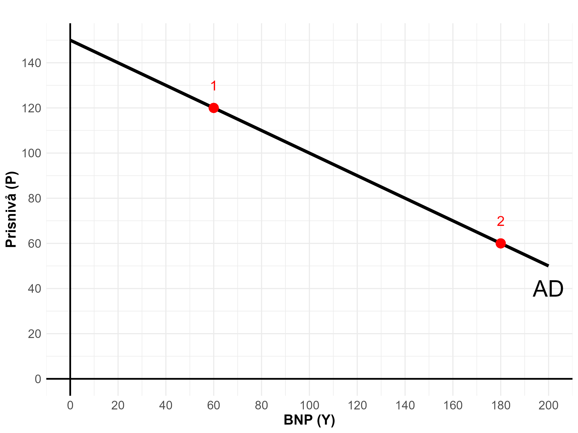
The AD curve slopes downward. I have marked two points on the curve. At point 1, where the price level is 120, the curve shows we demand goods and services worth a total of EUR 60 billion. At point 2, where the price level is 60, aggregate demand is EUR 180 billion.
Why do we demand less when the price level rises? There are two reasons. The main explanation is the interest‑rate effect. Think of it this way: if the price level suddenly rises, households and firms need more money to buy the same quantity of goods and services. This increases the demand for money, for example because more people go to banks to borrow. When many want to borrow, banks can raise interest rates. As in any market, higher demand can drive up the price — here the price of borrowing. With higher interest rates firms are less willing to undertake large investments (I) and many households cut back on consumption (C), especially big purchases like a house or a car. Thus the AD curve slopes down because higher prices → higher interest rates → less consumption (C) and investment (I) → lower AD. In addition to the interest‑rate effect there is a wealth effect: higher prices simply make you feel poorer, so you reduce consumption (particularly non‑essential and large purchases). The wealth effect, however, is much smaller than the interest‑rate effect.
Remember that AD is the sum of consumption (C), investment (I) and government spending (G). What do you think happens to the AD curve if households — at a given price level — suddenly want to consume more, if UPM Jakobstad wants to invest more, or if the public sector wants to buy more ventilators for hospitals? The AD curve shifts to the right. At a price level of 120 we would then want to buy not just EUR 60 billion but a lot more. You can think of this as a new AD curve lying further to the right.
Memory aid: When the price level changes we move along the AD curve. When, at a given price level, we suddenly want more from firms (for example because we become more optimistic about the future) the AD curve shifts to the right.
Now you know a bit more about AD in the AD‑AS model. But the AD curve only shows what we want from firms. To complete the model we must also learn what firms themselves want to produce. We call this aggregate supply (abbreviated AS for aggregate supply).
Aggregate supply
Aggregate supply (AS) represents the total quantity of goods and services produced in an economy at different price levels. The curve can take different shapes depending on the time horizon being analysed.
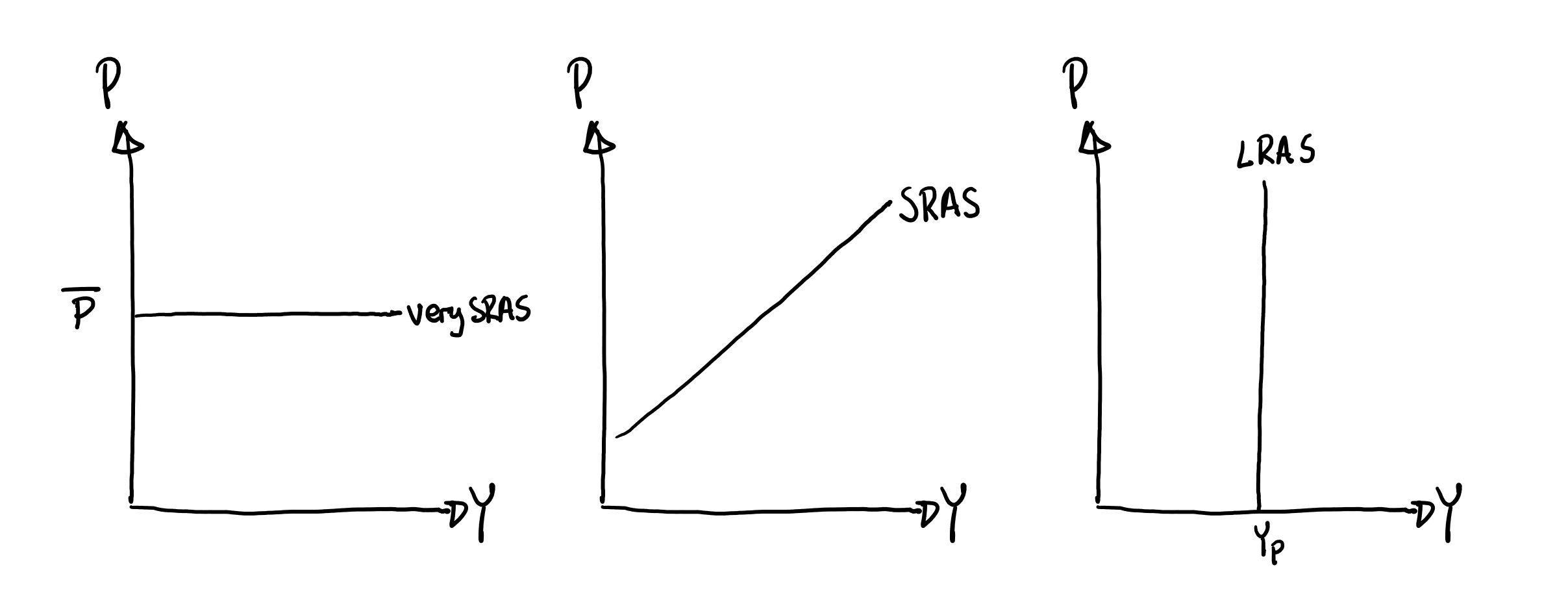
Very short‑run aggregate supply (very SRAS). This is Keynes’s assumption that prices and wages are fixed in the very short run. Fabbe had no way of changing prices and wages from one day to the next; for example he had advertised his prices and signed long‑term contracts with employees and suppliers. He could not offset demand shifts by altering prices. How many buns Fabbe produces in the very short run therefore depends entirely on demand: if few students want to buy, there will be no buns made. You see this relationship at the far left in Figure 14.5.
Long‑run aggregate supply (LRAS). Here is an analogy that may help you understand the long‑run relationship between GDP and the price level: in Finland in 1963 authorities removed two zeros from all banknotes because having so many zeros was simply impractical. A lunch that cost 100 marks on Monday therefore cost only 1 mark on Tuesday. Someone earning a wage of 200 marks per hour on Monday thus earned only 2 marks per hour the next day.
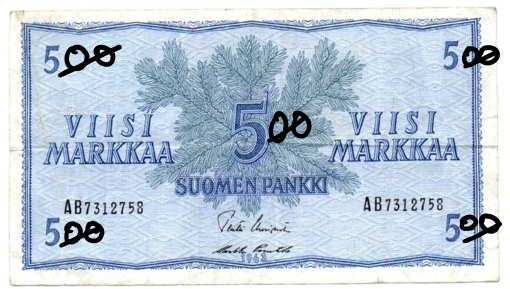 This meant the general price level in Finland plunged. Would it be strange if the reform fundamentally reduced Finland’s ability to produce goods and services? Fabbe certainly received 100 times less for his buns, but all his expenses also fell a hundredfold — so there was no reason for him to behave differently on Tuesday than on Monday. Common sense says the number of zeros on our banknotes hardly explains how well life turns out in Finland. Adding 18 zeros to every note cannot be the trick to eradicate famine in poor countries. You see this relationship at the far right in Figure 14.5 (LRAS = long‑run aggregate supply). In the long run there is no relationship between the price level and how much firms want to produce. It does not matter whether the overall price level is 1, 5, 50 or 1,000 — in the long run firms produce at the potential level.
Another way to remember why the LRAS curve is vertical is to think of Robinson Crusoe. What ultimately determines how well life goes on his island? Growth theory says it comes down to tangible factors: labour, capital and technology. How many banknotes exist on the island or how many zeros each note carries is irrelevant for prosperity. An important lesson from growth theory is that real factors — factors that do not concern money — determine a country’s long‑run outcome.
Short‑run aggregate supply (SRAS). In the short run, shown in the middle panel of Figure 14.5, prices and wages are not as rigid as in the very short run, but they are not as flexible as in the long run. Think again of Fabbe and his café. Suppose you work extra shifts for Fabbe. How were your employment terms agreed? You probably sat down and negotiated your wage. Your nominal wage — the number in your contract — is partly based on what you and Fabbe expected the price level to be over the year. While nominal wages matter, it is really your real wage — how much you can buy with your pay — that counts most.
Imagine you and Fabbe expected the price level to be low. You agreed that an hour’s work should buy you 10 cappuccinos, which led you to accept a €10 hourly wage. At the same time Fabbe negotiated his rent and input costs on the same assumptions.
Now suppose the actual price level turns out higher than you expected. Fabbe then receives more for his sold coffees and buns than he anticipated. Many of his costs, however, are locked into long‑term contracts — for example your agreed €10 hourly wage. He has likely also contracted low prices for rent and coffee beans. Fabbe will therefore want to produce more coffee and buns in the short run when the price level rises — simply because he will make higher profits.
Key lessons from Figure 14.5: firms’ behaviour depends on the time horizon. In the very short run prices are impossible to change, so production takes the full hit. In plain terms: Fabbe will be flat‑out busy if lots of students show up, but twiddle his thumbs if few customers come. In the short run (1–2 years) some prices can be adjusted, so a change in AD affects both GDP and the price level. In the long run Fabbe can adjust all prices and wages — so AD then affects only the price level.
Working with AD‑AS
You are now ready to use the AD‑AS model to understand how various shocks affect the economy in the short and long run. We begin by examining why a country can enter a boom and why the boom does not last forever. Imagine, for example, that rising optimism in society makes households want to buy more than before. The figure below shows what happens when aggregate demand (AD) increases sharply. The analysis is divided into three horizons: very short run (left‑hand panel), short run (middle panel) and long run (right‑hand panel).
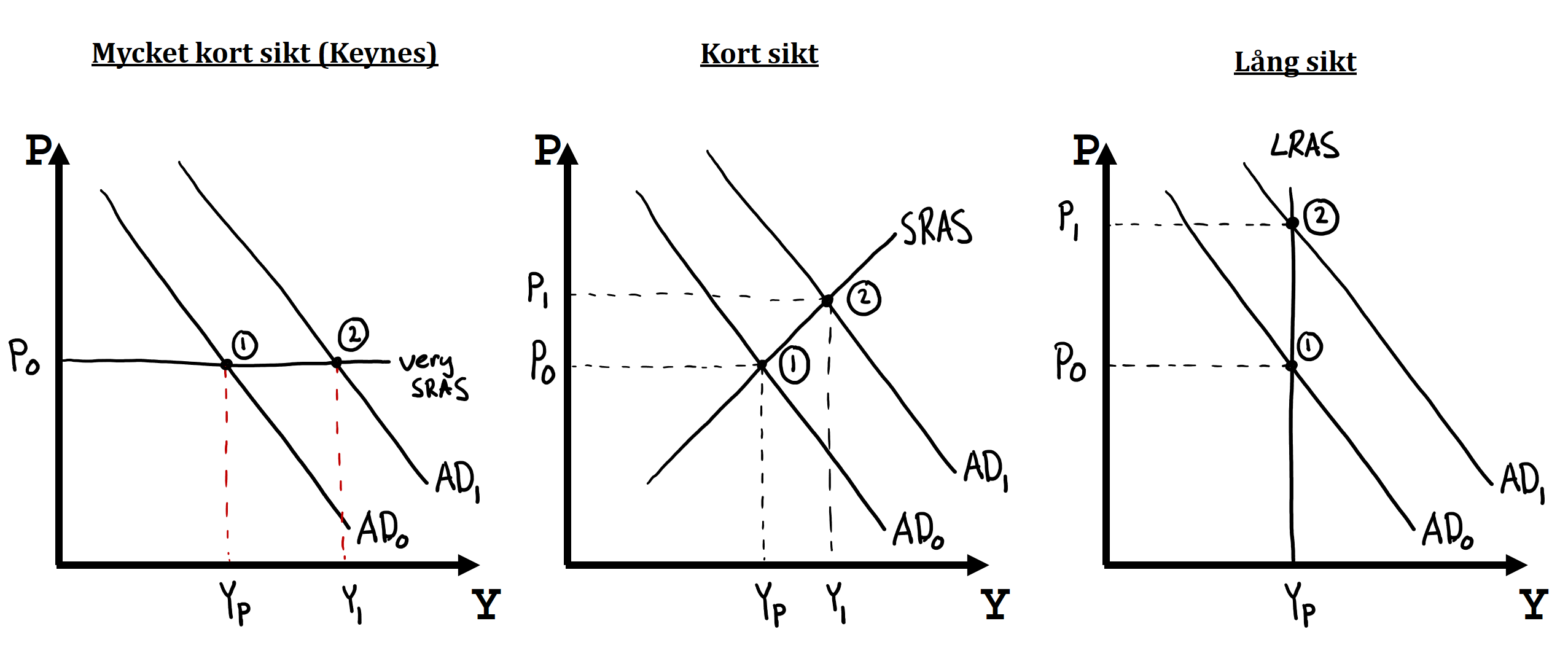
On the very short run prices and wages are fixed. Firms cannot change their prices or adjust employees’ wages. This means output is determined entirely by AD. The starting point is point 1, where the price level is \(P_0\) and output equals the potential level. In other words we are neither in a boom nor a recession. Suddenly something happens: AD shifts from \(AD_0\) to \(AD_1\)! Because all prices and wages are fixed, the effect on GDP is large: GDP rises substantially in the very short run, from \(Y_P\) to \(Y_1\). We have been thrown into a boom. This is exactly the kind of analysis you did with the Keynes model when you assumed all prices and wages were fixed.
In the short run prices begin to adjust. Again start from point 1 in Figure 14.6, where the price level is \(P_0\) and we produce at potential. When AD suddenly shifts rightward we move in the short run to point 2. Output is now not as high as in the very short run, but we are still in a boom. The difference arises because firms have been able to use the good times to raise their prices. You can imagine Fabbe charging €5 for a cappuccino instead of €4, which dampens the boom somewhat.
In the long run the long‑run consequences of higher AD are shown in the right‑hand graph. As you can see we move from point 1 to point 2. This means GDP in the long run is not affected by aggregate demand. Growth theory tells us that long‑run living standards are determined by real factors such as labour, capital and technology. In the long run all prices and costs are flexible. Think of the short‑run boom: perhaps you work for Fabbe, own the property he rents or sell coffee beans to the café — sooner or later it will be time to renegotiate contracts. In a boom with high prices and large profits it is easy to bargain for better terms. Fabbe’s costs therefore rise, which brings output back to the potential level and ends the boom.
This is important to understand, so work through the following example where I’ve drawn all three graphs in the same figure. Practice drawing and explaining what you do and why. Also analyse what happens if AD instead suddenly falls [Hint: do everything as before but shift the AD curve leftward to see why a recession occurs and why recessions eventually pass].
The effect of a positive demand shock
In the late 1980s politicians implemented several reforms that made borrowing cheaper. This caused both stocks and housing prices to rise sharply. Households and firms became very optimistic about the future. Let us now analyse this positive demand shock and its effects in both the short and the long run.
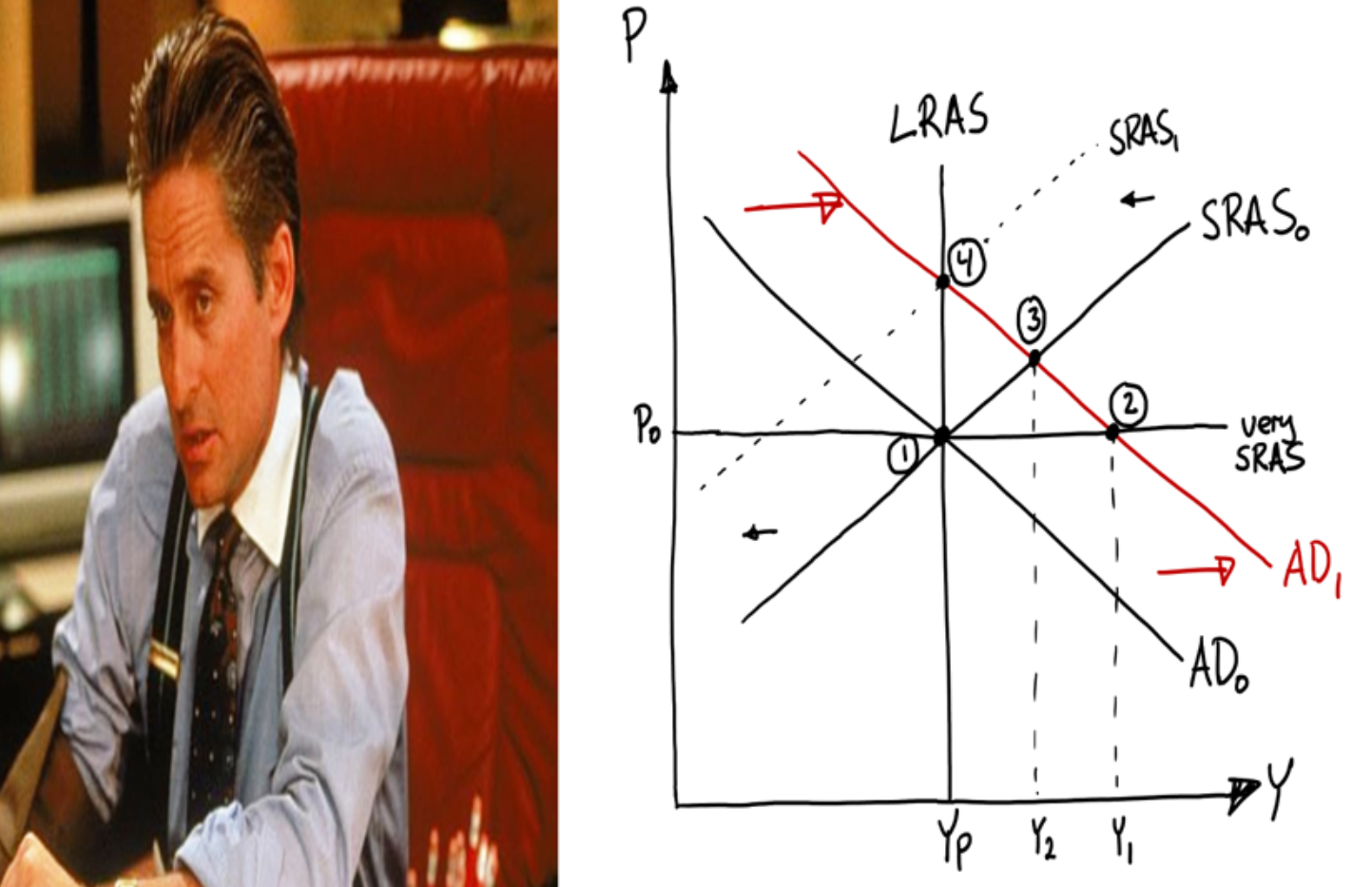
We start at point 1 in the figure. Here the economy is in long‑run equilibrium — actual GDP equals potential GDP. As you know from Figure 14.1, this means we are neither in a boom nor a recession.
Suddenly AD shifts right. Politicians have made borrowing extremely easy. People feel wealthy and optimistic. Now it’s my time to live the high life! Firms across the country experience a demand boom. It’s just like when 250 students storm Fabbe’s café. In the very short run all prices are fixed, as Keynes emphasised. The effect is therefore a large rise in output. We move to point 2. Note that actual GDP lies above potential GDP — optimism has thrown Finland into a boom.
After a while prices become more adjustable. Fabbe realises he can earn more by raising prices — students are mad for coffee. When he prints new price lists and advertises online he takes the chance to charge more. In the short run we therefore move to point 3. Firms have used the good times to raise prices somewhat, which dampens demand a bit. We are still in a boom, however.
What is life like in a boom? GDP is unusually high. The economy is tight; unemployment is probably lower than normal. Can the boom last forever? No — parties always end. Why? Think again of Fabbe. The café is booming; students buy more coffee and buns than ever. The kitchen is under pressure. Staff work hard, maybe evenings and weekends. Fabbe is swimming in profits. It’s great to be Fabbe!
But then a new year arrives and it’s time for wage negotiations. How do you think your chances of a pay rise look? Probably very good. There’s a boom, Fabbe makes big profits and the general price level has risen. It’s natural for employees to demand a share of the gains in the form of higher wages. The same applies to Fabbe’s other costs: flour purchases, rent, etc. You can imagine the SRAS curve shifting left as costs rise — but by how much? Imagine it shifts a tiny amount left. We would still be in a boom and prices and wages would continue to rise. The boom ends only when prices have risen so much that we are no longer above potential GDP. That occurs at point 4. In the long run we return to potential output.
Repeat this because it is important: AD jumped and pushed us into a boom. In the short run this raised GDP, somewhat raised the price level and likely lowered unemployment. In the long run all wages and costs are renegotiated, so GDP and unemployment return to their original levels. All that remains long term is a higher price level. Coffee is more expensive, buns are more expensive — but your wage is also higher. Your purchasing power — what you can buy with your income — is therefore exactly the same as before. Fabbe’s profits are also the same as before. In the long run the boom thus has no effect on our living standard — just as growth theory predicted.
Låt oss repetera eftersom detta är mycket viktigt: Vi kastades in i högkonjunktur då den aggregerade efterfrågan plötsligt ökade. På kort sikt ledde detta till högre BNP, något högre priser och troligen lägre arbetslöshet. På lång sikt kan alla löner och kostnader omförhandlas, vilket gör att BNP och arbetslösheten återgår till sin ursprungliga nivå. Allt som händer i det långa loppet är att prisnivån i samhället har stigit. Kaffet är dyrare, bullarna är dyrare – men din lön är också högre. Din köpkraft – alltså vad du kan köpa för din inkomst – är med andra ord exakt lika stor som i ursprungsläget. Även Fabbes vinster är lika stora som tidigare. På lång sikt hade högkonjunkturen alltså ingen som helst effekt på vår levnadsstandard i landet – precis som vi gissade utifrån tillväxtteorin.
Exercises
In this chapter you have learned to analyse short‑term fluctuations in the economy. Below are some cases where you can apply your knowledge in practice. Press Show Answers when you want the computer to mark your answers. Good luck!
Understanding business‑cycle fluctuations
The economy constantly swings between recessions and booms. But why do these fluctuations occur — and why do business cycles always end?
- The definition of a recession is that and characteristic of booms is that .
- Explain the following terms in your own words: a) recession, b) downturn, c) potential GDP, d) upturn, e) peak.
- Procyclical variables move in the same direction as GDP. For example, employment rises when GDP rises. Which of the following is likely procyclical? .
- Countercyclical variables fall when GDP rises. For example, unemployment falls when GDP rises. Which of the following is likely countercyclical? .
- Can Finland be in a downturn phase at the same time as being in a boom? .
- A leading indicator is .
1–6. Read the chapter carefully and you will certainly manage these exercises. A good way to prepare for the exam is to actually write your answers on paper. It is harder than you think to respond in a way that is correct, clear and clever.
Keynes Explains the World
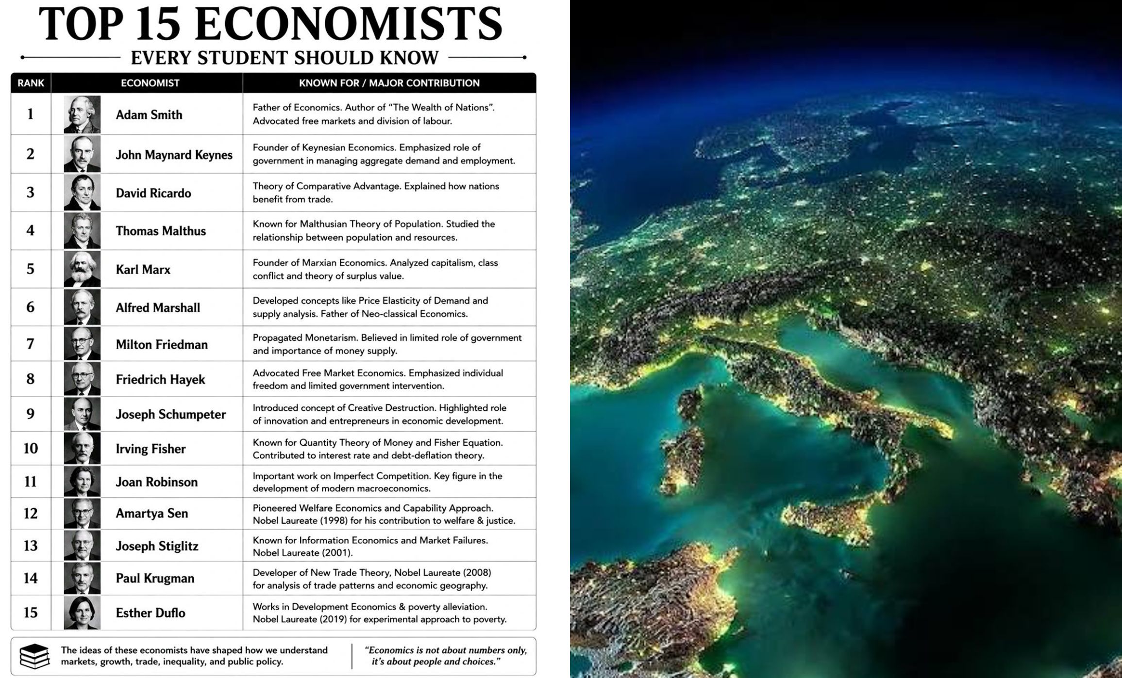
Below is a top-15 list of the most influential economists of all time. Topping the list is the founder of the discipline, Adam Smith (1723–1790), and in second place is the Englishman John Maynard Keynes (1883–1946), whose theories you work with in this chapter. Suppose you know the following about a country: Yp = 700; AD = C + I + G; C = 70 + 0.8Y; I = 60 and G = 30. Use Keynes’s model to analyse the country’s economy.
- Which of the following quotes is associated with John Maynard Keynes? .
- The marginal propensity to consume above is , which means households consume .
- Analysing the figures in the exercise shows equilibrium GDP is , which means the country is in a .
- Suddenly consumers become more optimistic and therefore spend more. Autonomous consumption rises to 80 while the marginal propensity to consume is unchanged. The country’s GDP therefore rises to .
- Who said “The economy, stupid”?
- The form of the consumption function will matter a lot in the next chapter.
- My tip: work together with others. You learn a huge amount by explaining to others. Another option is to talk to ChatGPT — it’s not as good but can work fairly well sometimes (though what ChatGPT says depends a lot on how clearly you phrase your question):
- The new consumption function is C = 80 + 0.8Y. Can you compute the new GDP?
How will it go?
One variable that has proved to be a very strong indicator of the economic future is the Consumer Confidence Indicator. Every month Statistics Finland interviews thousands of randomly selected Finns about their expectations for the economy. The series shown here is a composite of responses about respondents’ views on their own finances, on Finland’s economy, on the household’s ability to save, and on the expected number of unemployed over the next 12 months. I downloaded these figures here and plotted them in the figure below:
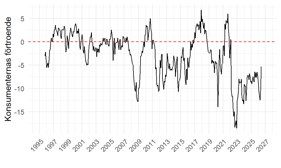
- The figure shows consumers currently view the next 12 months rather bleakly, but prospects are somewhat brighter today than in 2023, when sentiment was abysmally low. Explain in words how this increased optimism is likely to affect Finns’ incomes going forward.
- Assume you know the following about Finland’s economy: Yp = 340; AD = C + I + G; C = 50 + 0.6Y; I = 20 and G = 50. If the increased optimism causes households instead to want to consume according to C = 58 + 0.6Y, then GDP will rise from to , i.e. GDP increases by approximately .
- Here I would “think” in the AD‑AS model. Note there is no single correct answer — what matters is arguing intelligently. You can, for example, start from a situation of recession. If consumers suddenly become a bit more optimistic they will probably want to consume more. The AD curve therefore shifts slightly to the right. In the very short run this raises GDP. Exactly how much GDP rises (and whether it is enough to end the recession) depends, of course, on how far AD shifts to the right.
- First calculate GDP in the initial situation: it is 300. Note this implies the economy is in a fairly deep recession (potential GDP is 340). Now AD increases (because optimism makes households open their wallets). With prices and wages completely rigid, GDP rises to 320 in the very short run. An increase from 300 to 320 corresponds to about 6.7 per cent (percent change = change / original × 100).
Business‑cycle analysis with the AD‑AS model
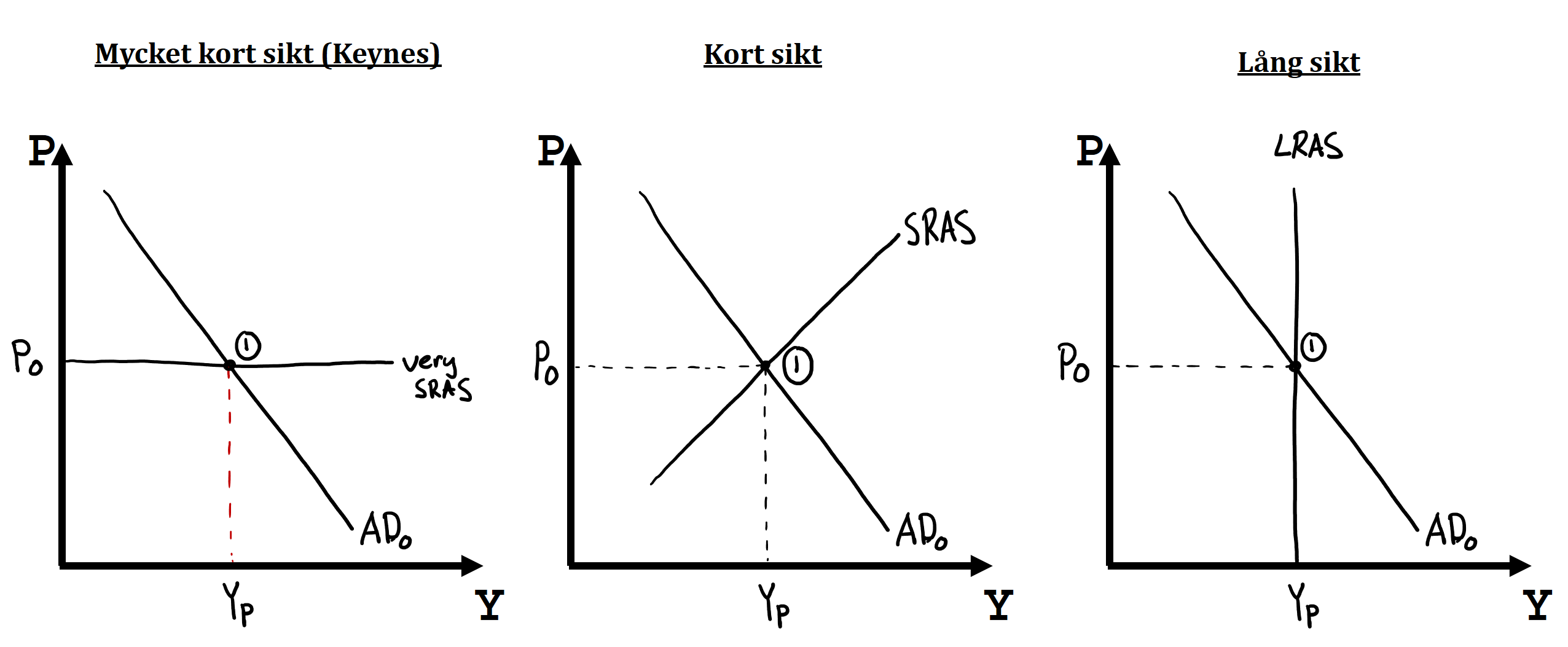
In this figure I have drawn the AD‑AS model in three separate panels. You can use this model to understand why business‑cycle fluctuations arise in the short run — and why booms and recessions always end in the longer run.
- What explains the AD curve’s negative slope? .
- When the price level changes we the AD curve, and when AD changes at a given price level we the AD curve.
- An example of something that causes a positive demand shock is and an example of something that causes a negative demand shock is .
- What happens in the very short run after a positive demand shock? Illustrate and explain.
- What happens in the short run after a positive demand shock? Illustrate and explain.
- What happens in the long run after a positive demand shock? Illustrate and explain.
- What happens in the very short run after a negative demand shock? Illustrate and explain.
- What happens in the short run after a negative demand shock? Illustrate and explain.
- What happens in the long run after a negative demand shock? Illustrate and explain.
- Read Section 14.4 about the AD curve and practise writing the answer in 2–3 simple, clear sentences. As always, aim to convince the grader that you know what you’re talking about.
- You already learned the difference between moving along a curve and shifting a curve in Section 2.2. Review that section if you’ve forgotten.
- Remember: positive demand shocks shift AD right, negative demand shocks shift AD left. Positive supply shocks shift SRAS right, negative supply shocks shift SRAS left.
- Start from the left‑hand panel above. Here prices and wages are fully rigid on the very short run. An AD shift to the right therefore yields a large increase in GDP while the price level remains unchanged.
- In the short run there is more scope to adjust prices. Firms exploit good times to charge higher prices. In the middle panel the result is both a higher price level and higher GDP. Note GDP is not as large as in the very short run because the higher prices reduce demanded quantities somewhat.
- In the long run all prices and wages can be adjusted. Eventually firms’ costs are renegotiated — for example wages. In a situation of high output, rising prices and large profits workers can bargain for higher pay, which reduces firms’ willingness to produce. This process continues until the boom ends and output returns to potential. The price level ends up higher than initially, but so do wages, so real purchasing power is the same as before.
- For questions 7–9 think the opposite of 4–6. An AD shift left causes GDP to plunge in the very short run because firms cannot offset the shock by cutting prices.
- In the short run the crisis can be somewhat mitigated by price reductions.
- In the long run all prices and wages adjust downward and we return to potential GDP.
- In 1929 large parts of the world were thrown into the Great Depression. This clip explains what caused the crisis and what the consequences were. Names mentioned: Adolf Hitler, John Maynard Keynes, Franklin D. Roosevelt.