2 How a market works
(where you learn why markets are often a smart way to determine production and allocation)
A few years ago Thomas Twaite decided to make a toaster entirely by himself. That may not sound remarkable, but note the word entirely. Thomas wanted to build his toaster without any help from others. That meant he could not buy electrical cables from Bauhaus or use a screwdriver — because cables and screwdrivers are themselves made from parts that someone else has assembled. He could not use ready‑made plastic for the casing either — plastic comes from oil that someone else has pumped out of the ground. Thomas therefore had to dig up his own metals and his own oil. At break times he could not drink coffee — the beans are grown by farmers in the tropics and shipped to Finland to be roasted in factories with hundreds of employees.
After three years and thousands of hours of work Thomas finished his toaster. Here is the result:
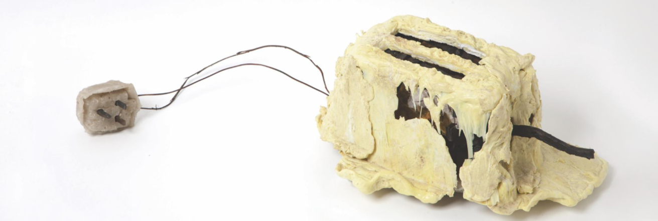
The toaster illustrates perhaps the single most important lesson from economics: We do better when we help each other. Some of us drill for oil, others grow coffee beans or cook on the freighters that bring beans and oil to Finland. The more we specialise, the more we exploit each other’s strengths. This specialisation also tends to make us even better over time. If you can focus on one specific task, you often become particularly skilled at it.
The insight that we should cooperate is so central that we’ll take one more example. In the figure below you can see Adam and Eve working at the same firm.
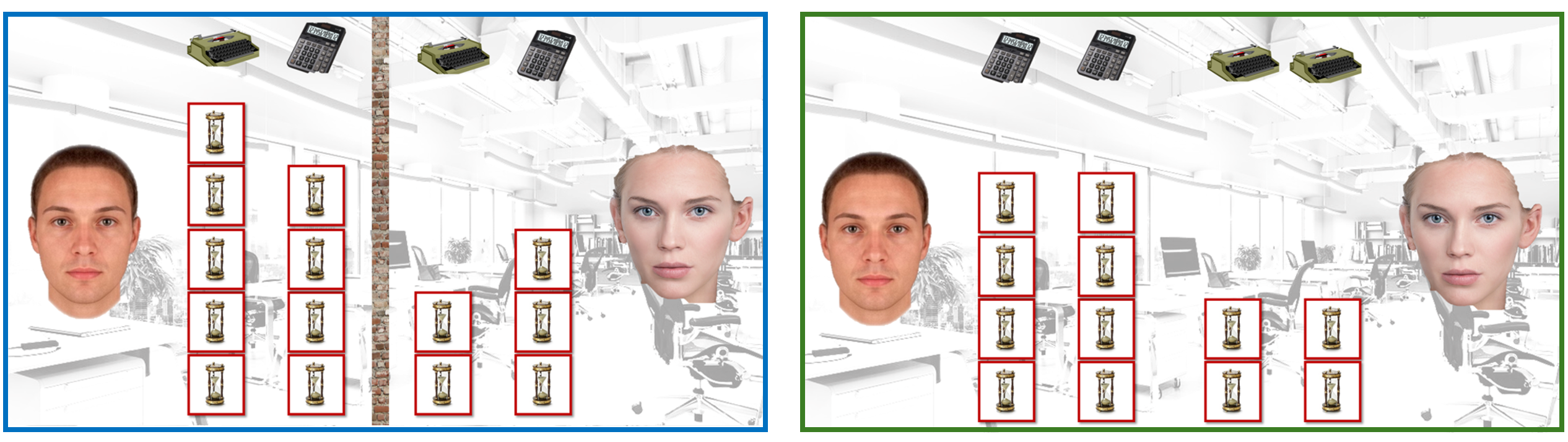
The blue box on the left in the figure above shows what happens when Adam and Eve do not cooperate. The boss tells each employee to write a report and solve a number problem every day. An hourglass in the figure represents one hour. You can see it takes Adam 5 hours to write the report and 4 hours to solve the number problem. Adam therefore has a tough day and goes home after 9 hours. Eve is much more capable than Adam; she can write the report in 2 hours and do the numbers in 3 hours. Eve therefore goes home after only 5 hours.
But is it really best for Adam and Eve to work like this, or could they gain from cooperating? We will soon see that the trick is to split the tasks so that each person does what they are relatively best at. But who is relatively best at something? First think about report writing. Here you know Eve is completely superior; she writes a report in 2 hours while it takes Adam 5 hours. True, Eve is also better with numbers (3 hours vs 4 hours), but it is in report writing that Eve has the extra large advantage. Writing reports is therefore Eve’s comparative advantage. If Eve has a comparative advantage in writing, then by definition Adam’s comparative advantage must be in doing the numbers. Even if Adam is worse than Eve at everything, he is less worse at the numbers than at writing.
absolute advantage is when an individual, firm or country can do something more efficiently than others — that is, with fewer resources; Lionel Messi has an absolute advantage over you at both football and mini‑golf
comparative or relative advantage is when an individual, firm or country can do something at a lower opportunity cost than others; comparing you and Messi, football is his comparative advantage while yours is mini‑golf
If Eve has a comparative advantage in writing, then by definition Adam’s comparative advantage must be in doing the calculations. Even if Adam is worse than Eve at everything, he is relatively less worse at the calculations than at writing.
So what happens when Adam and Eve cooperate by specialising according to their comparative advantages (that is, Adam does both number problems and Eve writes both reports)? The answer appears in the green box in the figure above. Note that total output is exactly the same as before: 2 reports and 2 number problems. The difference is that both Adam and Eve get to go home one hour earlier than when they didn’t help each other. Everyone wins!
2.1 Plan or market?
The theory of comparative advantage says that it is smart to cooperate. The big question now is how this cooperation should come about. We will look at two extremes: the planned economy and the market economy. Let’s start with the planned economy.
The planned economy: The unit for production and allocation
In the autumn of 2028 you are appointed head of the Unit for Production and Allocation, popularly “UPA”. Your task is to organise how all cooperation in Finland should be arranged. First you must decide what should be produced in the country. Which goods and services should exist — and in what quantities? Should we grow 12.57 million litres of strawberries or 12.72? Should toilet paper be produced — and if so how many rolls? Should it be possible to go to a hairdresser and get help with cleaning at home — and if so how large is the need?
You must also decide how all these goods and services will be created. Who should grow the strawberries and who should work at the paper mill? Who should be a hairdresser and who should scrub toilets? Finally, you must also decide for whom all these goods and services should be produced. Who should get the strawberries, the toilet rolls, the haircuts and the cleaning help? Should everyone get exactly the same of everything or do you want a different distribution?

Deciding on all production and allocation in Finland is an, to say the least, challenging task. One way to approach it is to travel around the country to see what people want. Perhaps you then notice long queues outside hairdressers and pallets of toilet paper everywhere that nobody wants. In that case it is a signal that there are too few hairdressers but too much toilet paper. As UPA chief you would then have to quickly reassign some workers from the paper mills and retrain them as hairdressers. And if you notice that people allergic to strawberries have been allocated lots of strawberries while others are outraged at the shortage, then something has gone wrong with the distribution. Most people will surely realise that WHAT, HOW and FOR WHOM are terribly difficult things to decide — and that UPA will often get things wrong.
the planned economy involves centralised production decisions based on political direction rather than market forces, influenced by Karl Marx’s ideas
Example of the planned economy’s challenges:
In the Soviet Union a nail factory was ordered to produce one ton of nails. To maximise the chance of meeting the authorities’ plan, the workers chose to produce only half‑metre‑long, coarse nails of little practical use to ordinary people. The authorities then revised the plan: From now on the factory should produce one million nails. What kind of nails do you think the workers produced then?
The market economy: The price system
In a market economy there is no need for a Unit for Production and Allocation. Instead, it is the price system that determines what should be produced and how it should be allocated. The basic principle for all markets is simple and intuitive: Things that many people want and that are hard to produce tend to be expensive (for example diamond jewellery), while things that fewer people want and are easy to make tend to be cheap (for example bland noodles). And prices in turn determine how much of each good or service is traded.
the market economy is the most common economic system in the world, featuring free competition and pricing based on supply and demand
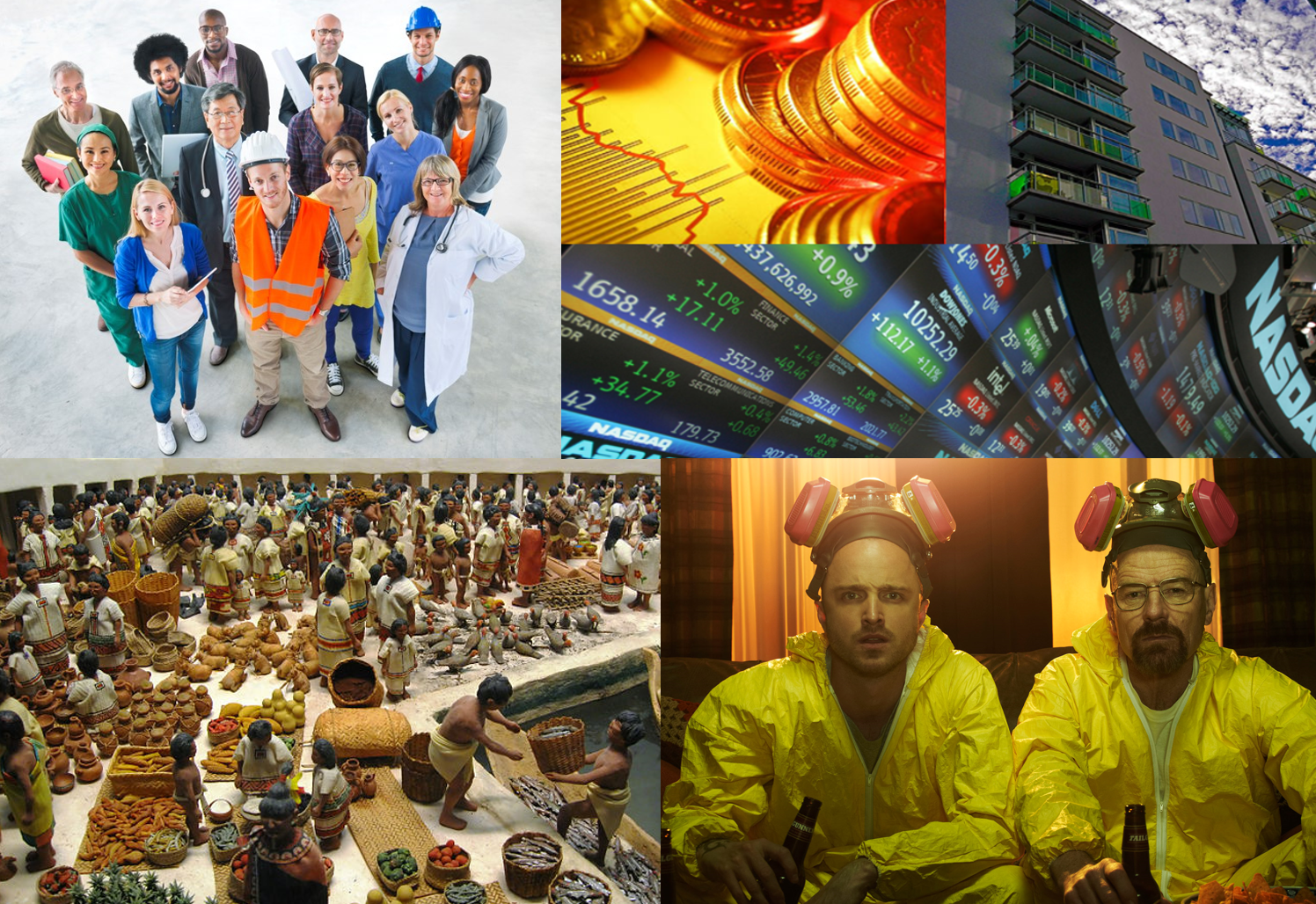
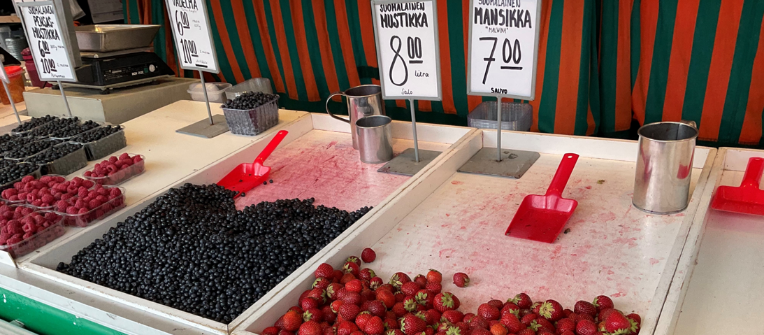
In this chapter you will learn more about how a market works, which is useful because markets are everywhere. You buy strawberries at the Market Square in Turku, you trade stocks on the Helsinki Exchange, you hunt for an apartment on the housing market, you exchange foreign currency on the forex market, you sell your skills on the labour market and you read about drug dealing in dodgy backstreets. We will therefore build a simplified imaginary world that you can use when you want to understand what happens on a market — it does not matter whether what is traded is strawberries, stocks, housing, labour or crystal meth.
the market is a place where buyers and sellers meet to trade
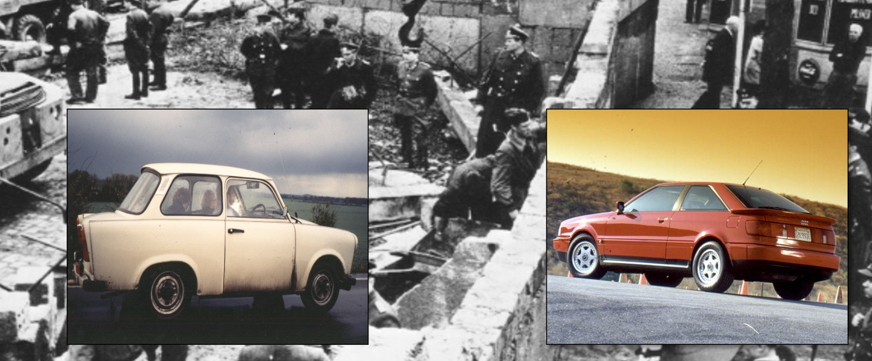
History has shown — again and again — that countries that use markets to decide production and allocation often become much richer than countries where these decisions are made centrally. One example is the division of Germany in 1949 into market‑based West Germany and planned‑economy East Germany. The differences in living standards quickly became striking. But why do countries with markets often become so wealthy? We will now explore that in depth.
2.2 Supply and demand
Let’s look at the market for strawberries at the Market Square in Turku. We know there are two groups: those who want to sell strawberries and those who want to buy strawberries. To understand how much is traded we must first understand how these two groups think.
Think back to the theory of comparative advantage. Eve was relatively best at writing reports. She realised it would be smart for her to specialise in report writing. That let her go home at lunchtime. In the same way there are people whose comparative advantage is growing strawberries. Maybe you’re one of them? Your deep knowledge of strawberry cultivation and your burning passion for berries of all kinds make you perfect for the job — and you’re uninterested and honestly quite bad at anything that isn’t about berries. It’s almost obvious that it would be smart for you to make a living by growing lots of strawberries and use the income from sales to buy everything else you need. In other words: you sell strawberries, the rest of us buy strawberries.
In the table below I’ve listed some factors I think affect how much sellers want to sell and how much buyers want to buy. What do you think — have I missed anything important?
| Factors affecting sellers | Factors affecting buyers |
|---|---|
| Price of strawberries | Price of strawberries |
| Costs (market stall fee, diesel price) | Income |
| Technology (hand‑picking vs. machine) | Taste, weather, fashion |
| Price of alternative goods (juice) | Price of related goods (raspberries vs. cream) |
In the left column of Table 2.1 you see items that are likely to affect the supply of strawberries — that is, how much sellers want to sell. Here I assume sellers want to maximise their profits. That means anything that raises their revenues or lowers their costs should make more people want to sell more.
For example, it currently costs €450 per month to rent a stall at the market. If Turku municipality halved the fee I bet many more would want to sell strawberries. I also think more people would start selling if harvesting became easier — for instance if somebody invented a machine that removes the need to pick by hand.
Similarly there are factors that affect demand — that is, how much buyers want to buy. For example, I guess more Turku residents want to buy strawberries the days after payday, when they still have lots of money left, or if medical studies are published claiming strawberries prevent cancer. Weather surely matters too — the warmer it is, the more people will probably buy strawberries.
In the table there is only one factor that affects both sellers and buyers — namely the price of strawberries. That is why it is especially important to think about how price affects the market. You can imagine that all other factors in Table 2.1 are held constant. Imagine, for example, that it is 1 September 2026 in Turku: the stall fee is €450, strawberries are picked by hand, residents have a median income of €2,482 per month, and it is 26°C.
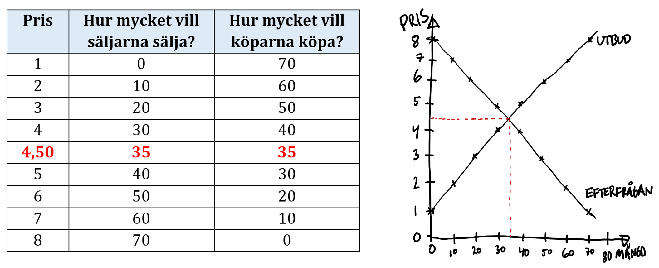
Below I have drawn a table that shows (purely hypothetically) how much sellers and buyers are willing to trade at different prices on such a day. I have also plotted the relationships in a graph.
the demand curve shows how much consumers are willing to buy of a given product at different prices
the supply curve shows how much producers are willing to sell of a given product at different prices
As you can see, I think a higher price for strawberries makes more sellers want to offer them at the market. At a price of €1 per litre nobody wants to sell. But if the price rises to €8, sellers collectively want to sell 70 litres. Conversely, I expect a lower price will attract more customers. If the price is €8 per litre nobody wants to buy, but if the price is €1 per litre people in Turku want to buy a total of 70 litres.
Notice that something magical happens at the price of €4.50 per litre: Right here sellers want to sell exactly as much as buyers want to buy. The remarkable thing is that the market automatically moves toward this so‑called equilibrium price. How is that possible? Imagine the price instead was €3. At that low price people in Turku want to buy 50 litres of strawberries, but sellers are only willing to sell 20 litres. What do you think happens to the price of something that many people want but that is scarce? Sellers realise they can charge more — and the price is pushed up as if by an invisible hand.
If the price were €6 per litre the opposite would happen: now there are lots of strawberries for sale at the market but people in Turku are not very interested. To get rid of the surplus, sellers must cut the price. So who really decides that strawberries at the Market Square should cost exactly €4.50 per litre? The answer is NO ONE. Instead the price is determined by the interaction of what all sellers and buyers do. Market forces are all of us acting together.
the price mechanism is one of microeconomics’ core principles; the idea is that price guides firms’ production decisions: firms produce what consumers are willing to pay for
the market price is the price formed on a market as a result of supply and demand
the invisible hand is the idea that individuals’ selfish actions in a free market lead to the best possible economic outcome for society as a whole; coined by economics’ founder Adam Smith (1723–1790)
Remember that this analysis showed how much is traded given that all other things in Table 2.1 are held fixed. We assumed, for example, that the stall fee was €450 and that it was 26°C. Under those conditions our model predicts 35 litres traded at €4.50.
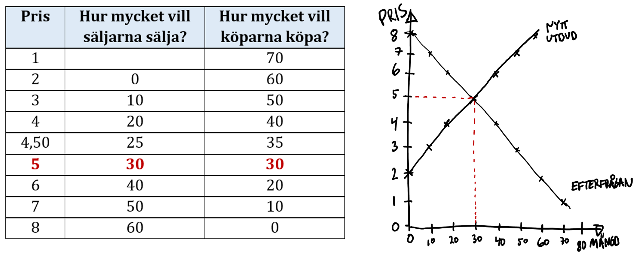
But what happens in our simplified imaginary world if Turku suddenly hikes the stall fee to €2,000? To figure that out you must redraw how sellers and buyers behave when the stall fee is €2,000. I have sketched such a scenario here:
What does it mean that the demand curve slopes downwards? It means that if you lower the price, more people will want to buy what you sell. This is almost always the case — and that’s why we call it the law of demand. Conversely, the law of supply says the supply curve slopes upwards: more people tend to want to sell when they are paid more.
The trick is first to think about which side is affected directly by the higher fees. It should affect the sellers, right? And the higher fee should make fewer people want to sell strawberries at the market. The fee shock will probably scare some sellers off the market — so fewer strawberries will be offered than before.
At the original equilibrium price of €4.50 customers now want to buy more (35 litres) than sellers want to sell (25 litres). The battle for berries will push the price up to a new equilibrium, where again buyers want to buy exactly as much as sellers want to sell. Our prediction is therefore that higher stall fees make strawberries more expensive and reduce the quantity sold (in the table and figure the result is now 30 litres sold at €5 per litre).
Once you understand this principle you can show the whole analysis in one figure. Make it a habit to always help the reader understand what happens in the figure. Don’t forget to check that your conclusion feels intuitively reasonable. Here is how you can present your analysis:
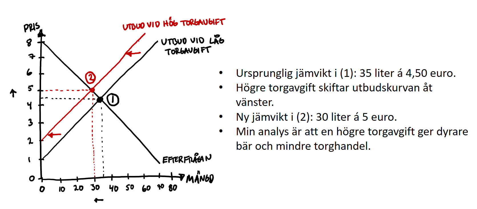
A common mistake is to confuse when you should move along a curve and when an entire curve should shift. Think of it this way: If the price changes you move along the curve. If something other than price changes that affects how sellers or buyers behave, then you shift the curve that is affected.
Summary checklist:
- Are the sellers or the buyers affected directly by the change? (The other group will be affected indirectly through price adjustments, but first identify which group is directly affected.)
- Does the change make the affected side want to trade more or less? If more, shift the curve to the right; if less, shift the curve to the left.
- Read off the new equilibrium. Is the price higher or lower than before? Is the quantity traded greater or smaller than before?
2.3 Plotting and measuring relationships
Now you know something about how to analyse a market in theory. The intuition is fairly simple: things that many people want and that are hard to produce tend to be expensive. But how does this work in practice? How do you actually draw a graph and how do you know what the relationship looks like in reality? In the two boxes below you learn how to draw a graph and how you can practically measure relationships.
econometrics is the use of statistical methods to study economic phenomena
How to draw
Economists are experts at analysing relationships. We want to find out how different things in life hang together. For example: how much higher pay do you typically get with a master’s degree compared with only a bachelor’s? What happens to crime if you deploy more police to a troubled area? How much does car travel fall if the price of petrol rises? We can investigate all this — and it is often easier than many think. Before we go out into the world to measure these relationships, however, it is important that you know how to draw a graph and how to interpret the line in a graph. Economists love to draw graphs, so it’s worth spending a few minutes learning how. Let’s therefore look at a concrete example from your own life: how does your blood‑alcohol concentration depend on how many strong beers you drink? In the figure below I have sketched a plausible relationship:
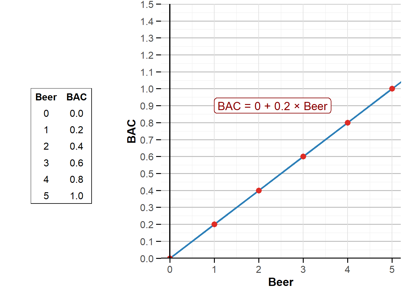
First look at the expression \(\small\text{BAC} = 0 + 0{.}2 \times \text{Beer}\). Here you see how your blood‑alcohol concentration depends on how many beers you have drunk. If you have drunk 0 beers, the formula says the breathalyser will read 0 BAC, because \(\small\text{BAC} = 0 + 0{.}2 \times \text{0}\) equals 0. If you have drunk 1 beer you have 0.2 BAC, because \(\small\text{BAC} = 0 + 0{.}2 \times \text{1}\) equals 0.2. In the table on the left I have also written your BAC if you drink 2, 3, 4 or 5 beers. I have plotted the relationship in a figure. I have therefore marked each combination from the table and drawn a straight line through the red points. That the line slopes upward means — unsurprisingly — that more strong beers raise your BAC.
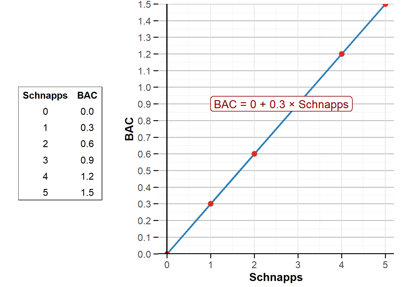
Now do the exact same exercise for the relationship between the number of schnapps and your BAC. Can you, using the relationship \(\small\text{BAC} = 0 + 0{.}3 \times \text{Schnapps}\), draw the corresponding table and figure? Do this on paper with pen — then click on the answer button below to check whether you got it right.
Running a regression
But where did the expression \(\small\text{BAC} = 0 + 0{.}2 \times \text{Beer}\) you were given in the example come from? And how do we ever know what any relationship actually looks like? Economists always go out into the world to measure how relationships appear in practice. Imagine, for example, that you wander around with a breathalyser at Oktoberfest in Munich, the world’s largest beer festival. Over the course of an hour you interview 13 visitors. You record your collected data in a table and plot them in a figure:
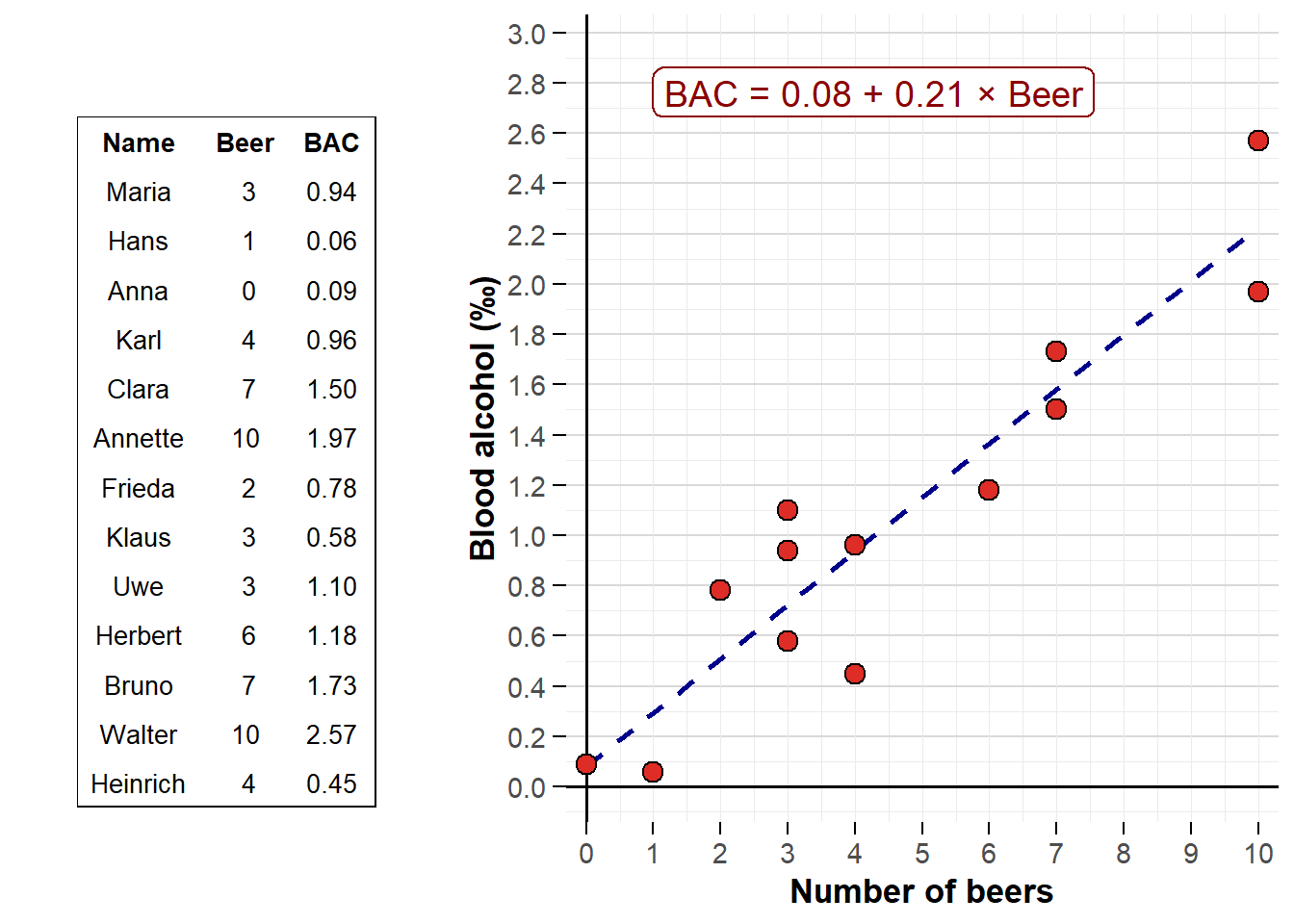
Each red dot in the figure corresponds to an individual. In the top right you can see the point labelled “Walter”, who has just drunk 10 strong beers and has a frightening BAC of 2.57. The dashed blue line is the computer’s attempt to summarise as well as possible how BAC typically looks depending on the number of beers consumed. You can imagine that the computer — using an advanced statistical technique called regression analysis — places the line so that it best summarises the relationship between beer and BAC. In this case the equation \(\small\text{BAC} = 0.08 + 0{.}21 \times \text{Beer}\) is our best guess for how drunk people get from drinking beer. In reality, each extra strong beer appears to raise BAC by about 0.21. Using this technique you can measure many interesting relationships yourself to learn more about how the world works.
The relationship between clicks and exam results
In Section 1 I claimed that the key to succeeding in your studies is active studying. But is that really true? Let’s use course data from Åbo Akademi: is it true that successful students study more actively than students who perform worse? This figure shows actual data from students who took this course in autumn 2023 (I have used fake names to avoid identifying anyone):
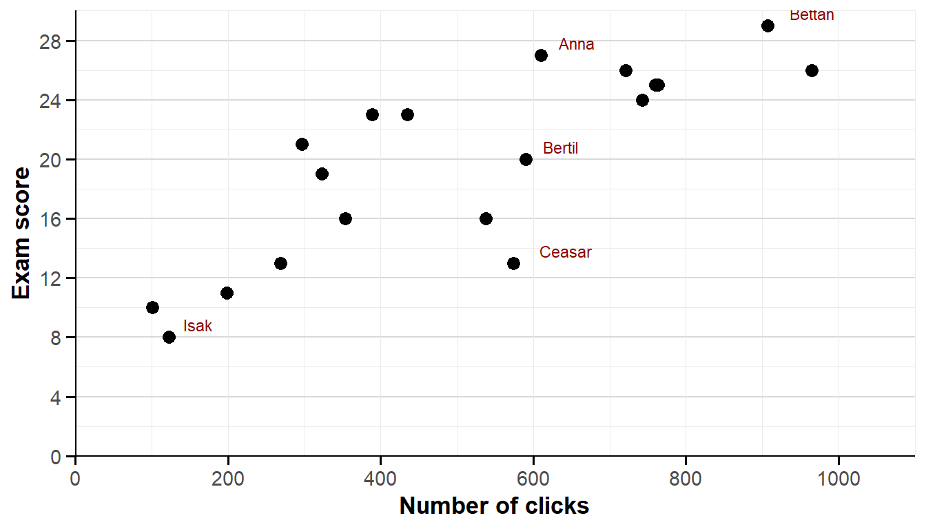
On the horizontal axis you can see how many times each student clicked on the course site in Moodle. Teachers can see exactly in the system what you looked at and when — so this can serve as our measure of how active participants were in the course. On the vertical axis you see how many points the student scored on the end‑of‑course exam.
There does seem to be a relationship. Broadly speaking, students with many clicks tended to do better. For example, Bettan was the second most diligent in the course: she clicked almost 1,000 times on various documents and finished top of the class with 29 points out of 30. Isak, on the other hand, clicked fewer than 100 times — and managed only 8 points.
But how can I describe this relationship more precisely than “the more you click, the better you do”? Exactly how many points can you expect to get if you don’t click at all — and exactly how many extra points does one additional click typically generate? The computer can help us answer all of this. You can imagine we ask the computer to fit a line in the figure that captures the relationship as well as possible. I have done that in the figure below:
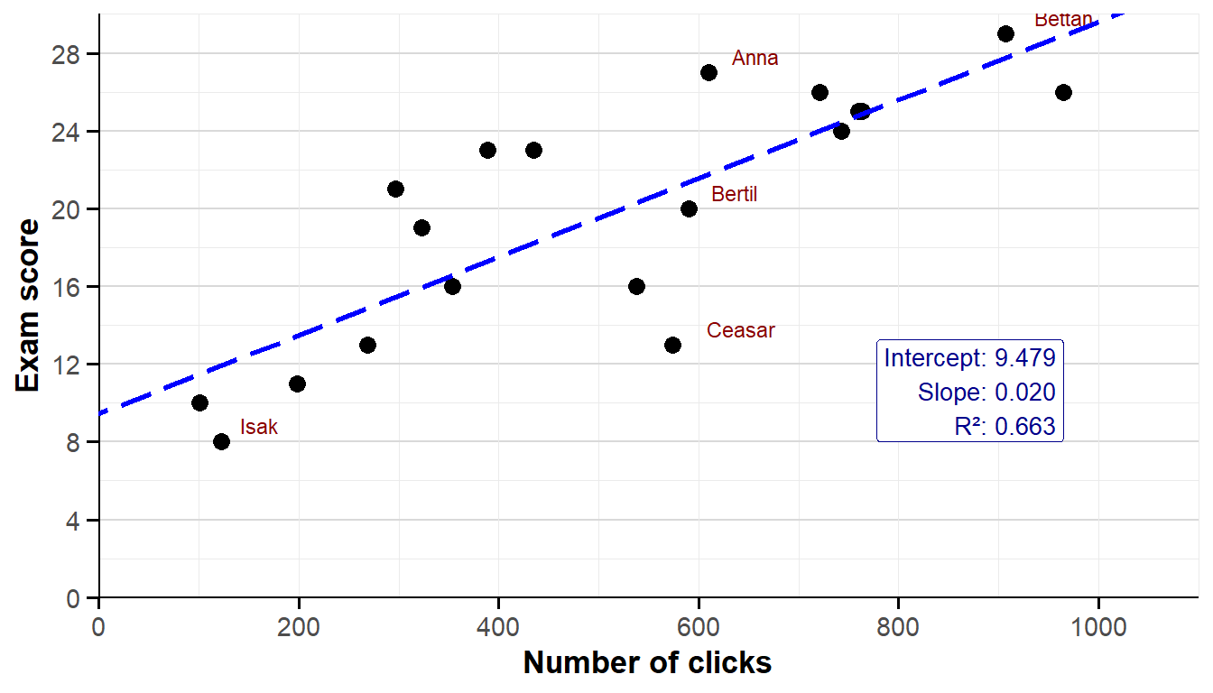
Look first at the dashed blue line in the figure. This is the computer’s estimate of the relationship between number of clicks and exam score. The line slopes upwards, which means that students with many clicks on average did better on the exam than students who were less active. In the bottom right of the figure the computer also gives us some additional details about the relationship between clicks and exam score.
An intercept shows where a line crosses the vertical axis. In this case the intercept was 9,479. This means that a student with 0 clicks, according to the computer, can be expected to score 9,479 points on the exam. The slope of the line is 0,020, which means each additional click is expected to increase your exam points by 0,020 points. So the relationship can be summarised as follows:
\[ \small\text{Exam score} = 9,479 + 0,020 \times \text{Number of clicks} \]
Using the formula you can now make a prediction for how students will perform in the course. Do you have a friend who’s said they will never visit the course site? The formula predicts that they will likely score 9,479 points and thus fail the course. But they can improve their chances by studying more; each additional click is expected, according to the computer, to add 0,020 points. If they click, say, 800 times, the formula predicts they will score just over 25 points out of 30.
You can also see in the figure that the relationship is not perfect. Look, for example, at the students Anna, Bertil and Ceasar. All three were roughly equally active during the course, at least in terms of clicks. According to the formula they should therefore all have scored about 22 points on the exam. In reality Anna scored 27, Bertil 20 and Ceasar only 13. Anna did unexpectedly well and Ceasar unexpectedly poorly. So it isn’t only the number of clicks that affects your success. Maybe Anna has an excellent study technique? Maybe Ceasar’s prior knowledge from upper secondary school is weaker?
How strong the relationship between clicks and exam results is depends on how close Anna, Bertil, Ceasar and the other students lie to the dashed line. If everyone lay exactly on the line the relationship would be perfect. In that case the relationship would be one hundred percent and the so‑called R² would be 1. If the students were instead randomly scattered in the plot there would be no relationship between clicks and exam results — and the R² would be 0. As you can see in the figure, the R² in this case is 0,663. That means the number of clicks can explain just over 66 per cent of how students perform on the exam. Being active is therefore a strong predictor of how you will do in this course. There are other explanations, but your own activity seems to be the key — at least for an introductory economics course at Åbo Akademi in autumn 2023.
We have now measured the relationship between clicks and exam results. You can use exactly the same technique to measure any other conceivable relationship in the world. During the course seminars you will get to try these methods yourself using Excel.
Exercises
In this chapter you learned to analyse a market using supply and demand. You also learned how to measure how two variables are related. Below you will use your knowledge to analyse situations in several different markets. Press Show Answers when you want the computer to grade your responses. If you want to see immediately whether your answer is right or wrong, press Show Answers before you start the exercises. Good luck!
The model of supply and demand
The table below shows how much firms are willing to supply and how much customers are willing to buy at different prices:
| Pris (€) | Utbjuden mängd | Efterfrågad mängd |
|---|---|---|
| 0 | 100 | |
| 5 | 0 | 75 |
| 10 | 12,5 | 50 |
| 15 | 25 | 25 |
| 20 | 37,5 | 0 |
- Transfer the information from the table above into your own graph, with price on the vertical axis and quantity on the horizontal axis. Plot the curves and mark which is the supply curve and which is the demand curve. The equilibrium price is and the quantity sold is .
- Explain to yourself, in your own words, why the market price does not end up at 10.
- Explain to yourself, in your own words, why the market price does not end up at 20.
- If consumers suddenly want to buy more at each price (for example because their incomes rise), then the demand curve should and the supply curve should , which together makes the price and sales .
- If firms suddenly want to supply more at each price (for example because they find smarter ways to work), then the demand curve should and the supply curve should , which together makes the price and sales .
- In recent years the number of haircuts in Turku has increased while the price of a haircut has fallen sharply. Is this caused by increased demand or increased supply? Answer:
- Explain to yourself, in your own words, why a small city apartment is often much more expensive than a large countryside villa.
- In Figure 2.2 Adam and Eve themselves decided how to split the work between them. That way Eve could go home after 4 hours and Adam after 8 hours. How long would their workdays be if the boss unilaterally decided that Adam must write the reports and Eve must solve the number problems? Answer: Adam works , Eve works .
- Do this at least once so you understand how it works. Remember to mark clearly that price is on the vertical axis and quantity on the horizontal. Also show which curve is supply and which is demand. Common labels are “P” (Price), “Q” (Quantity), “S” (Supply) and “D” (Demand).
- Look at the table or the graph to see how much sellers want to supply at price 10 and how much buyers want to buy. What happens when there is a shortage of something?
- Look at the table or the graph to see how much sellers want to supply at price 20 and how much buyers want to buy. What happens when there is a surplus of something?
- Think about which side is directly affected by the change.
- Always check that your results feel intuitively reasonable. In this question production suddenly became cheaper for firms, so it is logical that the market price will fall.
- Draw a supply–demand diagram. Then test what happens to price and quantity when demand increases and, separately, when supply increases.
- It’s probably about supply and demand. Maybe more people want to live in the city (higher demand), which pushes up prices. It can also be caused by a small housing supply in the city.
- Adam would have to work 10 hours and Eve 6 hours.
The electricity market
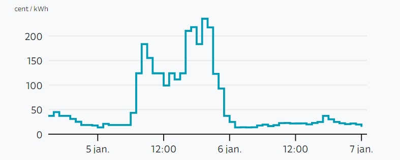
The price of electricity varies a lot. The chart below shows what electricity cost on some days in early January 2022. If you heated the sauna on the evening of 5 January the cost was €16.46, while it was only €0.97 if you waited until early the next morning. What electricity costs is determined by supply and demand. Analyse how the following factors affect the price of electricity. It helps to draw the supply and demand curves in your own diagram.
- The Olkiluoto 3 nuclear plant shutting down for repairs likely leads to .
- The temperature falling to −40°C on a winter day likely leads to .
- The state building more wind farms likely, at least in the long run, leads to .
- A major industrial strike likely leads to .
- If the EU, in protest against Russia’s war in Ukraine, stops imports of Russian gas, this likely leads to .
- Millions of Finns using the sauna on Fridays at 18–19 likely leads to .
- A sudden storm that allows wind farms to produce extra electricity likely leads to .
- More Finns switching from electric saunas to wood‑fired saunas likely leads to .
- More Finns turning up the heating radiators likely leads to .
- Finns returning to work after the holidays likely leads to .
Tip for these kinds of exercises: actually draw a supply–demand diagram. Then think about whether the change in each question directly affects producers or consumers. That is the curve you should shift — shift it right if they want to trade more and left if they want to trade less.
The market for second‑hand comic books
My old childhood comics have become a goldmine, but prices vary wildly between issues and over time.
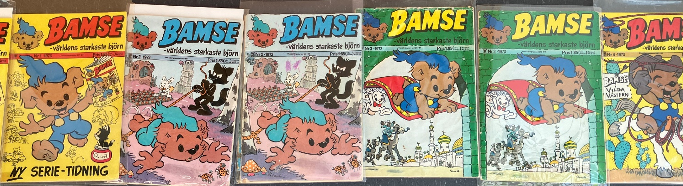
- The very first issue of Bamse, No. 1 from 1973, now costs about €3,500. What do you think is the most likely explanation for this particular issue being so expensive? .
- The release of issue No. 10 from 1974 was problematic, so only half as many copies were printed as normal. The price of this issue will therefore likely be .
- Suppose interest in buying second‑hand comics suddenly falls. In a supply‑and‑demand diagram this is illustrated by the demand curve and the supply curve , which together make the price and sales .
- Suppose the country’s biggest Bamse collector suddenly dies and his widow puts the entire collection on the market. This is illustrated by the demand curve and the supply curve , which together make the price and trading in second‑hand Bamse issues .
- There are probably two explanations: many people want to buy this issue (high demand) and at the same time very few collectors are willing to put it on the market (low supply). Both effects contribute to the issue being expensive.
The taxi market
In this exercise you will analyse how three different shocks affect the taxi market. Draw three separate supply‑and‑demand diagrams. Then think about how each shock affects the market: which curve shifts — demand or supply — and in which direction? Finally, read off from each diagram what happens to the price and the quantity traded.

- If bus fares rise sharply, taxi rides will become and the number of taxi trips will because the for taxis shifts to the right.
- If the municipality introduces congestion charges on private cars, taxi rides will likely become and the number of taxi trips will .
- If the allowed parking time with a parking disc is increased to 4 hours, taxi rides will likely become and the number of taxi trips will .
1–3. In this exercise I assumed that buses and taxis are substitutes — that is, you can replace one with the other. So when the bus gets more expensive it’s likely that more people will take taxis. Similarly, I assumed taxis and private cars are substitutes, so when private‑car use is made harder, demand for taxis increases. 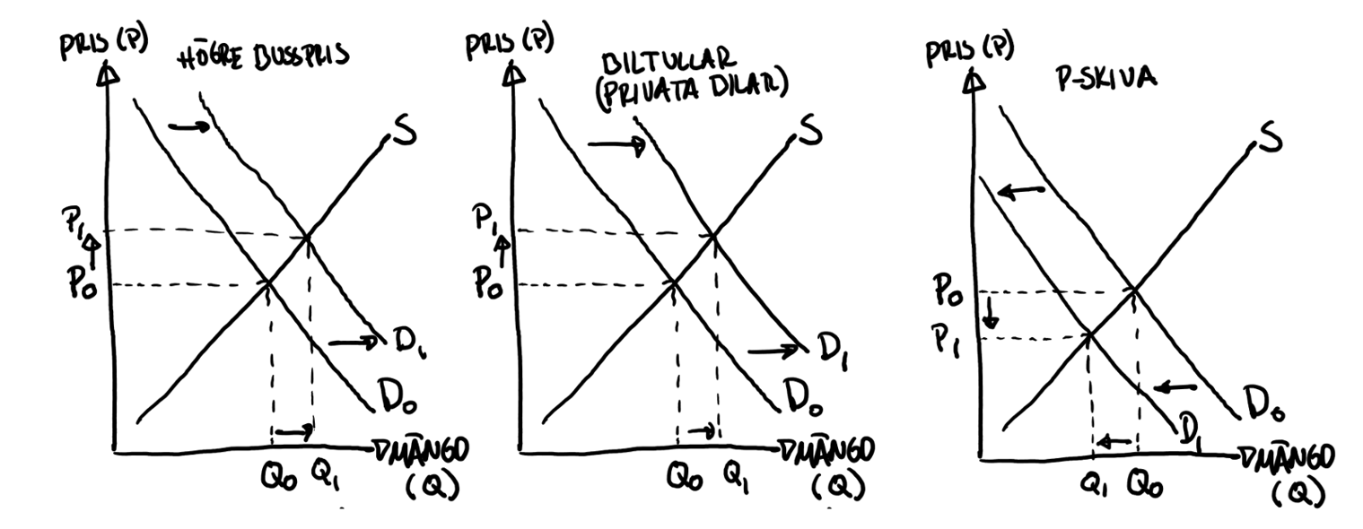
The pizza market
Here you will see what happens in the pizza market in Turku. Remember it’s easier if you draw the supply and demand curves.

- More expensive tomatoes make pizzas and the number of pizzas sold .
- A large price collapse for kebab likely makes pizzas and the number of pizzas sold .
- Stricter environmental regulations for pizzerias likely make pizzas and the number of pizzas sold .
- Seven Italian pizza masters move to Turku. A likely effect is that pizzas become and the number of pizzas sold .
- Higher incomes in the population will likely make pizzas and the number of pizzas sold .
1–5. Remember to always draw supply and demand. Try to mark as clearly as possible in the diagram where we started and where we end up. 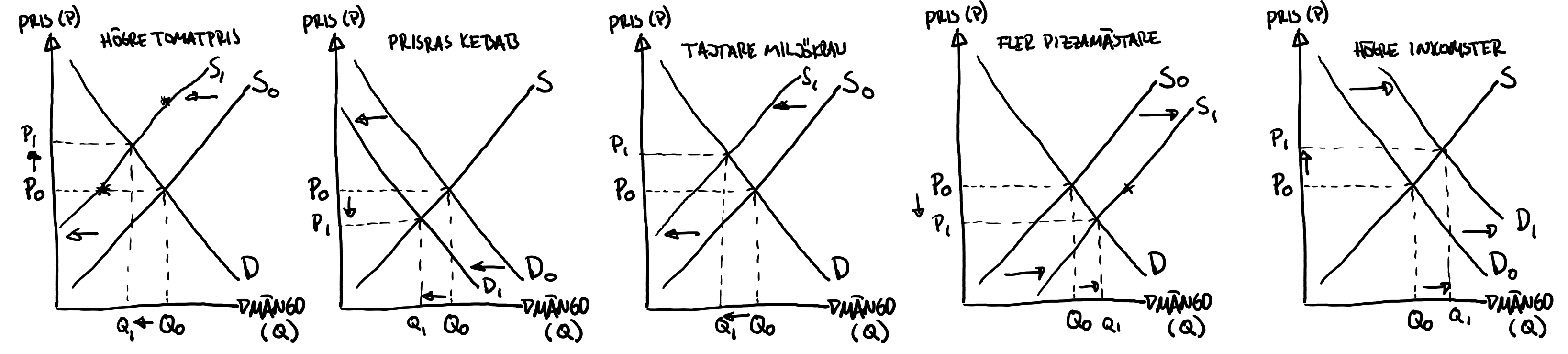
In the last question I assumed that higher incomes make more people want to buy pizza. As we will see in the next chapter, it is not always true that higher income makes you want more of a given product. For example, as a cash‑strapped student you probably eat a lot of instant noodles, but you will likely eat fewer of them in a few years when your income is higher.