6 More on decision making
(where you analyse in detail how consumers and firms make decisions)
In previous chapters we noted that individuals try to make their lives as good as possible. In this chapter we will delve deeper into what that actually means. We can use these insights to analyse different situations where people make decisions. Here we focus on two specific aspects: 1) consumer behaviour and 2) firm behaviour.
6.1 How does the consumer choose?
Let’s begin by understanding how consumers act: what do they buy and why? To gain deeper insight into consumer choices we need to get familiar with two central concepts: utility and the budget constraint. We will go through them one at a time:
Utility: More is better
We have assumed that people choose what makes their lives better. In economic terms we say individuals seek to maximize their utility. To understand utility imagine you want to climb the Matterhorn. The higher you climb, the more satisfied you become. However, there are many points on the mountain that are exactly the same height above sea level. Look, for example, at the curve at the bottom of the figure below:
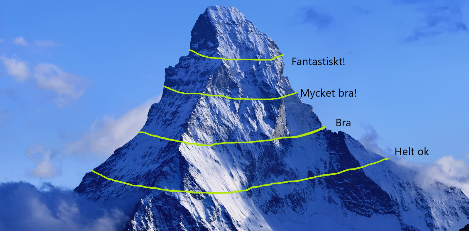
At every point along this curve you are exactly 2,832 metres above sea level, which means you feel equally satisfied at all those points. In this scenario you think life is “just OK.” If, instead, you are at 3,100 metres you experience life as “good,” and if you climb even higher you feel even more satisfied with your achievement.
The same applies to consumption. Think of two goods, say beer and lunches out. There are probably infinitely many combinations of these goods that make you feel “just OK.” Perhaps you feel “just OK” if each month you drink 3.32 beers and eat 2.19 lunches, but the combination “2.54 beers and 2.98 lunches” gives you exactly the same utility. Those two combinations therefore lie on the same indifference curve — they give you the same pleasure (in this case: “just OK”). To reach a higher utility level — “to climb higher up the mountain” — you must increase your consumption. For example, “9 beers and 5 lunches” might be a combination that makes you feel “fantastic.”
Now look at the figure below. On the far left you see our mountain, with two axes added. One axis represents the number of beers and the other shows the number of lunches. The mountain’s height represents your utility. You can see that your utility level is higher when you consume many beers and many lunches compared with when you get only a few beers and a few lunches.
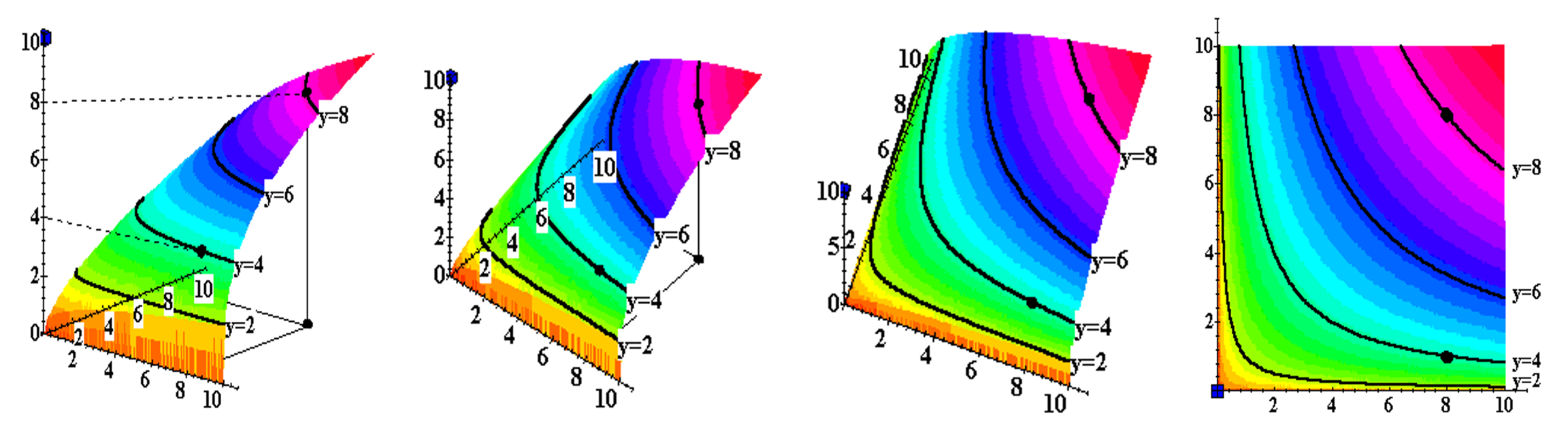
But thinking in three dimensions is hard. To make it easier to understand, imagine we “flatten” the mountain into a two‑dimensional plane. I have illustrated this above. When you’re done you end up in the picture on the right. Here you see the mountain in two dimensions, just like a map with contour lines. The axes still show quantities of each good, while the curves show utility levels for different combinations of beer and lunches.
Budget constraint: Money puts a limit
What prevents us from consuming everything we ever dreamed of? Our wallet. To understand an individual’s consumption decision we therefore also need to know what she can afford. This is determined by her income and the prices of beer and lunches.
One way to understand the so‑called budget constraint is via this thought experiment: Take your income and ask how many beers you can afford if you spend all your income on beer. If, for example, your income is €500 and a beer costs €5, you can buy 100 beers (and no lunches) if you spend everything on beer. Plot that combination as a point in a diagram whose axes represent beers and lunches. If instead you spend your entire income on lunches, and a lunch costs €10, you can buy 50 lunches (and no beers). Plot that combination as well. Finally draw a straight line between the two points — you have now drawn your budget constraint. The budget constraint therefore shows which combinations of beers and lunches you can afford.
an indifference curve shows all combinations of two goods or services that give the same utility or satisfaction
the budget constraint shows all combinations of two goods or services you can afford to buy
Consumer choice: Picks “the best possible”
Now you are ready to forecast a consumer’s buying behaviour. We assumed the consumer wants as much as possible, but is constrained by her budget. Our challenge is therefore to find the combination that gives the individual the highest possible utility. The figure below makes this easier to see. I have set the app to initially show a situation where beer costs €5, lunch €10 and the individual’s income is €280. I have also assumed that this person values beer and lunch equally.
Consumer’s choice.
Play with incomes, prices and preferences until you understand how it all fits together.
#| standalone: true
#| viewerHeight: 1100

if (!requireNamespace("shiny", quietly = TRUE)) install.packages("shiny")
if (!requireNamespace("shinylive", quietly = TRUE)) install.packages("shinylive")
if (!requireNamespace("ggplot2", quietly = TRUE)) install.packages("ggplot2")
if (!requireNamespace("plotly", quietly = TRUE)) install.packages("plotly")
if (!requireNamespace("scales", quietly = TRUE)) install.packages("scales")

library(shiny)
library(ggplot2)
library(plotly)
library(scales)

# Helper for consistent formatting
fmt <- function(x) comma(x, accuracy = 0.01, decimal.mark = ".", big.mark = ",")

# Fixed bounds
income_min <- 160
income_max <- 400
price1_min <- 3   # beer
price1_max <- 7
price2_min <- 8   # lunch
price2_max <- 12

x_fixed_max <- income_max / price1_min
y_fixed_max <- income_max / price2_min

ui <- fluidPage(
  titlePanel(""),
  sidebarLayout(
    sidebarPanel(
      sliderInput("income", "Individual's income (€):", min = income_min, max = income_max, value = 280),
      sliderInput("price1", "Price of beer (€):", min = price1_min, max = price1_max, value = 5, step = 0.1),
      sliderInput("price2", "Price of lunch (€):", min = price2_min, max = price2_max, value = 10, step = 0.1),
      sliderInput("alpha", "Preferences (alpha): 0 = cares only about lunch, 1 = cares only about beer:", min = 0, max = 1, value = 0.5),
      h4("Optimal quantity of beer:"),
      verbatimTextOutput("optimal_x"),
      h4("Optimal quantity of lunch:"),
      verbatimTextOutput("optimal_y")
    ),
    mainPanel(plotlyOutput("plot"))
  )
)

server <- function(input, output) {
  output$plot <- renderPlotly({
    income <- input$income
    price1 <- input$price1
    price2 <- input$price2
    alpha <- input$alpha
    beta <- 1 - alpha

    budget_line <- data.frame(x = c(0, income / price1), y = c(income / price2, 0))

    safe_alpha <- ifelse(alpha == 0, 1e-6, ifelse(alpha == 1, 1 - 1e-6, alpha))
    safe_beta <- 1 - safe_alpha

    optimal_u <- (income * (safe_alpha ^ safe_alpha) * (safe_beta ^ safe_beta)) / (price1 ^ safe_alpha * price2 ^ safe_beta)
    indiff_curve <- function(x) (optimal_u / (x ^ safe_alpha))^(1/safe_beta)

    higher_u <- optimal_u * 1.2
    higher_indiff_curve <- function(x) (higher_u / (x ^ safe_alpha))^(1/safe_beta)

    lower_u <- optimal_u * 0.8
    lower_indiff_curve <- function(x) (lower_u / (x ^ safe_alpha))^(1/safe_beta)

    x_vals <- seq(0.1, x_fixed_max, length.out = 300)
    indiff_data <- data.frame(x = x_vals, y = indiff_curve(x_vals))
    higher_indiff_data <- data.frame(x = x_vals, y = higher_indiff_curve(x_vals))
    lower_indiff_data <- data.frame(x = x_vals, y = lower_indiff_curve(x_vals))

    equilibrium_x <- (alpha * income) / price1
    equilibrium_y <- (beta * income) / price2
    equilibrium_lines <- data.frame(x = c(0, equilibrium_x, equilibrium_x), y = c(equilibrium_y, equilibrium_y, 0))

    p <- ggplot() +
      geom_line(data = budget_line, aes(x = x, y = y), color = "blue", size = 1) +
      geom_line(data = indiff_data, aes(x = x, y = y), color = "red", size = 1) +
      geom_line(data = higher_indiff_data, aes(x = x, y = y), linetype = "dashed", color = "darkgreen", size = 0.9) +
      geom_line(data = lower_indiff_data, aes(x = x, y = y), linetype = "dashed", color = "purple", size = 0.9) +
      geom_line(data = equilibrium_lines, aes(x = x, y = y), linetype = "dashed", color = "black", size = 0.8) +
      geom_point(aes(x = equilibrium_x, y = equilibrium_y), color = "black", size = 2) +
      labs(x = "Beer", y = "Lunch") +
      scale_x_continuous(
        limits = c(0, x_fixed_max),
        breaks = pretty_breaks(n = 6),
        labels = number_format(accuracy = 0.1, decimal.mark = ".", big.mark = ",")
      ) +
      scale_y_continuous(
        limits = c(0, y_fixed_max),
        breaks = pretty_breaks(n = 6),
        labels = number_format(accuracy = 0.1, decimal.mark = ".", big.mark = ",")
      ) +
      coord_cartesian(xlim = c(0, x_fixed_max), ylim = c(0, y_fixed_max), expand = FALSE) +
      theme_minimal() +
      theme(
        panel.grid.major = element_line(color = "gray90"),
        panel.grid.minor = element_blank(),
        axis.line = element_line(color = "black", size = 0.8),
        axis.ticks = element_line(color = "black", size = 0.8),
        axis.text = element_text(color = "black"),
        axis.title = element_text(size = 12, face = "bold")
      )

    ggplotly(p) %>%
      layout(margin = list(l = 60, b = 60),
             xaxis = list(tickformat = ",.1f"),
             yaxis = list(tickformat = ",.1f"))
  })

  output$optimal_x <- renderText({
    x_star <- (input$alpha * input$income) / input$price1
    fmt(round(x_star, 2))
  })

  output$optimal_y <- renderText({
    beta <- 1 - input$alpha
    y_star <- (beta * input$income) / input$price2
    fmt(round(y_star, 2))
  })
}

shinyApp(ui = ui, server = server)
Do you understand what’s happening in the figure? I’ve drawn three indifference curves — combinations of beer and lunches that give the person the same utility. Of the three, the person would prefer to be on the green curve because it allows slightly more consumption than the red curve and considerably more than the purple one. The blue line — the budget line — shows what the person can actually afford. You can see immediately that the person cannot reach the green utility level; the money simply isn’t enough. However, she can just reach the red utility level. She attains that utility by buying 28 beers per month and 14 lunches. She cannot reach a higher point on the mountain because no other affordable combination of goods gives her greater utility than this one.
Now you can experiment in the app by moving the sliders. You can, for example, derive the person’s demand for beer. You already know this person wants 28 bottles of beer when beer costs €5, but how many will she want if beer becomes cheaper or more expensive? Play with the app and fill in the boxes in the table below. I’ve helped you by filling in some of the cells. Change the price of beer only — do not alter income or her preferences. When you’ve filled in the middle column of the table you can plot the relationship in a chart with price on the vertical axis and quantity of beer on the horizontal axis, as usual.
| Beer price (€) | Quantity demanded at income €280 | Quantity demanded at income €300 |
|---|---|---|
| 7 | 20 | |
| 6,5 | ||
| 6 | 25 | |
| 5,5 | ||
| 5 | 28 | |
| 4,5 | ||
| 4 | 35 | 37,5 |
| 3,5 | ||
| 3 |
As you can see, a lower beer price makes the individual want to buy more beer. This is precisely the law of demand we encountered in earlier chapters. Now repeat the exact same exercise, but first raise the individual’s income to €300. Do you now see that a higher income shifts the demand curve to the right? You can of course also adjust the person’s preferences — for example make her less crazy about beer.
Advanced note: Note that the person in the app always spends a constant share of her income on beer. This implies the price elasticity is roughly −1 (price up 1% → quantity down 1%) and the income elasticity is roughly +1 (income up 1% → quantity up 1%). This follows from assuming so‑called Cobb–Douglas preferences, which yields a simple model that often fits reality reasonably well.
In an exercise at the end of the chapter you will use this technique to derive the total demand for beer across all 200 course participants. If you take more advanced economics courses you will learn to work with these methods in greater depth. Here are some examples of situations where this method is very useful:
Price analyst at Citymarket: You want to study how customers choose between eco‑friendly and less eco‑friendly options. What happens to sales patterns if you lower the price of the green alternatives? How are customers with different incomes affected?
EU official in Brussels: EU politicians plan a new petrol tax to reduce emissions. How would a higher petrol price affect consumers’ choices between petrol and other goods? How much additional income would a consumer need to remain at the same utility level as before the tax? How much would the consumer be willing to give up to avoid the tax?
Municipal politician in Turku: You want to remove the subsidy for children’s glasses. How would such a reform affect purchase decisions among families with children and their welfare?
Marketing director at a large firm: You must decide how to allocate the marketing budget between digital marketing (Google Ads, social media) and traditional advertising (TV, radio, newspapers) to maximise the firm’s payoff. How much should you invest in each channel? How would you change your allocations if digital marketing suddenly became 10% more expensive or if your budget were halved?
6.2 How does the firm choose?
There are almost 300,000 firms in Finland, most of them small. Now we will examine in more detail how these firms act. For example: why does an entrepreneur choose to sell strawberries at the market? How much do they want to sell? And how is the firm affected by fees and taxes? To understand firms’ decisions we will again build a simple model that helps us predict firm behaviour in different situations.
As usual we assume people are rational and choose the path through life that makes life as good as possible. But what does “as good as possible” mean for a firm owner? Here we assume that the entrepreneur seeks to maximise profit. Do you think this is a reasonable assumption? Bear in mind that many entrepreneurs are driven by motives other than profit—creating excellent products, employing many people, running a family business, contributing to society, providing a good workplace, or making customers as happy as possible. Many of these objectives are closely linked to profit, but remember this assumption can be criticised.
Profit is, by definition, the difference between revenue and costs. To understand firm behaviour we therefore need to understand their revenues and costs. Let’s begin with costs!
The firm’s costs
Imagine you run a firm that makes shirts. You use two factors of production: labour and capital. The more workers and the more capital you employ in your factory, the more shirts you will probably produce.
factors of production are the inputs needed to produce goods and services, for example labour, capital and natural resources
capital is a man‑made factor of production, such as machines, buildings, vehicles and roads
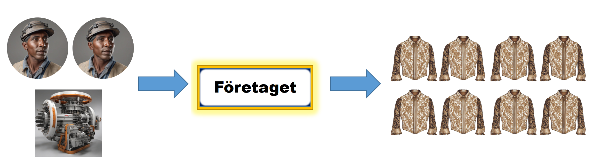
But how do you think the relationship between the factors of production and the number of shirts looks? Here is a proposal:
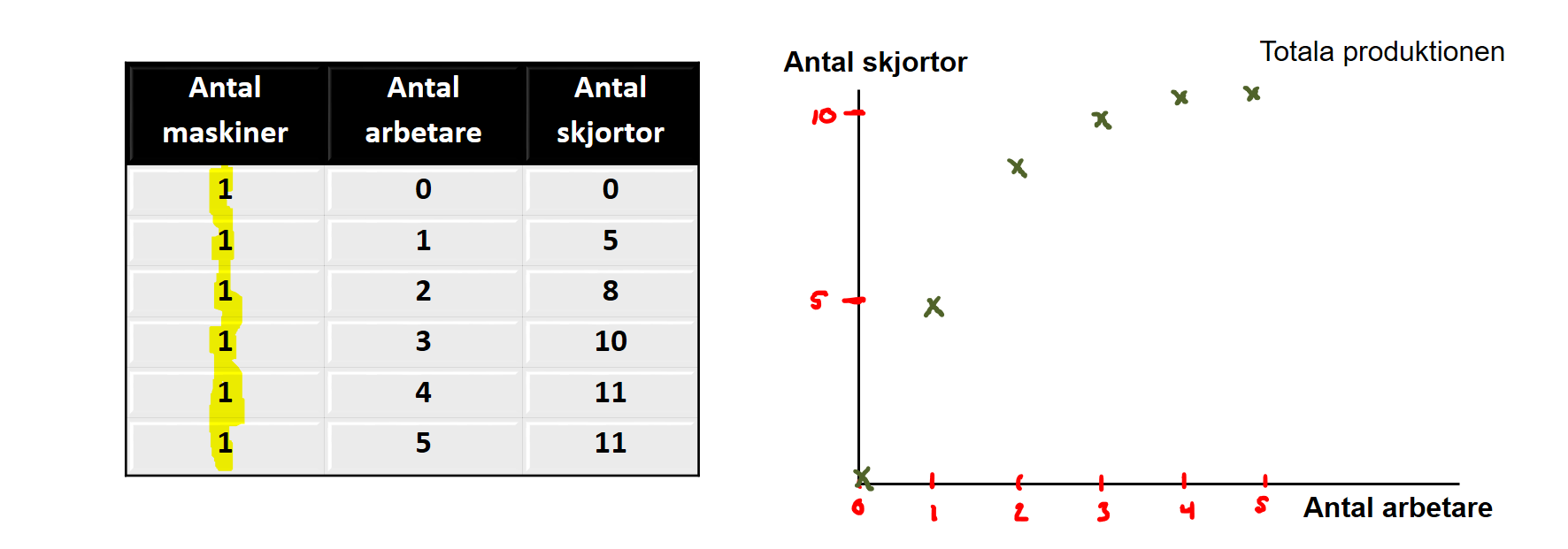
The table shows the number of machines, workers and shirts. I’ve assumed the number of machines is fixed. In the short run it’s often hard to change the amount of capital: maybe the machine must be manufactured in China, shipped by boat to Finland and craned into the factory. Changing capital is therefore not something you do overnight. It is usually easier to vary labour: you can adjust shift patterns and hire more ÅA students to work nights.
The table also assumes that more workers raise shirt output. I’ve plotted this relationship in the graph on the right. Note, however, that each extra worker contributes less and less to output. We call this the diminishing marginal product. Imagine you are the first worker in the factory. It’s clean and empty and you can breathe easily: all that’s there is the giant Chinese shirt machine. With a single button press you start the machine and output jumps from 0 to 5 shirts. Thanks to you output rises by 5. Now worker number two, Jenny from ÅA, enters the factory. Her work further raises output from 5 to 8 shirts. But as more workers arrive the factory becomes crowded — there is only one machine. When you hire worker number 4 output rises only from 10 to 11; extra colleagues help, but you also step on each other’s toes and it becomes harder to work efficiently.
Now we know something about production — but we really want to study costs. We assumed the firm seeks to maximise profit, and profit is revenue minus costs. How do we go from production to costs? Think like this: if it becomes progressively harder to raise output by adding more workers (given fixed machines), then costs must rise ever faster as output expands. The relationship between output and costs therefore looks roughly like this:
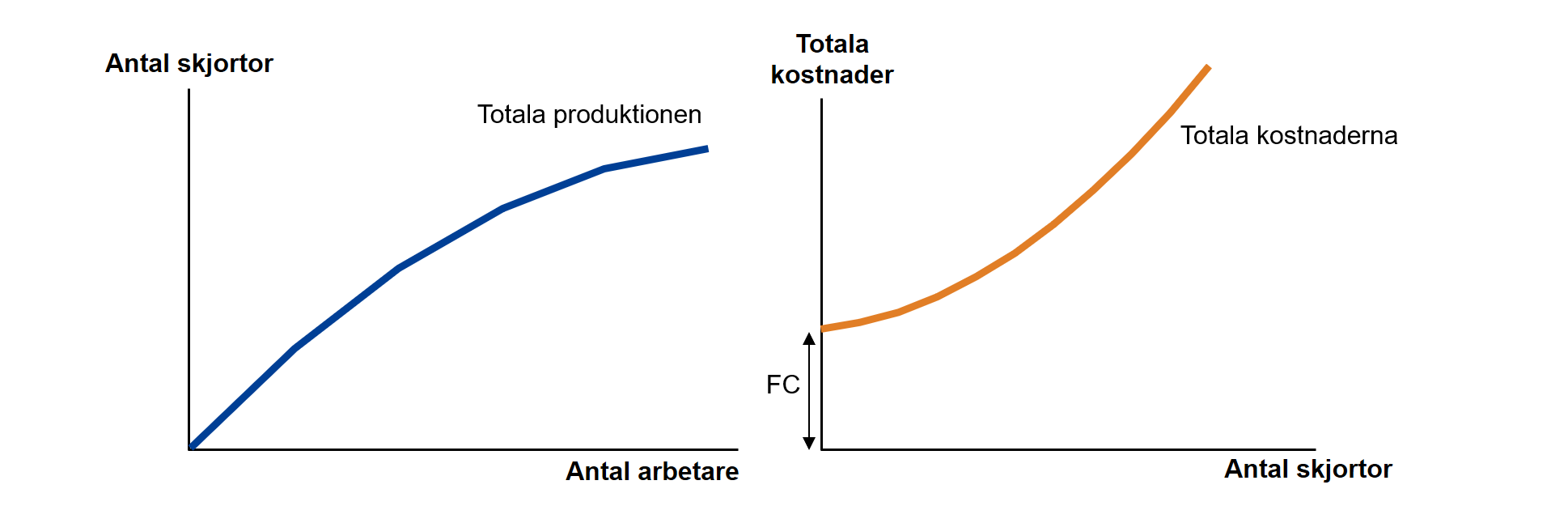
Even if we produce nothing there are still costs to pay. You have, for example, the machine that costs money whether or not you make any shirts. You may also have to pay for road fees and rent for premises. Costs you must pay even when production is zero are called fixed costs (FC).
fixed costs are costs that are fixed regardless of how much the firm produces
variable costs are costs that vary with the level of production
short run is the time period in which some resources and costs are fixed
long run is the time period required for all resources and costs to become variable
marginal cost is the cost of producing the last unit
Summary of costs: Even before you switch on the machine the firm faces a lump sum of costs that must be paid. Once production starts, costs increase with the number of shirts produced. Costs also rise progressively faster because capital is fixed and each additional worker contributes less and less to output. The marginal cost—the cost of producing one more unit—therefore becomes higher and higher as production expands, since it gets harder to increase output when the factory is already crowded.
The firm’s revenue
Now let’s turn to the firm’s revenue. An important insight is that a firm’s revenue depends on whether the market is competitive or not. We therefore begin by looking at the situation under fierce competition.
Imagine, for example, you produce wheat. Wheat is a standardized product; the kernels from your fields are hardly different from your neighbour’s or from wheat grown in Estonia or France — and there are a huge number of wheat farmers. All this means you are a price taker. That is, you must sell your wheat at the market price. Suppose the market price is €4 per sack. You cannot sell your wheat for €5 — nobody will buy from you; they will buy from another seller. And the intense competition among thousands of wheat producers also prevents you from selling at €3 — competition has already driven the market price down to the lowest level at which firms can survive. The table below sketches the wheat farmer’s revenue:
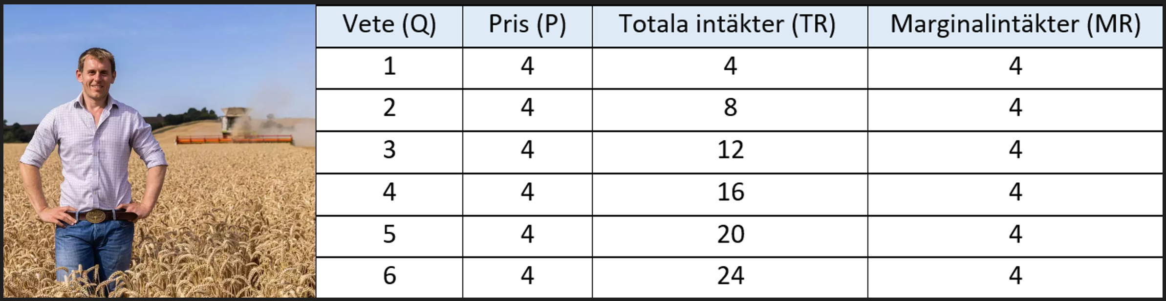
When you sell the first sack of wheat for €4 your total revenue rises from €0 to €4. The first sack therefore yields a marginal revenue of €4. Marginal revenue shows what happens to revenue at the margin — that is, when you sell one more sack. Selling two sacks gives total revenue €8; the second sack increased revenue from €4 to €8, so the marginal revenue of the second sack is also €4. As you can see, price and marginal revenue coincide under perfect competition: MR = P.
Differentiation I
Few things frighten students as much as the word “differentiation.” Differentiation often seems abstract and incomprehensible. In fact it’s fun, simple and extremely useful! Differentiation is about finding out what happens when you do a little more. Knowing what happens when you do a little more is useful in many life situations. Imagine, for example, you’re at a bar late on a Friday night. You’re considering whether to order one more strong beer. How will that beer affect your blood‑alcohol level? That is differentiation! In Section 2.3 we showed a plausible relationship between the number of strong beers and your BAC. Do you remember what that relationship looked like?
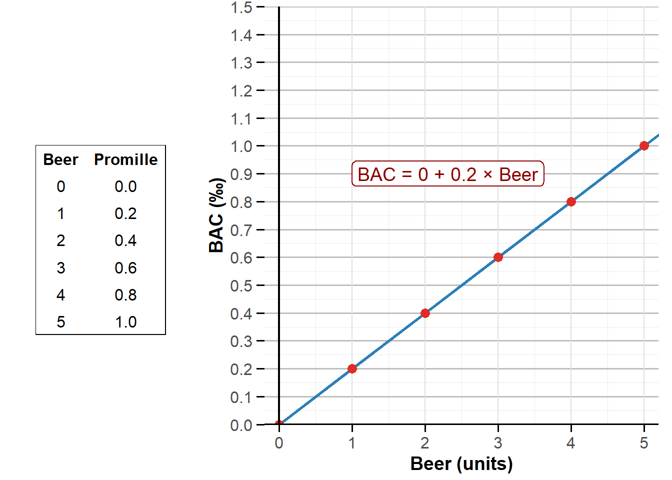
From the figure you may realise there are practically four ways to find out how one more beer affects your BAC:
- Look at the table. For each extra beer BAC seems to rise by 0.2. We then say the derivative is 0.2 — another way of saying the change is 0.2.
- Check the slope of the line. Every step to the right along the beer axis moves the line 0.2 units up along the BAC axis. The derivative is 0.2.
- Use a free AI tool such as Symbolab’s derivative calculator here. If you enter 0 + 0.2*x the tool returns the derivative 0.2.
- Use the formula and known differentiation rules. Functions can take many forms and each type has a differentiation rule. For the linear function BAC = 0 + 0.2 × Beer the rule says every extra beer always has the same effect on your BAC: the derivative equals the number in front of Beer, i.e. 0.2.
In Section 2.3 we also showed the relationship between the number of schnapps and BAC: \(\small\text{BAC} = 0 + 0{,}3 \times \text{Schnapps}\) . Can you compute the derivative — i.e. predict how your BAC changes if you swallow one more schnapps?
We also measured the link between clicks and exam score. Differentiate the estimated relationship \(\small\text{Exam score} = 9{.}479 + 0{.}02 \times \text{Clicks}\) to forecast how one additional click on the course site affects your exam score. If you can do all of this, you can differentiate. Congratulations — you will soon use this technique in your market analysis.
Differentiation II
There are different types of functions, and each kind has its own differentiation rule. As a student at Åbo Akademi you can buy an annual pass for €85, which gives you unlimited access to many exercise classes. If we plotted the relationship between the number of classes and the annual fee it would look like this:
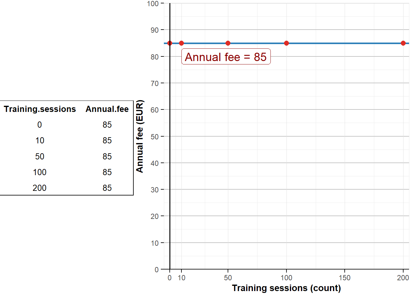
If you use the same way of thinking as before you’ll realise the derivative is 0. Both the table and the figure show that one more workout does not affect the price of the annual pass. When the function is just a constant, for example \(\small\text{Annual fee} = 85\) the derivative is 0. If you’re unsure you can always enter the function in Symbolab or ask an AI service.
Let’s look at one last example: how does your exam score depend on how many hours you study? Based on my experience as the course instructor I would guess the relationship looks something like this:
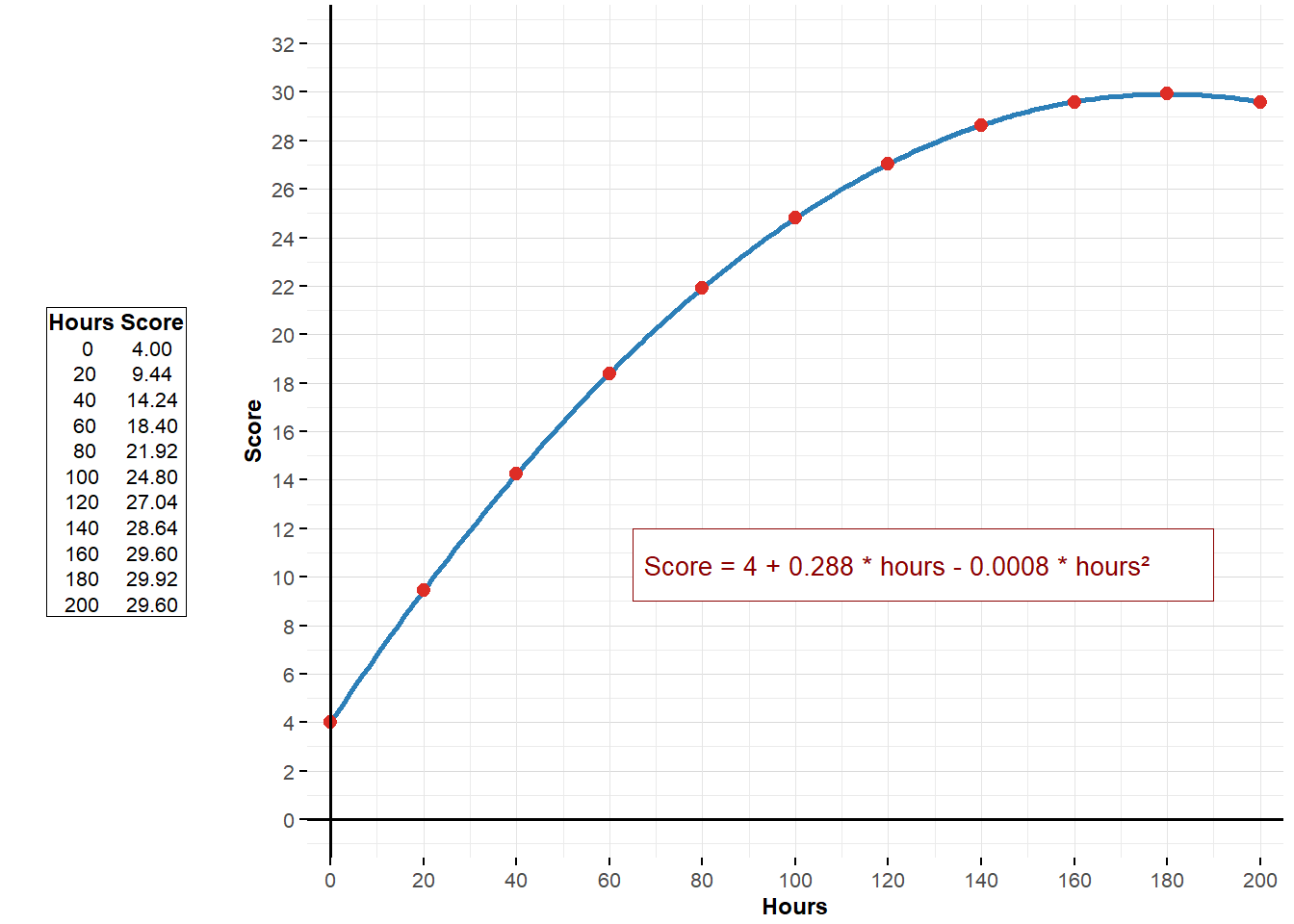
How do you interpret this relationship? The big lesson from the figure is that more study hours usually lead to a higher exam score. For example, someone who studies 0 hours seems to get 4 points on the exam, while someone who has studied 20 hours gets just over 9 points. In short: studying pays off!
But if you look closely you see it’s not always true in the same way. When we looked at shots of schnapps the line was straight: each extra shot always raised your BAC by the same amount. In the figure above the line is curved. That means an extra hour of study “bites” more when you have only studied a few hours so far than when you have studied yourself silly. The derivative therefore depends on how many hours you have already studied.
Let’s finally derive the derivative of \(\small\text{Score} = 4 + 0{.}288 \times \text{hours}-0{.}0008 \times \text{hours}^2\).
You can already differentiate the first two terms. The first term, 4, is a constant and the derivative of a constant is 0. The second term, 0.288 × hours, is linear and its derivative is 0.288. The third term, \(\small\text-0{.}0008 \times \text{hours}^2\), we haven’t differentiated before. Here use the power rule: multiply the coefficient by the exponent (2) and subtract 1 from the exponent. The power rule therefore gives the derivative of \(\small\text-0{.}0008 \times \text{hours}^2\) as \(\small\text2\times-0{.}0008 \times \text{hours}^{2-1}\). So the derivative of \(\small\text{Score} = 4 + 0{.}288 \times \text{hours}-0{.}0008 \times \text{hours}^2\) is \(\small\text0{.}28-0{.}0016 \times \text{hours}\)!
What does this mean for you as a student? If you have so far studied zero hours in the course, one additional hour of study will raise your exam score by 0.288 points. If you have already studied 50 hours, one more hour will raise your score by only 0.288 − 0.0016×50 = 0.208 points (about 0.21). And if you have, say, 190 hours already, an extra hour of study will actually reduce your score.
The firm’s choice: Picks “what maximises profit”
Now we are ready to predict how much a firm will actually want to produce. Remember we assumed the entrepreneur is driven by profit maximisation. Our challenge is therefore to find the production quantity that makes profit as large as possible. This is fairly advanced material for an introductory course, so I’ve created a small app to help you understand. Focus on the main lessons!
Producer’s choice.
Play with costs and the market price until you understand how it all fits together.
#| standalone: true
#| viewerHeight: 1370

if (!requireNamespace("shiny", quietly = TRUE)) install.packages("shiny")
if (!requireNamespace("ggplot2", quietly = TRUE)) install.packages("ggplot2")
if (!requireNamespace("plotly", quietly = TRUE)) install.packages("plotly")
if (!requireNamespace("grid", quietly = TRUE)) install.packages("grid")
if (!requireNamespace("scales", quietly = TRUE)) install.packages("scales")

library(shiny)
library(ggplot2)
library(plotly)
library(grid)
library(scales)

# Helper for consistent formatting
fmt <- function(x) comma(x, accuracy = 0.001, decimal.mark = ".", big.mark = ",")

ui <- fluidPage(
  titlePanel(""),

  sidebarLayout(
    sidebarPanel(
      numericInput("a", "Fixed costs (€):", value = 200, min = 0),
      numericInput("b", "Linear variable cost (€):", value = 10, min = 0),
      numericInput("c", "Quadratic variable cost (€):", value = 1, min = 0),
      numericInput("mr_value", "Price (€) (treated as MR):", value = 150, min = 0),
      numericInput("y_max", "Y-axis max (costs/revenue):", value = 200, min = 1),
      numericInput("x_max", "X-axis max (production level):", value = 100, min = 1),
      actionButton("calculate", "Calculate and plot!"),
      width = 3
    ),

    mainPanel(
      verbatimTextOutput("expressions"),
      plotlyOutput("costPlot"),
      br(),
      verbatimTextOutput("optimalLevel"),
      width = 9
    )
  )
)

server <- function(input, output) {
  observeEvent(input$calculate, {
    a <- input$a
    b <- input$b
    c <- input$c
    MR <- input$mr_value

    q_values <- seq(0.1, max(1000, input$x_max * 10), by = 1)
    atc_values <- sapply(q_values, function(q) a / q + b + c * q)
    mc_values <- b + 2 * c * q_values

    plot_data <- data.frame(
      q = q_values,
      ATC = atc_values,
      MC = mc_values,
      MR = rep(MR, length(q_values))
    )

    # Find approximate optimum where MC ≈ MR
    optimal_q <- NA
    diff <- abs(mc_values - MR)
    min_diff_idx <- which.min(diff)
    if (diff[min_diff_idx] < max(1, 0.01 * MR)) {
      optimal_q <- q_values[min_diff_idx]
    }

    output$expressions <- renderPrint({
      cat("Total costs (TC):\n")
      cat("TC = ", a, " + ", b, "q + ", c, "q²\n\n")
      cat("Average total cost (ATC):\n")
      cat("ATC = ", a, "/q + ", b, " + ", c, "q\n\n")
      cat("Marginal cost (MC):\n")
      cat("MC = ", b, " + 2 * ", c, "q\n")
    })

    output$costPlot <- renderPlotly({
      x_max <- input$x_max
      y_max <- input$y_max

      p <- ggplot(plot_data, aes(x = q)) +
        geom_line(aes(y = ATC, color = "ATC"), size = 1) +
        geom_line(aes(y = MC, color = "MC"), size = 1) +
        geom_line(aes(y = MR, color = "MR"), size = 1, linetype = "solid") +
        labs(
          title = "",
          x = "Production level (q)",
          y = "Costs and revenue (€)",
          color = NULL
        ) +
        coord_cartesian(xlim = c(0, x_max), ylim = c(0, y_max)) +
        scale_color_manual(
          values = c("ATC" = "darkgreen", "MC" = "darkred", "MR" = "blue"),
          guide = guide_legend(override.aes = list(size = 0.9, linetype = c("solid", "solid", "solid")))
        ) +
        theme_minimal(base_size = 14) +
        theme(
          axis.title = element_text(size = 14, face = "bold"),
          axis.text = element_text(size = 12),
          legend.position = c(0.88, 0.85),
          legend.background = element_rect(fill = "white", color = "grey80", size = 0.5),
          legend.key = element_rect(fill = "transparent", color = NA),
          legend.text = element_text(size = 11),
          plot.margin = margin(10, 10, 10, 10)
        ) +
        geom_hline(yintercept = 0, color = "black", size = 0.6) +
        geom_vline(xintercept = 0, color = "black", size = 0.6) +
        scale_x_continuous(labels = comma_format(decimal.mark = ".", big.mark = ",")) +
        scale_y_continuous(labels = comma_format(decimal.mark = ".", big.mark = ","))

      # Mark optimal level if found and within plotted range
      if (!is.na(optimal_q) && optimal_q > 0 && optimal_q <= x_max) {
        optimal_mr <- MR
        optimal_atc <- a / optimal_q + b + c * optimal_q

        p <- p +
          geom_segment(aes(x = optimal_q, xend = optimal_q, y = 0, yend = optimal_mr),
                       linetype = "dashed", color = "purple") +
          geom_segment(aes(x = 0, xend = optimal_q, y = optimal_atc, yend = optimal_atc),
                       linetype = "dashed", color = "#1b9e77") +
          geom_point(aes(x = optimal_q, y = optimal_mr), color = "purple", size = 3)

        profit_polygon <- data.frame(
          x = c(0, optimal_q, optimal_q, 0),
          y = c(optimal_atc, optimal_atc, optimal_mr, optimal_mr)
        )
        p <- p + geom_polygon(data = profit_polygon, aes(x = x, y = y), fill = "grey40", alpha = 0.2, inherit.aes = FALSE)
      }

      ggplotly(p) %>%
        layout(
          font = list(size = 13, family = "Arial"),
          legend = list(
            bgcolor = "rgba(255,255,255,0.9)",
            x = 0.88, y = 0.85, xanchor = "right",
            font = list(size = 11)
          ),
          margin = list(l = 60, r = 10, t = 40, b = 60),
          xaxis = list(tickformat = ",.0f"),
          yaxis = list(tickformat = ",.2f")
        )
    })

    output$optimalLevel <- renderPrint({
      if (!is.na(optimal_q)) {
        TC <- a + b * optimal_q + c * optimal_q^2
        ATC <- a / optimal_q + b + c * optimal_q
        MC <- b + 2 * c * optimal_q
        TR <- MR * optimal_q
        Profit <- TR - TC

        cat("Approximate optimal production level q =", fmt(optimal_q), "where MR ≈ MC.\n\n")
        cat("At this level:\n")
        cat("Marginal cost (MC) =", fmt(round(MC, 3)), "\n")
        cat("Marginal revenue (MR) =", fmt(round(MR, 3)), "\n")
        cat("Average total cost (ATC) =", fmt(round(ATC, 3)), "\n")
        cat("Total revenue (TR) =", fmt(round(TR, 3)), "\n")
        cat("Total cost (TC) =", fmt(round(TC, 3)), "\n")
        cat("Profit =", fmt(round(Profit, 3)), "\n")
      } else {
        cat("No optimal production level found where MR ≈ MC within the given interval.\n")
      }
    })
  })
}

shinyApp(ui = ui, server = server)
In the app I have specified the firm’s cost structure and the market price under perfect competition. Click Calculate and plot! to see everything you need to know. The app does a lot of the heavy lifting, so it’s a good moment to recap:
- Marginal cost (MC) slopes upward:
The dark red curve shows how costs change when the firm produces one more shirt. You see marginal costs rise with output. Remember why: you were the first worker and the factory was empty, so pressing the start button was easy. But as more workers crowd around a single machine, each additional worker adds less output. With 46 workers fighting for space, worker 47 will contribute hardly any shirts. Thus it is cheap to expand output at low levels, but progressively harder and more expensive as production grows.
- Average total cost (ATC) falls first and then rises:
Why? ATC falls initially because fixed costs are spread over more units. Suppose fixed costs are €1 million and each worker’s hourly wage implies €10 per shirt in variable cost. Producing one shirt yields an average cost of €1,000,010, while producing two shirts cuts the average dramatically. That explains the steep initial decline. The curve eventually turns up because marginal cost increases: once the factory is crowded, raising output requires many extra workers and the cost of the last unit becomes very high.
- The MC curve crosses the ATC curve at ATC’s minimum:
Why does this hold? ATC is an average and MC is the marginal change when you do a bit more. If the marginal value (MC) is below the average, adding it pulls the average down; if marginal is above the average, adding it pushes the average up. Think of classroom age: a newborn (MC < ATC) lowers the average age; a 100‑year‑old (MC > ATC) raises it.
- The firm maximises profit where MR = MC:
The optimal output is where the revenue from the last unit (MR) equals its cost (MC). Intuitively: the last unit should add as much revenue as it costs. If the last unit earns €4 but costs €1, produce more. If it earns €4 but costs €9, produce less. Given the market price €150 and the app’s cost parameters, the firm produces 70 units; you can change price and costs in the app to see how the optimum moves.
- The shaded rectangle shows the firm’s profit:
Why? Profit = total revenue − total cost. Total revenue = price × quantity (70 × €150 = €10,500). Total cost = ATC × quantity (ATC at 70 ≈ €83, so 70 × €83 = €5,810). The difference (total revenue minus total cost) is the dark rectangle in the figure.
- But does the firm necessarily make a profit even when it chooses optimally?
A final check: producing where MR = MC maximises profit, but that maximised profit may still be negative. If you are a very poor manager, incur huge fixed costs (marble lobby, long vacations) and have high variable costs, your best possible performance can still mean bankruptcy. Play with higher cost settings in the app and you will see that the MR = MC point can correspond to negative profits.
Once you understand all this you’re ready to start playing. You can, for example, use the app to derive the firm’s supply curve, in exactly the same way you derived the consumer’s demand curve in Section 6.1. Simply vary the market price and see how much the firm wants to produce at each price.
What happens to the firm’s supply when the market price rises? At what market price does the firm incur losses and exit the market? What happens if you change the firm’s fixed costs? What happens if you change its variable costs? Play and think! The key is to develop an intuitive understanding of how the pieces fit together. If you take more advanced economics courses you will work further with these kinds of models.
Below are three concrete applications of producer theory:
You are an asset manager specialising in the forest industry. You therefore follow the major firms in the sector. A large company is considering a major scale‑up through large investments. How will that decision affect the firm’s profits? Using producer theory you can analyse production costs as output expands and forecast how the investment will affect costs, revenues and profits—information valuable to potential investors.
As an industry analyst in the automotive sector you face a proposed government increase in carbon taxes. You use producer theory to analyse how the tax will affect manufacturers’ production costs. By studying firms’ marginal costs you can assess how the tax may raise unit production costs, which in turn can lead to higher car prices and lower demand. Your analysis helps firms make strategic choices about pricing, cost reduction and investment in cleaner technology to remain competitive.
You are a market analyst at a food company considering a new product line. How should you set the price to maximise profit? By applying producer theory you can compute the optimal output and pricing given fixed and variable costs and the market demand curve.
6.3 Market revisited
With these deeper insights we can now better understand what happens in a market in the short and long run. Why, for example, do prices for popular products often spike dramatically at the start and then fall back? Imagine you run a firm that makes VR headsets. They provide a three‑dimensional experience by simulating a virtual environment. The product is currently used mostly for gaming but can also be used in education (e.g. to train fighter pilots or surgeons) or for architects visualising new buildings for clients — and many expect VR technology to grow rapidly in the coming years. We will now analyse your firm and the whole industry.
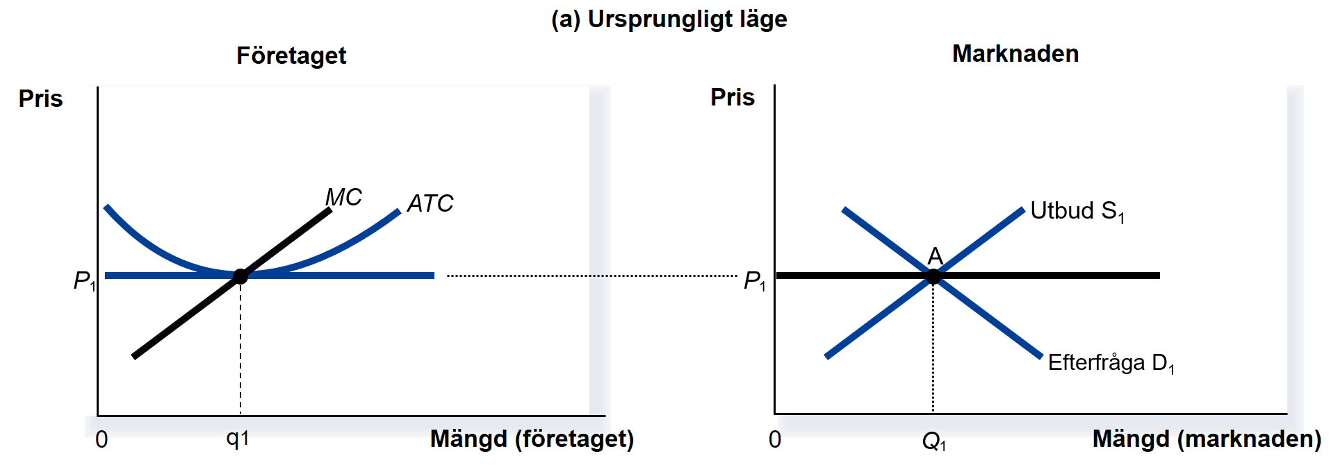
The figure below shows the situation for your firm (left) and for the entire market (right). As always, supply and demand are central. Together they determine market price and output. In the figure the market price is P1. Your firm must accept that same price as given (at least if competition is fierce). Each firm always produces where MR = MC, since profit is maximised there. A rational producer chooses output so that the revenue from the last unit equals the cost of producing that unit. Under perfect competition P = MR. Thus the firm produces where P = MC. The following picture illustrates the initial situation:
Now a change occurs in the market. Suddenly people realise VR headsets are fantastic. Overnight everyone wants a VR headset! The figure below shows how you can illustrate this shift:
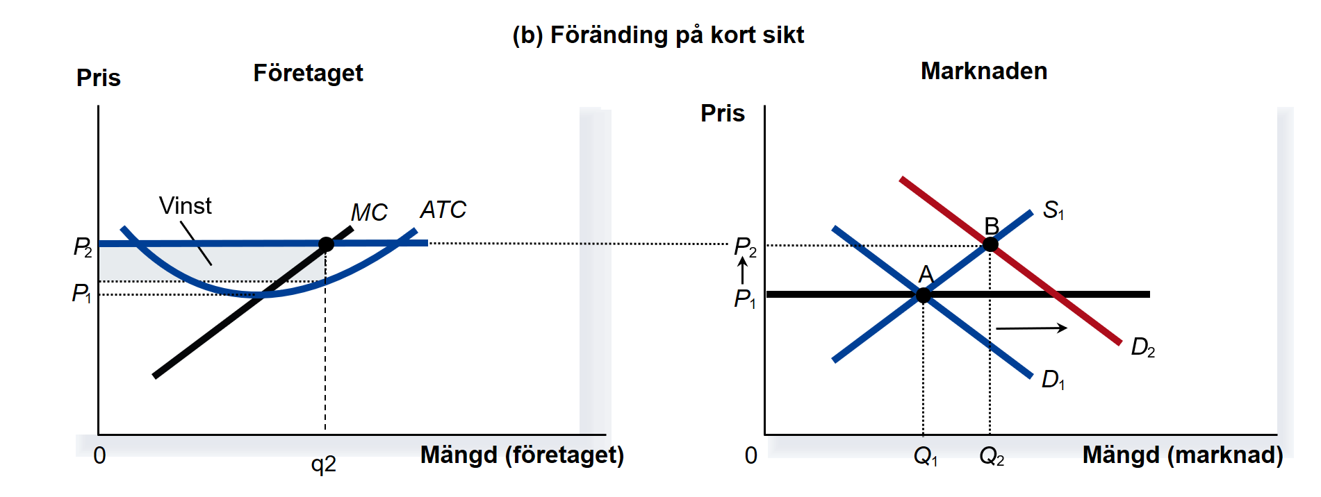
This means demand for VR headsets rises, pushing up the price. Your firm will therefore increase output from q1 to q2 (since profit is maximised where P = MR = MC). These are boom times for your firm: you earn a large economic profit, shown by the shaded rectangle. Note, however, that you are no longer producing where average cost is minimised. But what happens in the long run? The figure below shows the outcome:
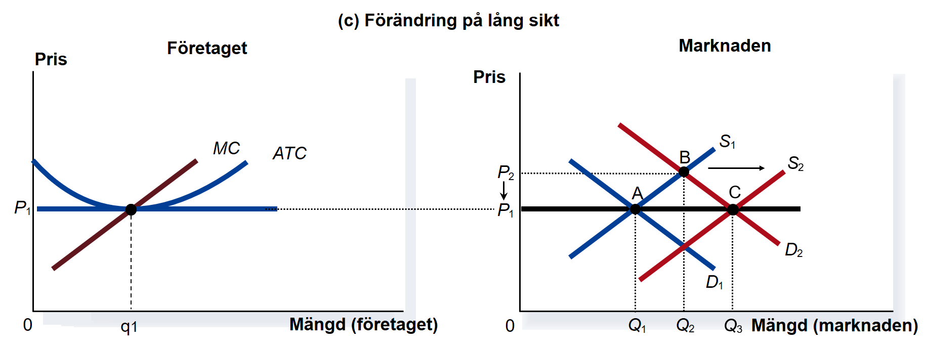
Yes — profits in the industry will attract new firms, just as flies are drawn to sugar. This increases supply, which pushes the market price down — and entry continues until economic profit is again zero. In the long run you therefore return to zero economic profit. The profit disappears as new firms enter and drive down the price.
Summary: In the short run firms can earn profits and produce at unnecessarily high cost, but in the long run economic profit is zero and the good is produced at the lowest possible cost. People’s desire for VR headsets leads, as if by an invisible hand, to VR headsets being produced. This is a remarkable achievement: the market automatically ensures that each good and service is produced in the right quantity (at least under competition). Planners in a command economy could only dream of something like this!
6.4 Heaven on earth?
So far we have almost painted markets as heaven on earth. If you stop reading this book here, you risk sounding like a fool:
If two people want to trade, why not? Both parties will be better off afterwards — otherwise they wouldn’t trade! The buyer obviously values the good more than it costs, and the seller receives more than her reservation price. Markets have proven an excellent way to allocate production and distribution. In a planned economy it is likely the wrong quantities will be produced and goods won’t reach the consumers who truly want them. Just look at life in North versus South Korea! Long live the market!
All of that is often true, but it is not the whole picture. Relying on anecdote about planning disasters is a cheap trick. Think instead about all the firms that charge usurious prices while paying pitiful wages despite billion‑euro profits. Think of factories that dump toxic waste and fuel global warming. Think of expensive insurers and tradespeople who defraud customers by “fixing” things that are not broken. How can such things happen if markets are so perfect? The answer is that markets can and do fail. The next three chapters will examine these market failures and how — if at all — they can be addressed.
Exercises
In this chapter we stepped back to gain a deeper understanding of how firms and consumers behave. Below are some cases where you can apply your knowledge in practice. Press Show Answers when you want the computer to grade your responses. Good luck!
Demand for beer among course participants
You are organising a trip where all participants in this course spend a week in Mallorca. You have brought 1,400 cans of Lapin Kulta that you want to sell to the students. But what price will prevail if supply and demand determine it?

- Start by deriving the demand for a typical ÅA student. Use the “Consumer’s choice” app earlier in the chapter. Assume a typical student has income €375 and a lunch costs €10. Set the student’s beer‑preference parameter (0–1). A useful trick is to decide what share of income a typical student spends on beer — assume 10% of income goes to beer. Move the preference slider to 0.1. This heuristic usually gives reasonable forecasts. Finally, use the app to fill in column 2 of the table below.
| (1) Beer price (€) | (2) Quantity demanded (1 student) | (3) Quantity demanded (200 students) | (4) Quantity supplied |
|---|---|---|---|
| 7 | 1400 | ||
| 6 | 1400 | ||
| 5 | 1400 | ||
| 4 | 1400 | ||
| 3 | 1400 |
- Now you know how many beers a single student wants to buy at different prices (given a particular income and beer preference). To get the total demand for the trip you must multiply each individual quantity by the number of course participants. Assume 200 students join the trip and fill in column 3.
- Is there any price in the table at which total demand is approximately equal to the quantity supplied? What will the beer price be on your market?
- Possible disaster 1: A mad student goes berserk and smashes most of the beer cans! Only 1,000 cans remain. What would happen to the beer price in your forecast?
- Possible disaster 2: The government cuts study grants sharply, so the typical student brings €100 less on the trip. What would happen to the beer price in your forecast? (Assume supply remains 1,400 cans.)
- I assumed a typical student has income €375 and spends 10% of income on beer. That gave me the table below. If students actually behave this way, beer will sell for €5 per can: at that price students’ total demand equals the seller’s supply. (By surveying a random sample of students about their incomes and beer preferences you could make an even better market forecast.)
| (1) Beer price (€) | (2) Quantity demanded per student | (3) Total demand (200 students) | (4) Quantity supplied |
|---|---|---|---|
| 7 | 5 | 1000 | 1400 |
| 6 | 5.83 | 1166 | 1400 |
| 5 | 7 | 1400 | 1400 |
| 4 | 8.75 | 1750 | 1400 |
| 3 | 11.67 | 2334 | 1400 |
- See above.
- See above.
- Supply is now 1,000 cans. At which price in the table do sellers supply the same quantity buyers demand? At €7. That would be the new market price if a vandal destroys many cans.
| (1) Beer price (€) | (2) Quantity demanded per student | (3) Total demand (200 students) | (4) Quantity supplied |
|---|---|---|---|
| 7 | 5 | 1000 | 1000 |
| 6 | 5.83 | 1166 | 1000 |
| 5 | 7 | 1400 | 1000 |
| 4 | 8.75 | 1750 | 1000 |
| 3 | 11.67 | 2334 | 1000 |
- The table below shows what happens when we cut students’ incomes by €100. The beer price falls — likely to just under €4 per bottle.
| (1) Ölpris (€) |
(2) Efterfrågad mängd 1 student |
(3) Efterfrågad mängd 200 studenter |
(4) Utbjuden mängd |
|---|---|---|---|
| 7 | 3,93 | 786 | 1400 |
| 6 | 4,58 | 916 | 1400 |
| 5 | 5,5 | 1100 | 1400 |
| 4 | 6,88 | 1376 | 1400 |
| 3 | 9,17 | 1834 | 1400 |
Empanadas in Santiago de Chile
The market for empanadas consists of a large number of firms in Chile’s capital, Santiago. Price formation in this perfectly competitive market is illustrated in the graph on the left below. On the right the cost structure for a single firm, La Empanada, operating in the market is shown. Quantity is measured in boxes of empanadas and price is in dollars.
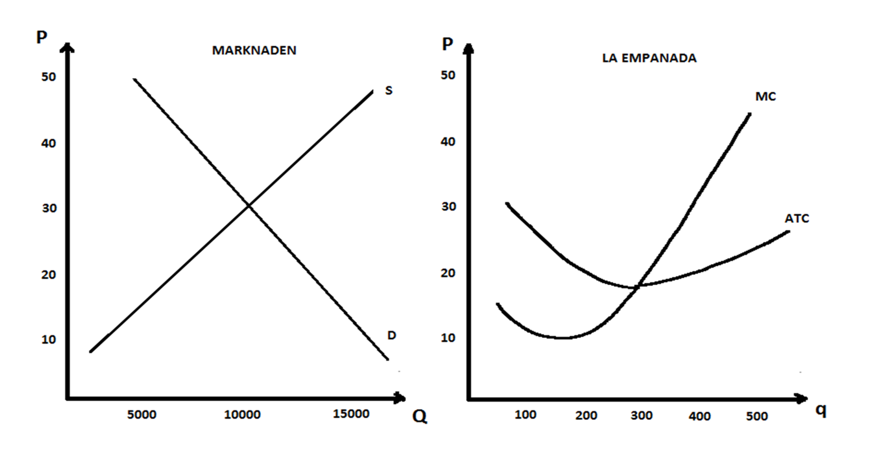
- The quantity of empanadas traded in the market will be about .
- Can you add La Empanada’s demand curve and marginal‑revenue curve to the right‑hand figure?
- Approximately how many empanadas should La Empanada produce to maximise its profit? Answer:
- Approximately how large is La Empanada’s profit? Answer: .
- What will happen to the empanada market in Santiago in the long run? Explain clearly.
- Supply and demand imply roughly 10,000 boxes of empanadas are sold at a price of $30 per box.
- The market price is \(30\). Under perfect competition La Empanada must always sell at the market price. Draw a horizontal line at price = \(30\). That line is the firm’s price and also its marginal revenue (MR): every extra box sold always brings in \(30\).
- Find the output where MR = MC — i.e. where the last box’s revenue equals its cost.
- La Empanada maximises profit by producing 400 boxes. Read off ATC at Q = 400: average cost is about \(20\) per box. Selling 400 units at \(30\) while average cost is \(20\) yields a profit of \(10\) per box.
- What do you think happens when profit‑hungry entrepreneurs discover there’s big money in selling empanadas in Santiago? This is exactly the mechanism that explains why some industries expand over time while others shrink or disappear.
How does the firm behave?
You run a firm in an industry characterised by perfect competition. The market supply and demand curves are given by \(\small P_S=500+5Q\) and \(\small P_D=5000-10Q\). You are to determine how much your firm should produce in the short run to maximise profit.

- The quantity traded in the market is units, the price per unit is euros and consumer surplus is euros.
- Assume each firm has the following costs: \(\small TC=3125+500q+125q^2\) and \(\small MC=500+250q\). How many firms are currently in the market (assuming all firms are identical)? .
- By computing profits you can determine what will happen in the long run. The firm earns short‑run profit , which implies that the number of firms in the market will in the long run .
- Here you compute what happens in the market, just as you have done in e.g. Chapter 3.
- Remember that a firm that wants to maximise profit always produces where MR = MC. You now know the market price is 2,000. Under perfect competition the individual firm must sell at that price, so marginal revenue MR = 2,000. Set MR = MC and solve for the output where the revenue from the last unit equals its cost. That gives you each firm’s optimal output; knowing industry output you can then compute the number of firms.
- Once you know a firm’s output and the price it receives you have its revenue. Use TC to compute total cost, then revenue minus cost = profit. If firms make positive profit, entry will be induced in the long run.
How much profit does your bakery make?
You run a small bakery in a local, competitive market where the price is p = €2 per loaf. Your total revenue is therefore \(\small TR(q)=2q\) where q is the number of loaves per day. Your total cost in euros is \(\small TC(q)=20+0,5q+0,005q^2\).

- Look at the function for your total costs. The fixed costs are euros.
- Marginal revenue MR shows what happens to your total revenue if you sell a little more. Technically you get MR by differentiating total revenue TR with respect to q. Here marginal revenue is: euros.
- Marginal cost MC shows what happens to your total costs if you produce a little more. Technically you get MC by differentiating total cost TC with respect to q. Here marginal cost is: .
- If the firm wants to maximise profit it should produce per day.
- The firm’s profit will be per day.
- In the long run the number of bakeries in the market will .
- Look at \(\small TC(q)=20+0,5q+0,005q^2\). Fixed costs are costs you must pay even if production is 0. Plug in \(\small q=0\): \(\small TC(0)=20+0,5*0+0,005*0^2=20\).
- Earlier in the chapter you learned to differentiate. The derivative of \(\small TR=2q\) with respect to q is 2.
- Differentiate \(\small TC(q)=20+0,5q+0,005q^2\) with respect to q: the derivative is \(\small 0,5+2*0,005q\). So marginal cost is \(\small MC(q)=0,5+0,01q\).
- Think at the margin! The last loaf you produce should bring in exactly as much revenue as it cost to produce. Set MR = MC and solve for q. That q is the profit‑maximising output.
- Profit is total revenue minus total cost. Now that you know output and that you receive €2 per loaf, compute total revenue and total cost; the difference is your profit.
- If you want to hear two AI voices discuss the content of this chapter you can listen here (8 min). Below is also a short AI video that summarises key concepts from the chapter: