12 Growth for rookies
(where you learn the basics of growth and investigate why some countries are richer than others)
Once upon a time we were all poor. In 1800 the average Finn earned the equivalent of EUR 2 per day. That was the human condition in large parts of the world in 1800. And there was nothing particularly special about the year 1800 — in fact humans had remained at about EUR 2 per day ever since our species emerged some 200,000 years ago. But roughly 200 years ago everything changed, as you can see in the following figure:
What exactly happened? Suddenly growth took off. Today the typical Finn has about EUR 110 per day, and our access to healthcare, housing, food and leisure has expanded in ways that are almost hard to comprehend. So why were we at EUR 2 per day for 200,000 years and then suddenly at EUR 110? This is one of economics’ toughest and most important puzzles. What do you think explains it? Maybe our newfound wealth comes from having more people, or from working harder? Or does our higher standard of living stem from having sacrificed the environment? Perhaps Finland became rich only because other countries were forced to remain poor?
If we can figure out how some countries moved from poverty to prosperity, we can use that recipe to eradicate the poverty that still plagues many parts of the world. In the next two chapters we will therefore analyse economic growth in depth. In this first chapter you will, among other things, use the neoclassical growth theory, which shows how resources and technology affect the speed of a country’s economic growth. In the next chapter we will move on to newer theories that emphasise, among other things, the roles of education and institutions in growth.
12.1 The importance of time: the Rule of 70
The simple explanation for why Finland is richer than Somalia is that our economy has grown a little faster than Somalia’s for a very long time. We can demonstrate this using the Rule of 70:
The Rule of 70 says that “70 divided by the growth rate” gives the number of years until income has doubled. Where does the Rule of 70 come from? Imagine you deposit EUR 100 in a bank at 5 per cent interest. After one year your €100 has grown to €105. After two years it is €110.25, after three years €115.76. It can be shown mathematically that it takes about 14 years (70/5) for your original €100 to grow to €200.
\[ \small\text{Years until your income has doubled} = \frac{70}{\text{growth rate in percent}} \]
If you know how fast a country grows you can use the Rule of 70 to calculate how long it takes to become twice as rich. In the world map below you can see GDP growth for every country since 1980. If you click on China, for example, you’ll see that growth has varied year to year, but on average GDP appears to have grown by about 10% per year. Such rapid growth means — according to the Rule of 70 — it takes only 7 years (70/10) for China to double its GDP. In Finland growth has been much weaker, perhaps around 2% on average. That implies, by the Rule of 70, it takes roughly 35 years for Finland’s GDP to double.
The lesson from the Rule of 70 is that small changes sustained over a long time work wonders. What holds for economic growth applies in many other areas. Getting a bank interest rate of 3 per cent instead of 2 per cent may seem trivial, but after a few decades it becomes a fortune. What determines which of you writes the best thesis at the end of your studies is probably not who is best right now — but who improves fastest. What usually matters most is the rate at which you get better.
12.2 Neoclassical growth theory
The Rule of 70 showed that small differences in economic growth eventually make some countries rich and others poor, but it says nothing about why growth occurs. It’s therefore time to build our first macro model. As you learned in Section 1.1, theories are simplified, make‑believe worlds that help you understand reality. For example, we used supply and demand theory to analyse strawberry trading at the market square in Åbo. Now we will create a theory that explains why some countries are rich and others poor. We call this first theory the neoclassical growth theory. The heart of the theory is:
“How much a country produces depends on three things: labour, capital and technology.”
That’s really all there is to the neoclassical growth theory. You can compare a country to a bakery. What do you think determines how many loaves the bakery can produce?

Yes — production obviously depends on how many people work in the bakery (labour) and how much equipment the bakery has (capital). A bakery with three bakers and seven ovens will plausibly produce more loaves than a bakery where two bakers share a single oven. Technology also matters: if the bakery uses clever methods it will probably produce more bread than if it relies on outdated techniques. We will now take a closer look at these three ways a country can become richer.
More people working!
According to the neoclassical growth theory, GDP can grow if more people work. For anyone who wants to understand Finnish politics, the following figure is probably the most important in the whole book. It’s a chart that keeps experts and politicians awake at night worrying about the country’s future:
As the figure shows, projections indicate the number of Finns aged 25–64 will fall dramatically during your lifetime. At the same time the number of Finns over 65 is expected to rise sharply. (Tip: change the country in the figure to, say, Somalia, South Korea or Sweden to see how the situation looks there.)
The demographic dependency ratio summarises the age structure in a single number. The measure shows how many people are children (<15 år) or elderly (>65 år) relative to those aged 15–64. If, for example, there are 100 children, 100 elderly and 200 people aged 15–64, the dependency ratio is 100. That would mean each person of working age must support themselves and one additional person who is not of working age. In Finland the demographic dependency ratio is currently 61.6 (source here). This means each Finn of working age must today support themselves and a further 0.616 people who are not of working age. Click the link above to see the figure for your home municipality — and try to interpret the number.
How ever fewer people of working age will be able to support ever more people out of the labour force is likely to be one of Finland’s decisive issues during the rest of your life. Lately much political debate has centred on how to get more young people into their careers faster. For example, there is much talk of “faster studies” and “increased throughput” in higher education. Several reforms have been introduced to encourage students to finish sooner: if you, for example, graduate on time almost 40 per cent of your student loan is written off. Several political reforms have also been implemented to extend working lives, including changes to the pension system. Many people — like the politicians in Lestijärvi in Figure 1.2 — are also wondering what can be done to increase the birth rate in Finland. We will now tackle that question using data.
How does having children affect income?
Why has the number of births fallen so much? There are, of course, many possible explanations. Can you think of any yourself? Earlier in the book we saw that the wallet often influences life choices. Perhaps children are “expensive”, and that this deters people from having them? That’s one possible explanation we can explore.
Let us therefore examine what happens to income when people have children. Fortunately we live in an age awash with data. At my work there are gigantic databases containing hundreds of facts about everyone living in Finland. There I can, among other things, see what each individual earns and how many children they have. With a few keystrokes we can extract data for all Finns aged 18–30. In this group, which comprises almost half a million people, 57 per cent had children.
If we look at their annual incomes in 2022 we see an interesting pattern: those with children earned on average EUR 16,973, while those without children earned EUR 28,139. At first glance you might be tempted to interpret this as meaning that having children is an economic disaster — but do you see why that conclusion is probably not quite right?
The explanation is that there may be many other differences between those who have children and those who do not — and it may in fact be these differences that explain why the childless earn so much more than parents. It is not random who chooses to have children. For example, fertility varies greatly across regions. Our data show that 18–30‑year‑olds in Helsinki, where wages are highest in the country, have on average 0.58 children, whereas those in Larsmo, where wages are lower, have on average 2.07 children. That people with many children often have lower incomes may therefore not be caused by the children themselves, but by the fact that people in lower‑income regions tend to have larger families.
One way to tackle this problem is to think of the fork in the road illustrated in Figure 1.1. In our data we can see what each individual with children earned in 2022, but of course we cannot know for sure what each person would have earned if they had not had children. With the help of matching analysis we can, however, make an informed guess. The principle is quite simple.
Take Kaija Vilponen‑Liimatainen, whom we met in Chapter 1. How much would Kaija have earned in 2022 along The Road Not Taken — that is, in a hypothetical life where she did not have children? The idea behind matching analysis is to search our huge database for a person who is essentially identical to Kaija but who does not have children. Suppose we find Kati, who also lives in Lestijärvi. She is not only the same age as Kaija but has the same education and work experience. In fact they are identical in many respects. There is really only one thing that distinguishes them: Kaija has children and Kati does not. The difference in pay between Kaija and Kati therefore becomes our best guess of how Kaija’s income was affected by having children.
The great thing is that the computer can instantly make this kind of comparison for all parents in Finland, and thereby produce an estimate of how children generally affect our incomes. Here are my results:
| Variable matching | Difference in annual earnings (€) |
|---|---|
| No matching (raw difference) | -€11,166 |
| Match on education level | -€5,323 |
| + Match on gender and age | -€2,664 |
| + Match on municipality | -€2,321 |
| + Match on other variables | -€1,321 |
The top row of the table shows that individuals with children earned on average EUR 11,166 less per year than individuals without children. On the next row I matched on education, which means I compared each parent’s income with a person who has the same education level but no children. As you can see, the average gap is now “only” EUR 5,323. That means more than half of the pay gap between parents and non‑parents is actually due to the fact that people who have children tend to be considerably less educated than those who do not.
On the following rows I progressively made the comparison more exact. In the final row I compare individuals with children to individuals without children who have the same education, are the same age, live in the same municipality and have worked for the same length of time. Even among these very similar people, those with children still earn about EUR 1,321 less than their “look‑alikes” without children. In later economics courses you will learn how to perform these kinds of analyses — they are worth their weight in gold when you write your thesis or take your first steps in the labour market.
More capital!
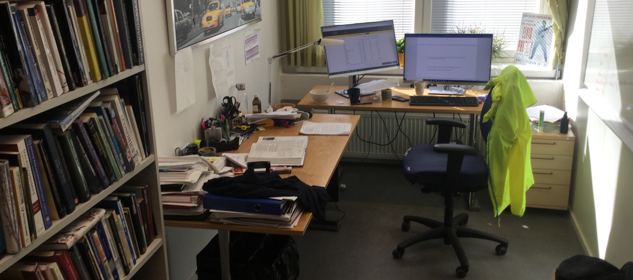
According to the theory, economic growth can also be achieved by increasing the amount of capital. The more capital you have to work with, the more you will probably produce on the job. As I write this I use quite a bit of physical capital — just like the baker in the bakery. I have my laptop, two screens, a desk, chairs and much else. On average Finns work with capital worth about EUR 27,000. But why exactly EUR 27,000?
Let’s take a closer look at the role of capital. I’ve created an app that illustrates the relationship. If you’re not used to thinking in graphs this may feel hard, but play with the app for a few minutes — and don’t give up until you understand the connection!
#| standalone: true
#| viewerHeight: 920

if (!requireNamespace("shiny", quietly = TRUE)) install.packages("shiny")
if (!requireNamespace("plotly", quietly = TRUE)) install.packages("plotly")
if (!requireNamespace("grid", quietly = TRUE)) install.packages("grid")
if (!requireNamespace("scales", quietly = TRUE)) install.packages("scales")

library(shiny)
library(plotly)
library(grid)
library(scales)

# Helper for consistent formatting
fmt <- function(x) comma(x, accuracy = 0.01, decimal.mark = ".", big.mark = ",")

ui <- fluidPage(
  sidebarLayout(
    sidebarPanel(
      numericInput("s", "Investment rate (% of GDP):", value = 25, min = 0, max = 100, step = 1),
      numericInput("d", "Depreciation rate (% of capital):", value = 10, min = 0, max = 100, step = 1),
      numericInput("A", "Technology (A):", value = 2.5, min = 0, step = 0.1),
      numericInput("kmax", "Max on x-axis (k):", value = 200, min = 1, step = 1),
      br(),
      width = 3
    ),
    mainPanel(
      plotlyOutput("solowPlot"),
      HTML("<div style='margin-top: 18px;'></div>"),
      verbatimTextOutput("equilibriumFacts"),
      width = 9
    )
  )
)

server <- function(input, output, session) {

  # Basic validation for user inputs
  observe({
    if (is.na(input$s) || input$s < 0) updateNumericInput(session, "s", value = 0)
    if (is.na(input$d) || input$d < 0) updateNumericInput(session, "d", value = 0)
    if (is.na(input$A) || input$A < 0) updateNumericInput(session, "A", value = 0)
    if (is.na(input$kmax) || input$kmax <= 0) updateNumericInput(session, "kmax", value = 200)
  })

  solow_model <- reactive({
    s <- input$s / 100
    d <- input$d / 100
    A <- input$A
    kmax <- max(1, input$kmax)

    # Analytic steady state for y = A * sqrt(k) (alpha = 0.5)
    k_star_analytic <- NA
    if (d > 0) {
      k_star_analytic <- (s * A / d)^2
    }

    # grid for plotting: cover 0..k_plot_max but extend to include k* if outside range
    k_plot_max <- max(kmax, ifelse(is.na(k_star_analytic), 0, k_star_analytic * 1.1))
    k_seq <- seq(0, k_plot_max, length.out = 600)

    Y <- A * sqrt(k_seq)                # y = A * k^(1/2)
    Invest <- s * Y                     # s*y
    Depreciation <- d * k_seq           # d*k

    data.frame(
      k = k_seq,
      Y = Y,
      Invest = Invest,
      Depreciation = Depreciation,
      k_star = k_star_analytic
    )
  })

  output$solowPlot <- renderPlotly({
    df <- solow_model()
    s <- input$s / 100
    d <- input$d / 100
    A <- input$A
    kmax <- input$kmax

    k_star <- df$k_star[1]  # analytic value repeated in column
    valid_kstar <- !is.na(k_star) && is.finite(k_star) && (k_star > 0)

    y_max_plot <- max(df$Y, na.rm = TRUE) * 1.05

    p <- plot_ly(df, x = ~k, hoverinfo = "none") %>%
      add_lines(y = ~Y, name = "Output per worker (y)", line = list(color = "darkblue"),
                hoverinfo = "text", text = ~paste0("k=", round(k,1), "<br>y=", round(Y,2))) %>%
      add_lines(y = ~Invest, name = "Investment (s·y)", line = list(color = "#d95f02"),
                hoverinfo = "text", text = ~paste0("k=", round(k,1), "<br>Invest=", round(Invest,2))) %>%
      add_lines(y = ~Depreciation, name = "Depreciation (d·k)", line = list(color = "darkgreen"),
                hoverinfo = "text", text = ~paste0("k=", round(k,1), "<br>Dep=", round(Depreciation,2)))

    if (valid_kstar) {
      y_star_Y <- A * sqrt(k_star)
      y_star_Invest <- s * y_star_Y
      y_star_Consumption <- y_star_Y - y_star_Invest

      # vertical dashed line at k*
      p <- p %>%
        add_segments(x = k_star, xend = k_star, y = 0, yend = y_max_plot,
                     line = list(color = "purple", dash = "dash", width = 2),
                     showlegend = FALSE)

      # marker at (k*, y*)
      p <- p %>%
        add_markers(x = k_star, y = y_star_Y, marker = list(color = "purple", size = 6),
                    showlegend = FALSE, hoverinfo = "text",
                    text = paste0("k* = ", fmt(round(k_star, 4)), "<br>y = ", fmt(round(y_star_Y, 4))))

      # horizontal helper line for investment at k* (not in legend)
      p <- p %>%
        add_segments(x = 0, xend = k_star, y = y_star_Invest, yend = y_star_Invest,
                     line = list(color = "#d95f02", dash = "dot"), showlegend = FALSE)

      # vertical segment showing consumption (distance between y and invest at k*)
      p <- p %>%
        add_segments(x = k_star, xend = k_star, y = y_star_Invest, yend = y_star_Y,
                     line = list(color = "red", width = 4), showlegend = FALSE)

      # small horizontal caps to make the distance visually clearer
      cap_width <- max(0.02 * max(kmax, k_star), 0.5)
      p <- p %>%
        add_segments(x = k_star - cap_width, xend = k_star + cap_width, y = y_star_Y, yend = y_star_Y,
                     line = list(color = "red", width = 2), showlegend = FALSE) %>%
        add_segments(x = k_star - cap_width, xend = k_star + cap_width, y = y_star_Invest, yend = y_star_Invest,
                     line = list(color = "red", width = 2), showlegend = FALSE)

      # annotation labeling the consumption distance
      p <- p %>%
        add_annotations(
          x = k_star, y = (y_star_Y + y_star_Invest) / 2,
          text = paste0("Consumption = ", fmt(round(y_star_Consumption, 4))),
          showarrow = FALSE, font = list(color = "red", size = 12), yanchor = "middle", xanchor = "left",
          xshift = 10
        )
    }

    p %>%
      layout(
        xaxis = list(title = "Capital per worker (k)", range = c(0, max(kmax, ifelse(valid_kstar, k_star*1.05, kmax))),
                     tickformat = ",.0f"),
        yaxis = list(title = "Output, investment, depreciation (units)", tickformat = ",.2f"),
        font = list(size = 13, family = "Arial"),
        legend = list(x = 0.78, y = 0.95, bgcolor = "rgba(255,255,255,0.95)", font = list(size = 11)),
        margin = list(l = 60, r = 20, t = 20, b = 60),
        shapes = list(
          list(type = "line", x0 = 0, x1 = 0, y0 = 0, y1 = 1, xref = "x", yref = "paper", line = list(color = "black", width = 1.2)),
          list(type = "line", x0 = 0, x1 = 1, y0 = 0, y1 = 0, xref = "paper", yref = "y", line = list(color = "black", width = 1.2))
        )
      )
  })

  output$equilibriumFacts <- renderText({
    s <- input$s / 100
    d <- input$d / 100
    A <- input$A

    if (d <= 0) {
      return("Cannot compute steady state: depreciation rate (d) must be greater than 0.")
    }
    k_star <- (s * A / d)^2
    y_star <- A * sqrt(k_star)
    invest_star <- s * y_star
    depreciation_star <- d * k_star
    consumption_star <- y_star - invest_star

    paste0(
      "Facts about the steady state:\n",
      "Capital per worker (k*): ", fmt(round(k_star, 4)), "\n",
      "Output per worker (y*): ", fmt(round(y_star, 4)), "\n",
      "Investment per worker: ", fmt(round(invest_star, 4)), "\n",
      "Depreciation per worker: ", fmt(round(depreciation_star, 4)), "\n",
      "Consumption per worker: ", fmt(round(consumption_star, 4))
    )
  })
}

shinyApp(ui = ui, server = server)
In the app I sketched how I think GDP per worker depends on capital per worker. The blue curve shows how much each worker can produce. As you can see the curve slopes upwards — you can produce more if you have lots of capital than if you have little. The curve is bowed, which means additional capital has a bigger effect when you have little capital than when you have a lot. Think back to the baker: getting the first oven matters enormously — it’s almost impossible to bake without one. The second oven is also very valuable; now you can bake several loaves at once. More ovens are also good and raise output, but the value of yet another oven gradually falls; when you have 25 ovens the 26th hardly makes much difference. This is called diminishing returns.
We can now use the app to see that a country is automatically pulled towards a certain amount of capital per worker. This gets a bit technical, so hold tight. The trick is to understand that two opposing forces affect how much capital each worker ends up with. On the one hand capital grows because we continuously invest a share of our income in new capital. On the other hand capital shrinks because some existing capital wears out.
You can see all this in the app. The green line shows how much old capital breaks down. The curve slopes upward: the more capital we have, the more naturally breaks down. I set the app so that 10 per cent of capital wears out each year. If you have machines worth EUR 100 then machines worth EUR 10 break down per year; if you have machines worth EUR 200 then EUR 20 break down.
But the baker also continuously invests part of his income in new ovens — that’s the amber/orange curve. In the app I assumed the baker spends 25 per cent of his income on these new ovens. The higher GDP is, the more we invest in new capital.
Now note what happens when each worker has capital worth EUR 39.0625 in the app’s baseline. Here investment in new capital (EUR 3.90625) is exactly sufficient to replace the old capital that wears out (EUR 3.90625). It is therefore only here that the two opposing forces are exactly equal. If, for example, we had capital of EUR 30 per worker — i.e. we are to the left of the equilibrium — then investment would be greater than wear‑and‑tear and capital per worker would grow. If we were to the right of the equilibrium then investment would be insufficient to replace worn capital and capital per worker would fall. Given the parameter values in the app, the economy is drawn to an equilibrium where each worker has capital worth EUR 39.0625 — and with that amount of capital each worker produces goods and services worth EUR 15.625. Of that income EUR 3.90625 is invested for the future, while the remainder can be consumed.
Do you now see what a country can do to make GDP per capita grow? By using more of today’s income to invest in more capital for the future. Try the app yourself! What happens, for example, if we invest 40 per cent of our income in new equipment? When you raise the investment rate the amber curve rotates upwards. At the original equilibrium investment will now exceed depreciation, so capital per worker will gradually increase — and as capital grows GDP per capita will rise. In short: we get a period of economic growth. After a while we reach a new equilibrium where each worker has more capital and so can produce more than before. Note, however, that the growth is only temporary and stops once we reach the new steady state.
Let us now use this model to understand why growth in Germany was so enormous during the 1950s.

In the autumn of 1945 Germany lay in ruins. It’s a bit like a vandal having broken most of the ovens in the bakery. When much of the capital is destroyed it is hard to produce goods and services; both the baker and Germany become poor. In the app this would correspond to being left of the equilibrium: we are suddenly poor — but we will grow fast. In this situation investment in new capital exceeds the amount of old capital that wears out. That means each German will continually get more capital to work with — and thus the German economy grows rapidly. Growth continues until we have returned to the original amount of capital per person. The fact that growth in the years after the war was especially high precisely in the countries that were heavily bombed is exactly what the neoclassical growth theory predicts. The same will almost certainly happen when, for example, the war in Ukraine ends.
Better technology!
So far we have seen that GDP can rise if the country’s population grows. We have also seen that GDP per capita can grow temporarily if the country has not yet reached the capital steady state — for example because it was bombed to pieces or because it recently raised its investment rate. But once the country has reached its equilibrium k* growth stops. GDP per capita can of course become even higher by raising the investment rate further — instead of investing 40 per cent of GDP we could raise it to 60, 70 or 80 per cent — but that cannot work forever. For one thing a country can never invest more than 100 per cent of its income, and for another very high investment rates leave very little for consumption today.
So the fact that GDP per capita has grown over the last 200 years must depend on something else. What is it? The third route to growth in the neoclassical theory is that we — like the baker in the bakery — find smarter ways of working. This is technological progress, illustrated here:
Technology is about the knowledge, tools and methods we use to produce goods and services. By using our resources more cleverly we can simply get more done (or do the same amount as before and go home earlier). Nowadays an F1 tyre change takes 1.78 seconds instead of almost 9 seconds in 1990. The faster tyre change is not due to more workers or more capital; the videos show roughly the same number of mechanics today as in 1990 and each mechanic seems to have as many tools. Instead, the teams have developed new techniques and ways of working that make tyre changes much quicker.
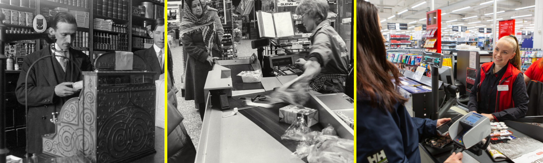
And in the pictures with the cash registers I’d bet the man on the left gets far less done than the women on the right. He doesn’t have access to as good technology as they do. For example, his till is clunky and he has to pack the items himself. In the 1980s the conveyor belt was invented, which made things faster. But the cashier still had to key in prices manually and customers paid with notes and coins. I remember as a child always having to queue forever at the shop. But today it’s quicker. The barcode scanner lets the woman on the right scan items rapidly and customers pay conveniently by card.
But the notion of technology is broader than what we commonly think of as tech. It is everything that affects how much we can produce with a given set of resources. Examples of technology therefore include the Post‑it note, the assembly line, computers and AI — but also clever incentive schemes and scheduling that motivate people. For example, Mas & Moretti (2009) has shown that cashiers are influenced by their peers in interesting ways.
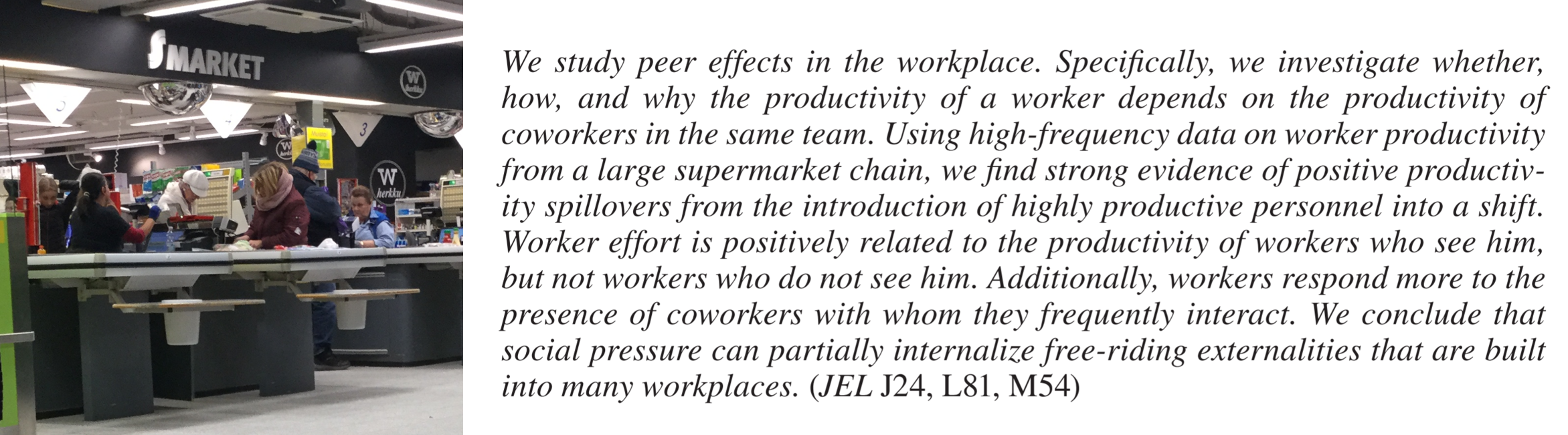
The researchers analysed data from a large supermarket. It’s straightforward to measure how many items each cashier scans per minute — you can read it directly from the store’s system. Some cashiers are fast, others slower. But the researchers also found that the work environment affected productivity. A slow cashier became faster on shifts when she sat near a fast cashier. In other words, diligence and ambition appeared to rub off.
How can you illustrate the effect of technological improvements in the neoclassical growth model? Go back to the app above. Try, for example, increasing technology from 2.5 to 3.5 and see how it affects incomes. You’ll see that better technology shifts the blue curve upward. With a given amount of capital a worker can now produce more because the economy’s technology has improved. In short: new technology makes us immediately richer.
There’s also a pleasant side effect. The amber investment curve shifts up as well (because we still invest the same share of our income — and our income has risen thanks to improved technology). Our investment in new capital therefore exceeds depreciation, so capital per worker grows and we become even richer along the way.
An interesting conclusion is that technological progress must be the explanation for sustained economic growth. So far there has been no evident upper bound on humanity’s ability to invent smarter ways of working. Do you disagree? If so, tell me exactly which year you think humanity reached its “peak”, when everything was done in the absolute best possible way and no further improvements were possible.
12.3 Convergence or divergence?
One lesson from neoclassical growth theory is that poor countries should be able to grow faster than rich ones. Poor countries — like bomb‑shattered Germany in the autumn of 1945 — may not yet have reached the capital steady state k*: their investment in new capital then exceeds the destruction of old capital, so capital per person rises and the country gets richer. Rich countries have likely already reached their steady state. GDP per capita can still rise through improved technology, but that effect applies to both poor and rich countries — so the poor probably have more channels that can boost their growth. This idea is called the convergence (or catch‑up) hypothesis.
Let’s go to the data and test whether poor countries actually grow faster than rich ones. This question is enormously important: the answer tells us whether income gaps between countries will widen or narrow. I therefore downloaded GDP per person for every country in 2000 and 2018 and plotted the following relationship:
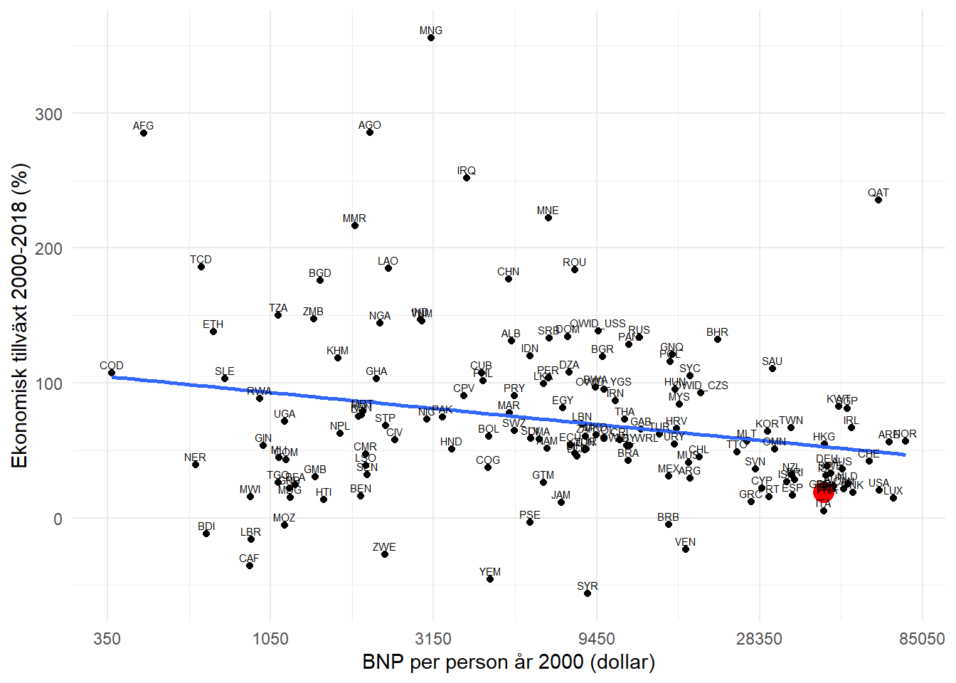
On the horizontal axis you see how rich each country was in 2000 in terms of GDP per capita. I’ve highlighted Finland in red. Countries far to the right, like Finland, were therefore rich in 2000. The vertical axis shows how fast each country grew economically over the following 18 years. You can see that Finland had low growth while, for example, Mongolia, Afghanistan and Angola grew rapidly.
Can’t you already spot a negative relationship by eye? Countries that were poor in 2000 have often since grown a bit faster than those that were rich. This is confirmed by the blue line, which is the computer’s summary of the relationship between GDP per person in 2000 and economic growth over 2000–2018. This means that the world is converging, since poor countries tend to grow faster than rich ones. In other words, those at the back of the race are running faster than the leading pack. That’s excellent news for the world’s poor.
12.4 Growth accounting
Let us do one more small study. From neoclassical growth theory we know that economic growth must stem from either increased resources (labour and capital) or from improved ability to use those resources (technology). An obvious question is therefore: which of these three factors made us so much richer? Should we thank the workers, the capital, or the technology? All of this can be measured in the data. This is called growth accounting. I have carried out such an analysis and present my results in Table 12.2.
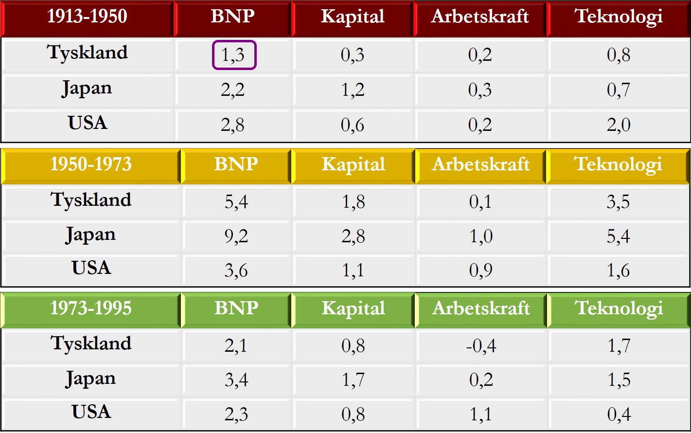
To understand the table, first look at the circled number at the top. It shows that Germany’s GDP grew on average by 1.3 per cent per year during 1913–1950. In the rest of that row I decompose how much of the growth was due to i) more capital per worker, ii) more hours worked and iii) improvements in technology. Germany’s growth in this period was therefore driven mainly by technological progress: of the 1.3 percentage points of growth, 0.8 percentage points came from technology, which corresponds to about 62 per cent (0.8/1.3) of the total. The contribution from increased capital was 23 per cent (0.3/1.3) and from increased labour 15 per cent (0.2/1.3). Note that by definition these contributions must sum to 100 per cent.
the neoclassical growth theory states that a country can temporarily become richer by investing more in new capital, but that sustained growth can only occur through technological progress — that is, by producing more with given resources.
In the rest of the table I performed a similar exercise for Japan and the USA across three time periods. Do you spot any interesting patterns? I, for one, am struck that technological progress in the USA during 1973–1995 hardly contributed to growth — even though this was precisely when computers became widespread. I am also impressed by Japan’s remarkable technological progress in 1950–1973.
If you like, you can do the exact same analysis with more recent data or for other countries. You can then explore lots of exciting puzzles: In which countries is technological progress currently fastest? Can we see the IT revolution and the internet in 2000s data, and the effect of ChatGPT after 2022? Has Europe’s ageing population dragged down growth?
What did the Japanese do to achieve that huge leap in technology? Since technology is, according to the theory, the key to sustained economic growth, it is highly interesting to find out why country A manages to improve its technology while country B fails. Or in other words: what is required for an F1 tyre change to become faster and for cashiers to get more done at work? That’s what the next chapter is about.
Exercises
In this chapter you have learned why some countries become rich while others remain poor. You have also explored the links between growth, happiness and the environment. Below are some cases where you can apply your knowledge in practice. Press Show Answers when you want the computer to grade your answers. Good luck!
Ukraine, the war and the future
You will now use growth theories to analyse the situation in Ukraine. Use the app in Section 12.2 as a guide, but make sure you can also carry out the analysis on your own with paper and pen.

- Assume capital per worker in Ukraine was at steady state before the war. The war destroyed much capital. As a result, GDP per capita will and investment in new capital is now than the depreciation of existing capital.
- When the war ends growth in Ukraine will likely be very high for several years and then slow down. Explain using the neoclassical growth theory why this happens.
- Assume a country invests 20% of GDP in new capital each year. If the country raises the investment rate to 30% the investment curve will , the depreciation curve will , capital per worker will , GDP per capita will and consumption per person .
- A country at steady state suddenly finds a way to work smarter. According to the neoclassical growth model GDP curve , the investment curve , the depreciation curve , capital per worker and consumption per person .
- If annual growth is 1% it takes years to double, but if growth is 2% it takes only years.
- Eva currently bench‑presses 50 kg and gets 4% stronger every month. When will she lift 100 kg (if growth continues)? . 7.A country became 4 times richer in 40 years. Assuming constant growth, the annual growth rate was . 8.According to neoclassical growth theory an increase in the investment rate implies that .
- Technological progress implies the following in the neoclassical growth model: .
- Tip for these tasks: Start from the theory, don’t ramble! I would first draw the figure below and then explain clearly so the exam marker sees you understand. Before the war Ukraine sits at point 1, where GDP per worker is high because each worker has lots of capital. During the war much capital is destroyed; in the figure I assume capital falls to K1, which makes GDP per worker drop to point 2. The war has made Ukrainians much poorer. Note, however, that in the figure investment in new capital still exceeds depreciation of existing capital.
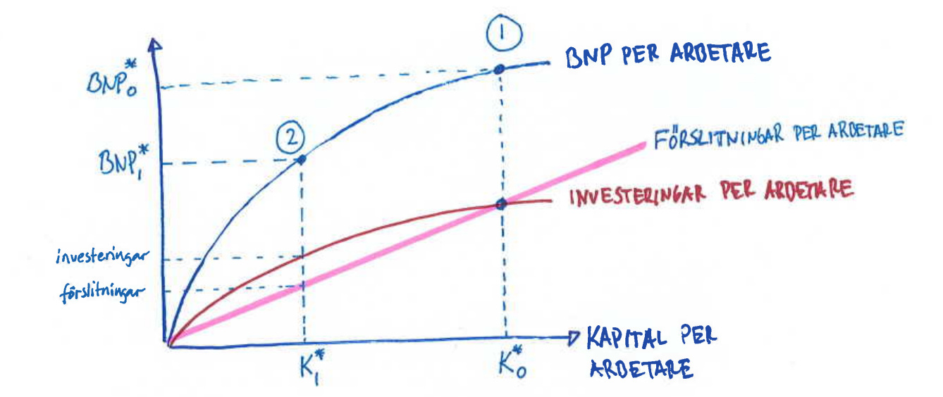
- What happens in the long run? Capital will grow over time because we invest more in new capital than the existing capital that breaks down. During the journey from K1 back to K0 GDP per worker will grow — until we return to point 1 and growth stops.
- As you can see in my figure above, the investment curve is about half as high as the GDP curve, which implies the country invests roughly 50% of GDP. If the country suddenly raises its investment rate the investment curve will move up in the figure, meaning capital will increase in the long run — and while capital rises GDP per worker will grow on the way. Note that consumption is the part of GDP we do not invest, so increased investment does not necessarily imply higher consumption (we do become richer but also commit a larger share of GDP to investment instead of consumption).
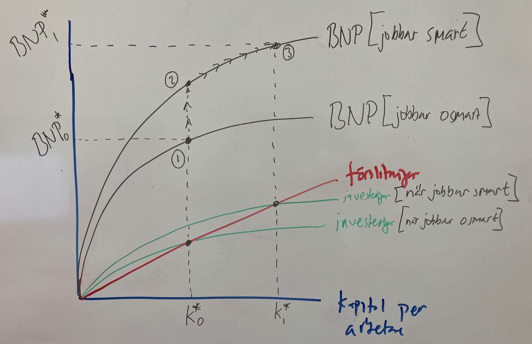
- See the figure below. Here the country continuously invests about 40% of GDP in new capital. In the initial state (point 1) GDP is GDP0 because capital is K0. When we suddenly work smarter the GDP curve shifts up and GDP rises immediately (point 2). Because we still invest 40% of income the investment curve shifts up as well, so capital grows over time. Eventually we reach point 3 where GDP is even higher (because capital is now K1). Growth then stops. (But the same mechanism likely repeats, since humans have repeatedly found smarter ways to work over the last 200 years).
- Learn to use the Rule of 70.
- Learn to use the Rule of 70.
- Learn to use the Rule of 70.
- See the discussion above and you will understand.
- See the discussion above and you will understand.
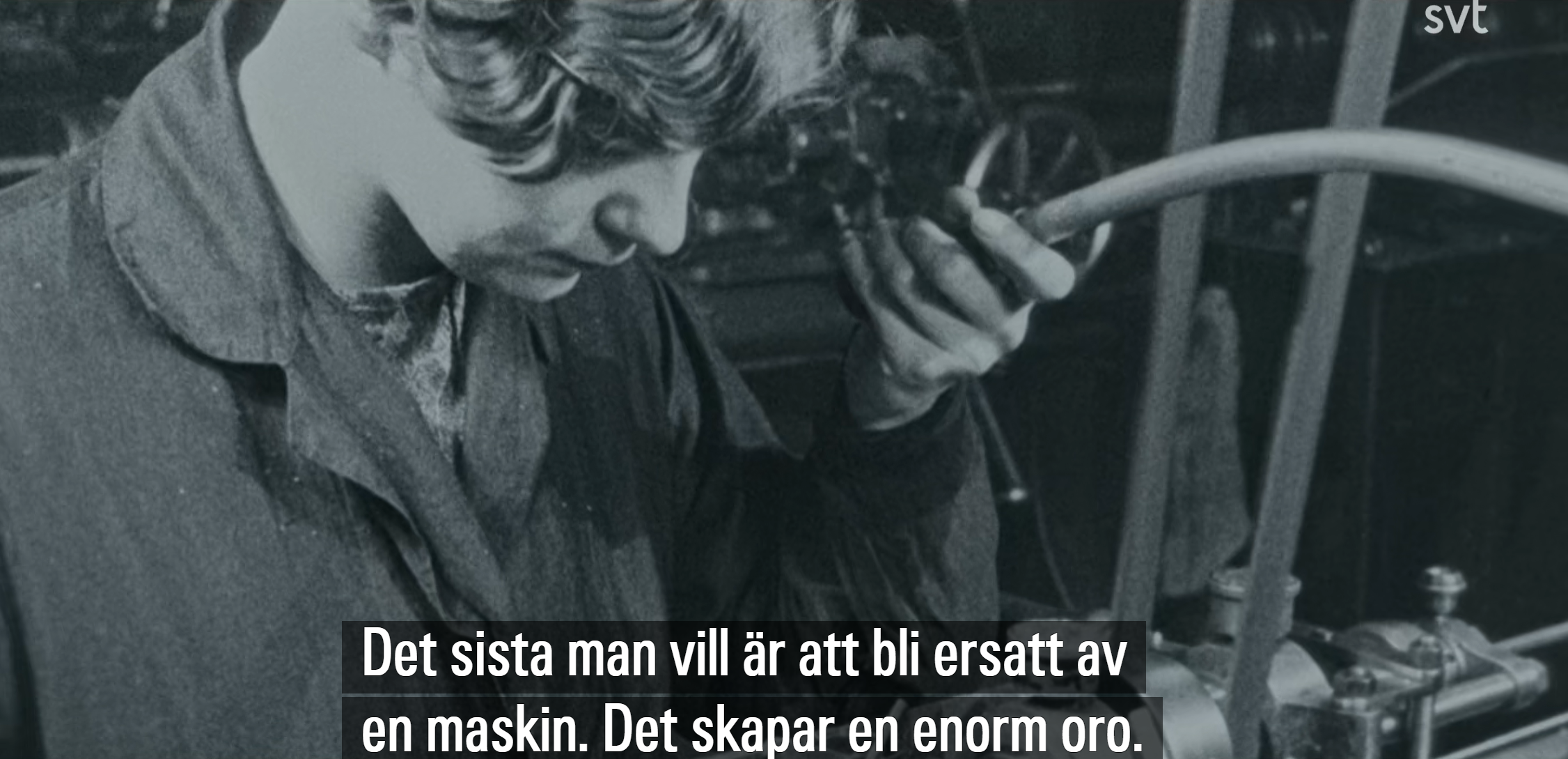
- Last year’s Nobel Prize in Economics went to research showing how technological progress reshapes the world, for better and worse. Click the image below to play a 13‑minute video that serves as an excellent introduction to the next chapter:
 .
.